Great contest guys!! Hope these awards are okay seeing as though I know nothing of LOST.
FIRST PLACE:: Gilraen Ringeril

SECOND PLACE :: Keyodie

THIRD PLACE :: Morwen Anduril

HONORABLE MENTION :: Riniel Anariel

HOST'S CHOICE :: Fencing Maiden

Those who voted!
1. Zandain
2. Ea
3. Rose of Rivendell
4. TrueNarnian
5. Bubble Black
6. Elven Archer
Comments are LOST!
+++++++++EVERYONE :: “Really good entries. Some nice, creative entries and a good mix of characters, interesting to see who people chose, and that they were all generally good guy characters (except for one oddball who chose a really evil, bad man).” –Johnny’s Fan
+++++++++Master of Tookland :: “Ok, I’ll admit it. I’m biased about your entries. It’s Desmond.

But aside from that

I really like your set. The blending is nicely done, and I love the colours. The gritty look to it works well and I like the text as it really fits.” –Johnny’s Fan
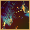
+++++++++Fencing Maiden :: “I like how it's angled to fit the banner without it looking 'forced'. Usually when people use horizontal pictures it turns out a little ackward, but not this!” –Ea
“This is a really nice set. I like the picture placement and the text suits the subject. It’s simple but effective.” –Johnny’s Fan
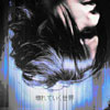
+++++++++timtimtimtim :: “Love the fact you only used one colour and that it’s purple.

The pictures are nicely arranged and I like the fact the text doesn’t relate to the character pictured (although I’m having trouble reading the smaller text).” –Johnny’s Fan
+++++++++Hobbit Riley :: “I think you’ve done really well blending the images together. And I like the fact it’s green. Although the “border” is a bit overpowering, I actually quite like it. Well done for trying something different.” –Johnny’s Fan
+++++++++Keyodie :: “I love the glossiness of your set and the way you've duplicated the picture. The texture on both is gorgeous!” –Bubble Black
“Beautiful entries. I love the main image and the way it glows. I also like the blending of the other images. The text is really well done. I like the fact the avatar is slightly different to the banner.” –Johnny’s Fan
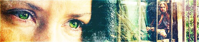
+++++++++Gilraen Ringeril :: “Gorgeous, as always! The colour and texture on your set is totally amazing! I love the way you placed the text on the banner and the font you used. The cropping of your icon is fantabulous too!” –Bubble Black
“SKATE! *ahem* I love the pictures you used (I’d love to know what Kate is thinking, that's a great look) and the way you have blended them. I really like the use of textures and the text.” –Johnny’s Fan
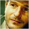
++++++++++Riniel Anariel :: “Great background which serves as a nice frame for the him. Good colors.” –Ea
“I really like the grungy feel of your set and the colouring is wicked too!” –Bubble Black
“I like the pictures you used and the blending is really good. The colours are nice and I like the text, as it suits really well.” –Johnny’s Fan
++++++++++Johnny's Fan :: “Very nice blending, but that is only to be expected from JF
” –Ea
This girl seriously needs slapping with a wet fish…I mean..come on! You had the choice of loads of good lookin’ guys and you chose Ben? Sheesh….get another obsession…” –Johnny’s Fan [Kit: Totally! What was she thinking? Gosh.]
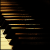
++++++++++Morwen Anduril :: “I like how the pictures are cut, the way 1/3 of his face is cut off so you can¨t see the eyes is slightly annoying, which makes it interesting

“ –Ea
“Yayness for Charlie! The way you've placed the pictures is brilliant and I love the text on the banner.” –Bubble Black
“Pictures you have chosen are really good and the way you’ve placed them. I like the fact you can see Charlie’s eyes in the back. Everything about it is just really good.” –Johnny’s Fan
+Kitoky


 I didn't think I would place... Thanks so much for the award!
")


 This was very, very unexpected!! Thank you so much, Kit for the award, and to everyone who voted and commented!