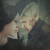
1) ErulissëEnethNîn
+ Is the most worked on banner
- Waaay to bright IMO
Comment: The most worked one of them IMO, but that brightness should have vaporised that vampire in the background, haha. The banner should have more darkness with a few spots of darkness to give it a more Vampire story look. But suitable green colours.
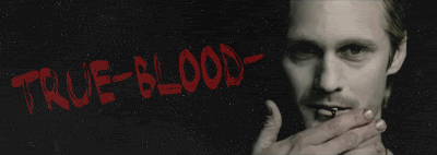
2) thedirector
+ Text work
- blury looking left face
Comment: Great work on the Van Helsing text, but the left image should be much more sharper.
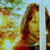
3) The_Doctors_Girl
+ I like the Aiming Van Helsing image and the quote
- To big text and bad placed
- Two much going on, so you don't know what you should look at.
Comment: There's two many images of Van Helsing in that banner. Instead of putting in lots of Van Helsings, put in a couple of images to set a mood in the banner, like a full moon on a cloudy sky and the castle from the movie.
Keep on working with those banners guys, I believe you all can improve even more than your current level are.


")


")


 <br><br><a href="http://immortalkiss.sarrand.net/"><img src="http://immortalkiss.sarrand.net/ik_lb6.jpg" border="0"></a>


 </center>