Joined: 03 June 2005 Posts: 1382 Location: Australia
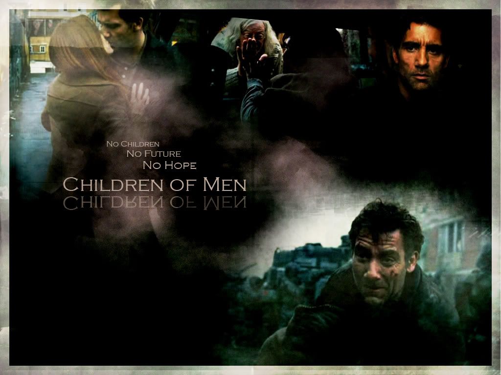
You can read the text sufficiently in the first one. I also find it much simpler than the second. The extra brushes over the top just clutters it more and detracts from the images.
So A was my vote.
Users browsing this forum: No registered users and 8 guests
You cannot post new topics in this forum You cannot reply to topics in this forum You cannot edit your posts in this forum You cannot delete your posts in this forum You cannot post attachments in this forum