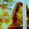
Rita Skeeter: You blended this one pretty well! But the border isn't really my fav. and it doesn't fit...also you might not want to use the light effect on such a small graphic such as an avatar. And the pictures are a bit too blurry...but it is blended well! Maybe you could try doing something like a color overlay to make them fit better?
Blian and Cat:ehh...not the best you've made. The black in the middle doesn't look to well with the rest of the banner. And again, I don't especially like that border.

. But nice picture choice! They do fit.
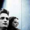
Cho and Harry:Again, a bit too blurry. And you could have blended the pictures a little better...maybe you could have gradually made the blue darker? But I like the light effect you added.
Peter Pervensie:This one is blended very well! But I don't think the lens flare in the corner fits very well. But it is blended well! Again, you might want to try a color overlay.
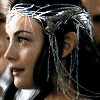
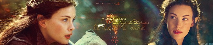
Arwen and Legolas:Like Beri said, the color tones are two different, so Legolas looks a little out of place. You might want to try blending the two backgrounds together instead of cutting their faces out...*shrugs* Just my opinion!
 Ron Avatar:
I might have used a different color for the heart and text, and added more effects to the picture...but it is pretty good!
Safe in my arms...just sleeping:Same thing here as the Arwen and Legolas one.
Beuxbaton:I would say this is one of your best ones so far! The brushes fit, the text fits, everything fits...good job!
Legolas...Prince of my heart:For the picture on the right, the edge of his face looks to soft, and the black in the middle doesn't fit...maybe you could have added some kind of texture or pattern in the middle. I like the picture choice tho. Good job!
Willy Wonka:Cool! Text fits and so do the pictures...great job! But it's a little too dark for my taste.
Harry Potter...the boy who lived:Cool! But the text is blurry and so are the pictures...It's a little too dark, but everything else is well done!
Dobby the house elf:This is overall really good! But it's a little too dark, and the brushes interfere with Dobby's face...but everything else is perfect!
Voldemort:Haha, this one is great. But again, the brush does interfere with his face. Other than that tho, good job!
All you need is love:This one is great! Again, the brush gets in the way of the characters' faces, but other than that it's a really nice banner!
Hermione:This is really nice! Brushes still get in the way, but it's really good other than that!
Cho Chang:This is a gorgeous banner! I love the effects and the brushes are in the right spot and everything! I would just erase the part of the brush that goes over Cho's chin...but other than that, great job!
A Narnia Lullaby:This is one of my fav.'s! I love how you blended it, and the star totally fits! Good job!
Emma Watson:This one is so pretty! But I think it could use a bit more coloring.

But it's really good!
Balian:Great! I would just suggest the same thing as the Emma Watson banner.


 I use a programm called Gimp, it isn't very well known, but it does exately the same as Photoshop and sstuff.
 I am still experimenting with the color effects and things but I'll definately try the colour overlay! Thanks agian
")


")


 *composes herself* Anyways, I love both your red ones, they're gorgeous. Great job!
 </center>