Joined: 02 July 2006 Posts: 3070 Location: Hitch-hiking to Vegas
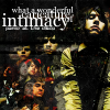
I'm thinking of using that as the top banner for a layout for me and merry's website we're making. whaddya think?
Sam
_________________ <center> Can't take the Kid from the Fight take the Fight from the Kid engaged to Tyson Ritter-my love forever <a href="http://www.dance-to-this-beat.net"> Dance to this Beat</a> </center>
Joined: 02 July 2006 Posts: 3070 Location: Hitch-hiking to Vegas
yes! I am glad u lieks it!
Sam
_________________ <center> Can't take the Kid from the Fight take the Fight from the Kid engaged to Tyson Ritter-my love forever <a href="http://www.dance-to-this-beat.net"> Dance to this Beat</a> </center>
Joined: 05 January 2006 Posts: 4689 Location: Somewhere dark... *glowy red eyes*
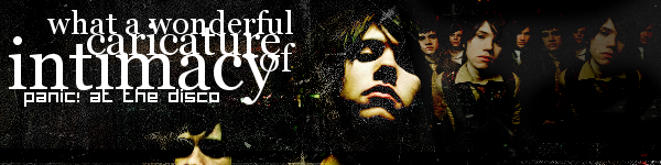
Tis beautiful! Is that Yuna on the right?
_________________ <center>
[font=Times New Roman, serif].:Sig by me, open to requests of banners, anicons, avvies and wallies over PM:.
.:For Icon credit, PM me:.
[/font]
</center>
Joined: 02 July 2006 Posts: 3070 Location: Hitch-hiking to Vegas
yup!
Sam
_________________ <center> Can't take the Kid from the Fight take the Fight from the Kid engaged to Tyson Ritter-my love forever <a href="http://www.dance-to-this-beat.net"> Dance to this Beat</a> </center>
Joined: 02 July 2006 Posts: 3070 Location: Hitch-hiking to Vegas
thankies! It actually looks softer and nicer when the host doesn't mess it up *cusses at host* Merry and I have decided to use it Thanks for the feedback, all!
_________________ <center> Can't take the Kid from the Fight take the Fight from the Kid engaged to Tyson Ritter-my love forever <a href="http://www.dance-to-this-beat.net"> Dance to this Beat</a> </center>
Users browsing this forum: No registered users and 8 guests
You cannot post new topics in this forum You cannot reply to topics in this forum You cannot edit your posts in this forum You cannot delete your posts in this forum You cannot post attachments in this forum


 ........is it 4 like a video game, or wut? just wondering.


