|
Page 1 of 1
|
[ 12 posts ] |
|
| Author |
Message |
|
|
Post subject: "Light Up the Sky" - which one?  Posted: Posted: November 5th, 2007, 11:28 pm |
|
Joined: 04 June 2005
Posts: 4449
Location: Northern USA

|
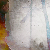
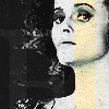
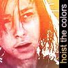
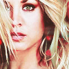
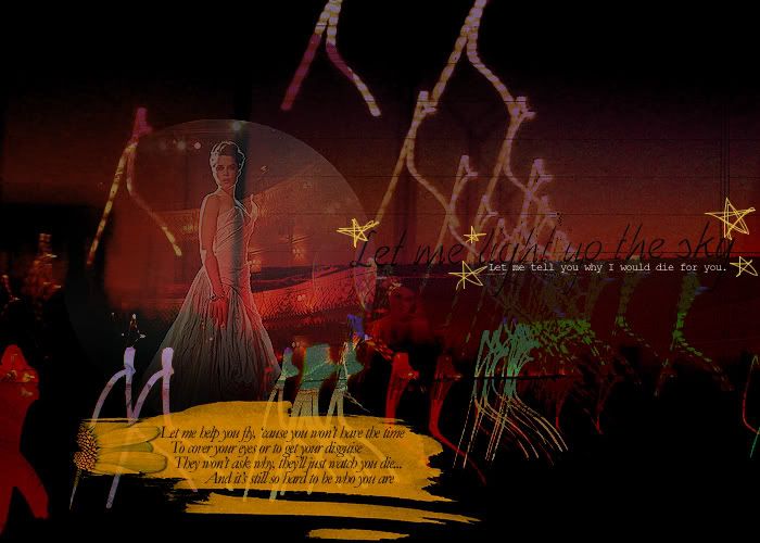
I made 2 versions of a blend/collage for a blend challenge site, but now I'm not sure which to submit!
Version 1:
Version 2:
Thanks for the help!  _________________ 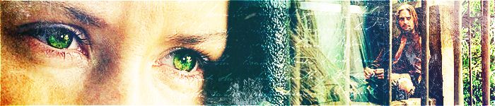
<center> icon & banner by me
skyward-thoughts</center>
|
|
| Top |
|
 |
|
|
Post subject: Posted: November 6th, 2007, 10:43 am |
|
Joined: 29 June 2007
Posts: 2319
Location: Rome, Italy
Gender: Female
|
they're both amazing. but I prefer version 1   _________________ 
|
|
| Top |
|
|
|
|
Post subject: Posted: November 6th, 2007, 6:34 pm |
|
Joined: 23 May 2006
Posts: 1406
Location: Snape's Dungeon.
|
|
| Top |
|
|
|
|
Post subject: Posted: November 6th, 2007, 7:05 pm |
|
Joined: 23 October 2005
Posts: 8345
Location: Rivendell
Country: ")
Gender: Female
|
I like them both, of course. But I'd say the second one. _________________ 
- married fingon fingolfinion 6/4/13 -
~art credit~
|
|
| Top |
|
|
|
|
Post subject: Posted: November 6th, 2007, 7:28 pm |
|
Joined: 06 May 2005
Posts: 15181
Location: Minas Morgul
|
|
I like version 2, mainly because it fits well with the theme. The textures and the extra stuff really makes it almost graffiti-like, and I don't know if that goes well with the theme.
_________________
<center>
THE HALLOWFEST 2010
<a href="http://www.arwen-undomiel.com/forum/viewtopic.php?t=20958">information here</a>
</center>
|
|
| Top |
|
|
|
|
Post subject: Posted: November 6th, 2007, 8:34 pm |
|
Joined: 04 June 2005
Posts: 4449
Location: Northern USA
|
Thanks for all the comments guys
I posted this on another forum as well, and it's an almost even split between the two on both forums!  I don't know how I'll be able to pick _________________
<center> icon & banner by me
skyward-thoughts</center>
|
|
| Top |
|
|
|
|
Post subject: Posted: November 7th, 2007, 9:32 pm |
|
Joined: 06 May 2005
Posts: 15181
Location: Minas Morgul
|
Why not both?
_________________
<center>
THE HALLOWFEST 2010
<a href="http://www.arwen-undomiel.com/forum/viewtopic.php?t=20958">information here</a>
</center>
|
|
| Top |
|
|
|
|
Post subject: Posted: November 7th, 2007, 11:29 pm |
|
Joined: 04 June 2005
Posts: 4449
Location: Northern USA
|
I wish, but I can only submit one to the contest it's for (did I even mention it was for a contest? lol ) _________________
<center> icon & banner by me
skyward-thoughts</center>
|
|
| Top |
|
|
|
|
Post subject: Posted: November 8th, 2007, 5:02 am |
|
Joined: 03 June 2005
Posts: 4079
Location: In my dreams
Country: ")
Gender: Female
|
I voted for the 2nd one, but they are both spectacular. Like Kit said, the 2nd one fits more with the theme, but the first ones looks more complex to me. So it's your call on whether they'll be judging the relation to the theme or how technical it is.
(Also, quick question, are the moon and stars brushes or just you with the pencil tool? ) _________________ 
|
|
| Top |
|
|
|
|
Post subject: Posted: November 8th, 2007, 8:45 pm |
|
Joined: 04 June 2005
Posts: 4599
Location: Zeh Shire
|
|
THEY'RE
BEAUTIFUL.
Keep them both obviously, but i think the second one too.
_________________ <center> 

|
|
| Top |
|
|
|
|
Post subject: Posted: November 17th, 2007, 1:20 pm |
|
Joined: 14 July 2006
Posts: 2652
Location: Rivendell, of course
|
OMG! Both versions are really, really beautiful! 
I like them both, but finally I've voted for the second one. I agree with what Kit and Taurquende have said about the theme.
Great job on both ones! _________________ ~The Dreamy A-U Gentlewoman~


<center>
~thanks to: Johnny's Fan (animated banner)~
~icons made by me~
My site: ~Evenstar Dreams~<center>
|
|
| Top |
|
|
|
|
Page 1 of 1
|
[ 12 posts ] |
|
Who is online |
Users browsing this forum: No registered users and 13 guests |
|
You cannot post new topics in this forum
You cannot reply to topics in this forum
You cannot edit your posts in this forum
You cannot delete your posts in this forum
You cannot post attachments in this forum
|
Powered by phpBB © 2000, 2002, 2005, 2007 phpBB Group
Boyz theme by Zarron Media 2003
|
|