Ok well I have a couple of art exhibits in my school where I need to display one drawing of mine. But the problem is I don't know which one I should display. So I need you to help me. Choose the one that you think is my best one yet. Of course you don't know if it is truly the best since you haven't seen all of my stuff but from the choices I give you. And please, please, give criticism. It can be bad as long as you have a good reason for it. Thank you!
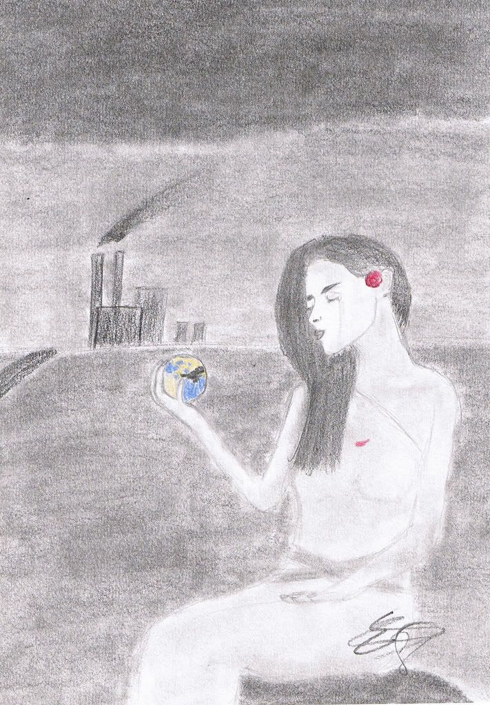
1.
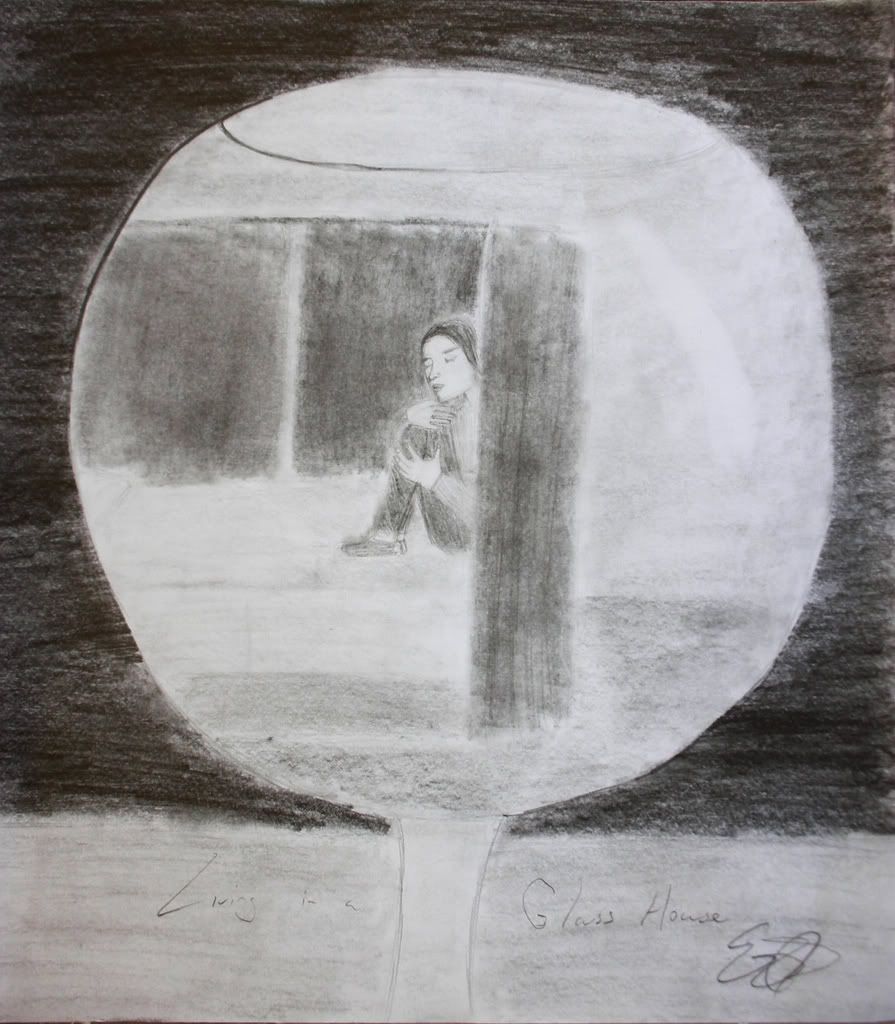
2.
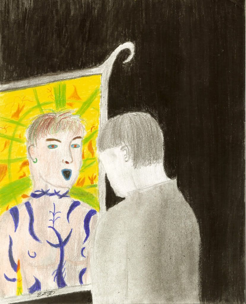
3.
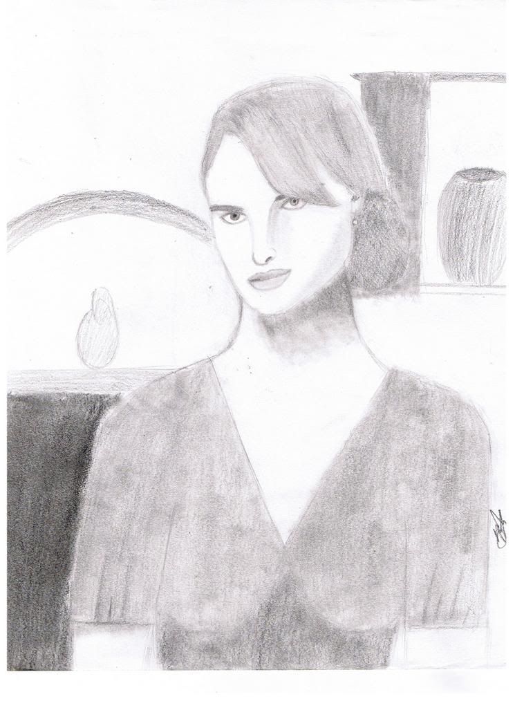
4.
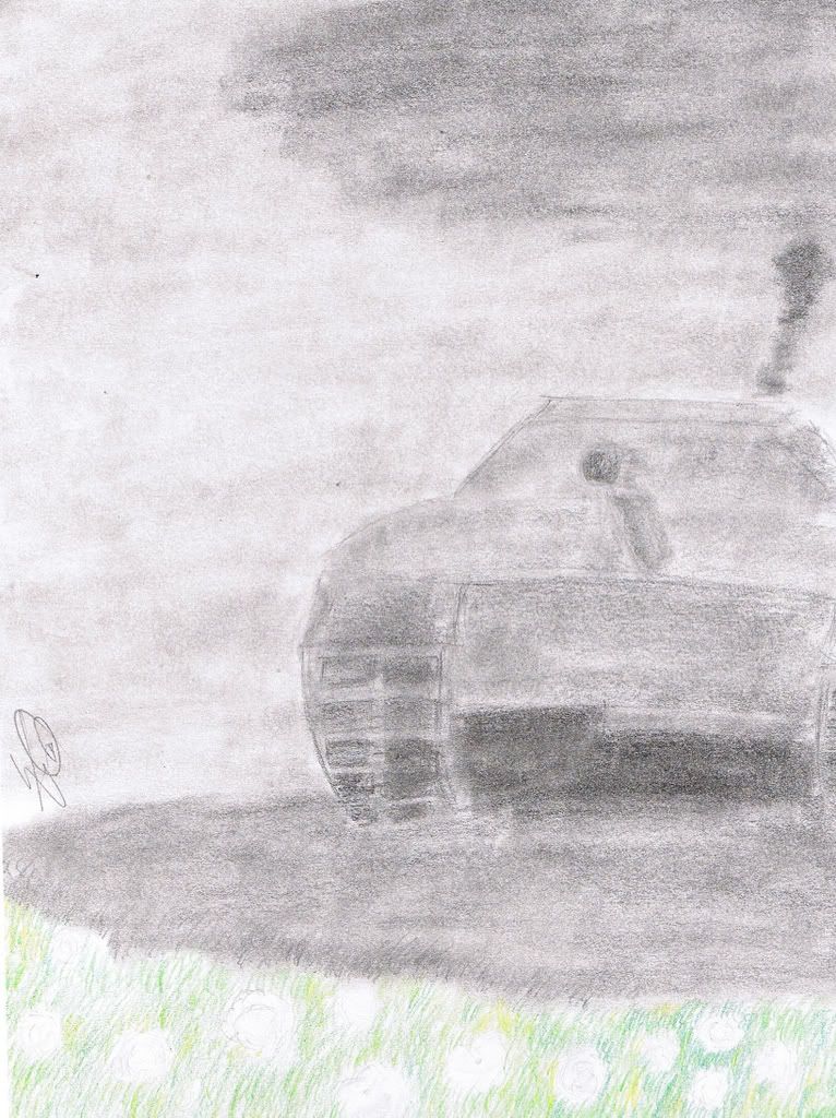
5.


 about the hair... one side is swept around the neck, and should be a bit shorter than the rest. also it seems a bit stiff, I usually draw hair slightly wavy to make it feel more soft. and one more thing... since the globe seems to be a focal point, you may want to outline the arm so it's a little sharper than the other to sort of lead the eye from the face to the globe. Keep up the great work!!