Hey guys. The new stuff is on the last page.

This time around, I'm working more on fonts, as well as just trying to develop a style that actually looks good.
I know I'm not the best, by far, and I don't really have a style. I've entered a couple contests, and I know the amazing talent that is on this website, and maybe you can all help me be better too.
credits
my brain-touchstonesart.com-a-u.com-bittereppiphany.com
Old stuff:
avvies

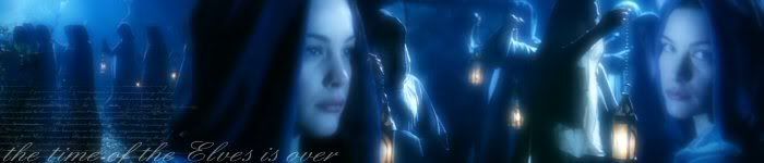
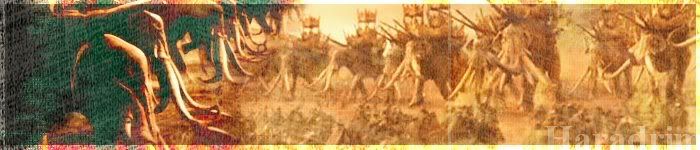
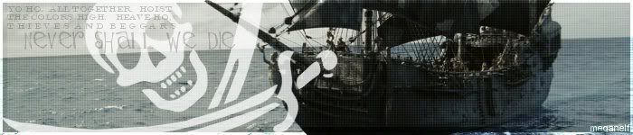
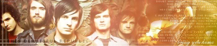
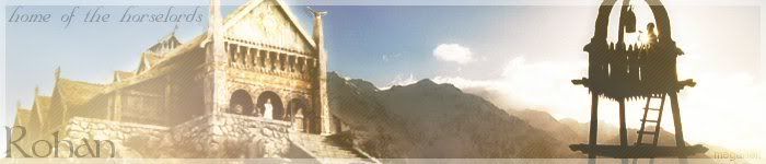
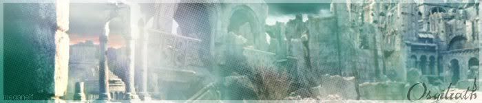
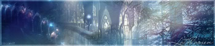
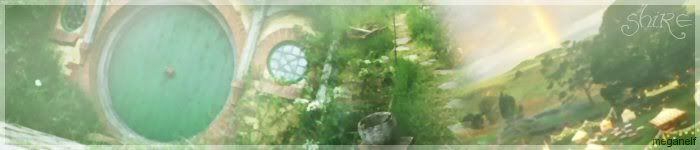
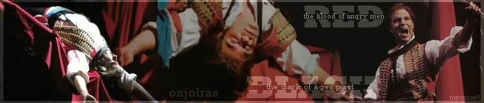
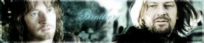
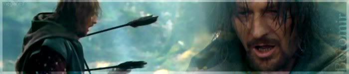
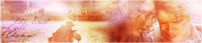
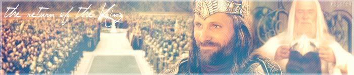
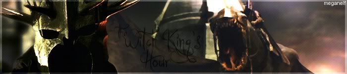
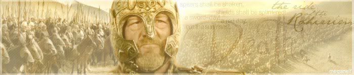
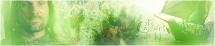
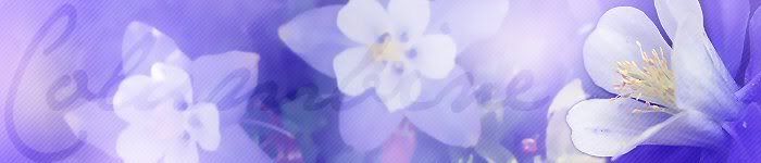
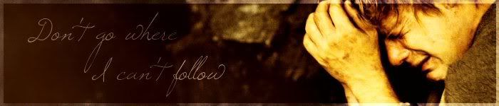
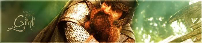
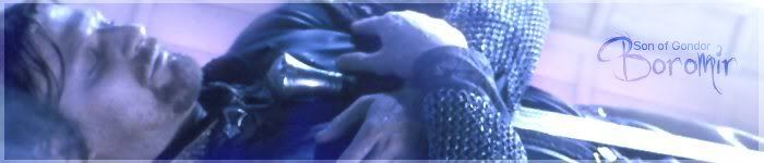
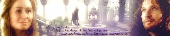
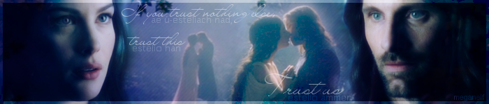
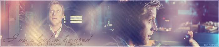
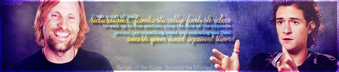
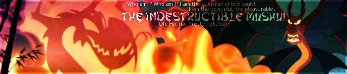
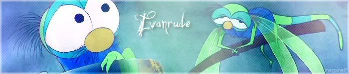
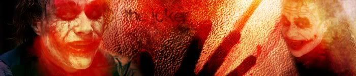
banners
--old stuff--

for turwaithiel swann:
for FairRider:

--new stuff--
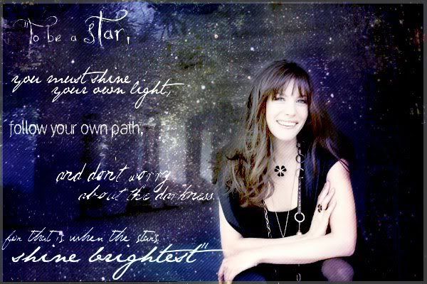
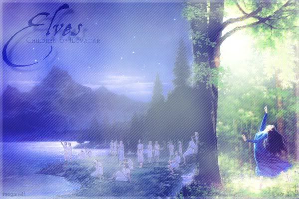
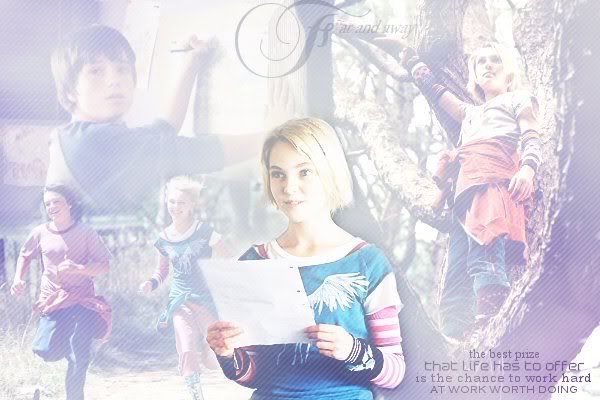
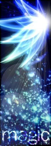
blends/randomness
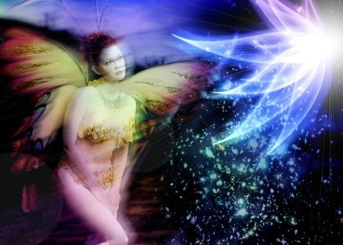
http://img.photobucket.com/albums/v686/ ... thefae.jpg
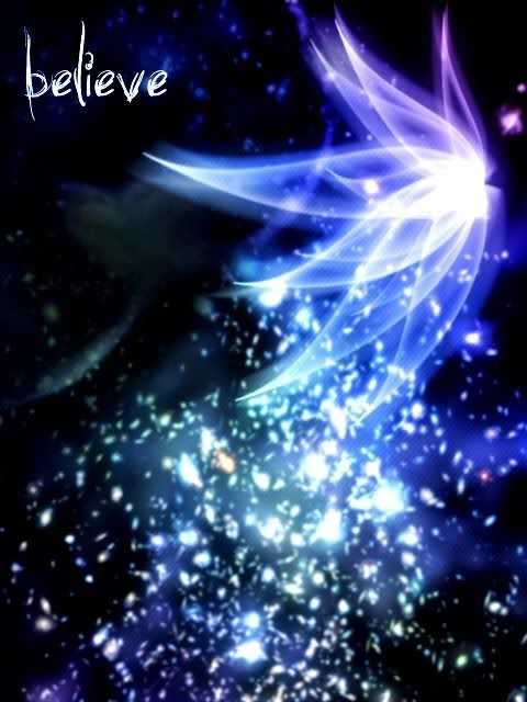
http://img.photobucket.com/albums/v686/ ... ieve-1.jpg
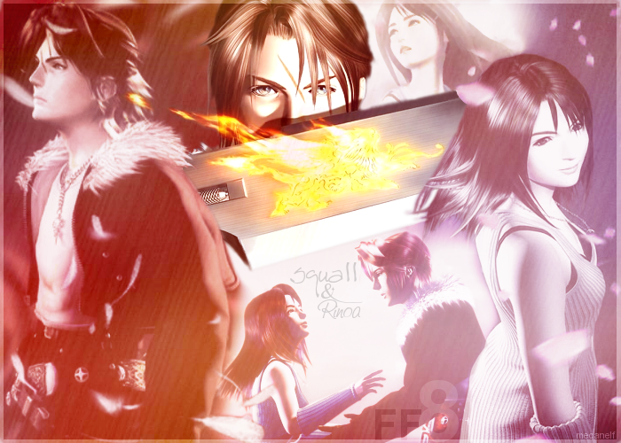
http://img.photobucket.com/albums/v686/ ... f/ff-1.png
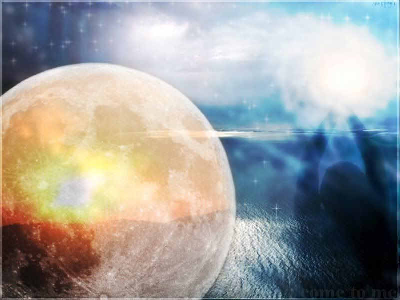
http://img.photobucket.com/albums/v686/ ... metome.jpg


