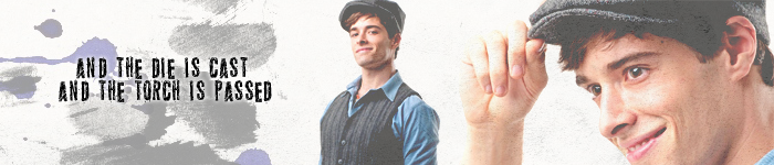
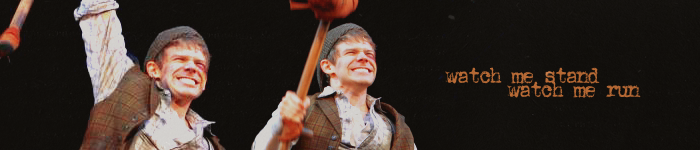
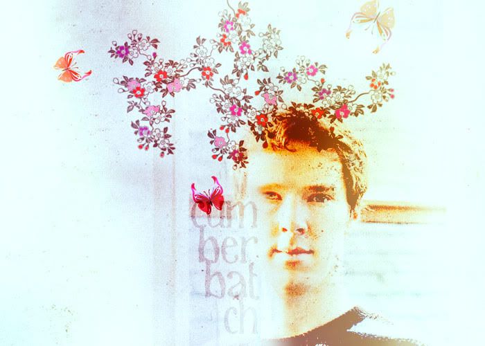
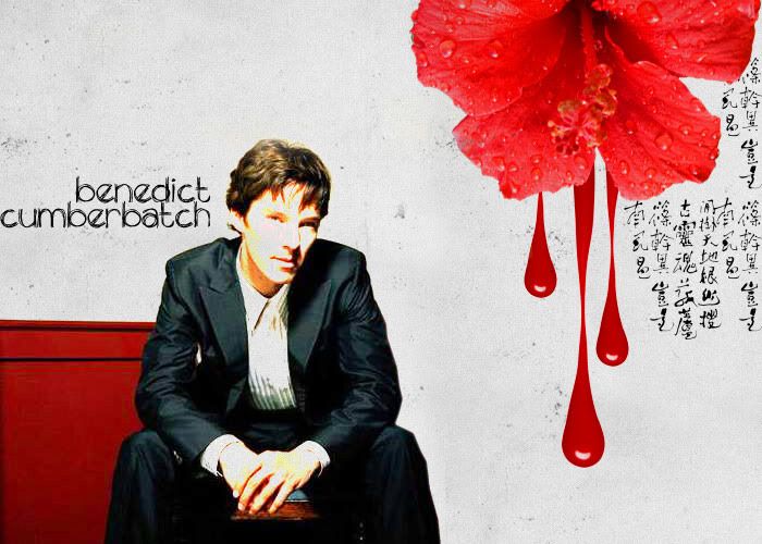
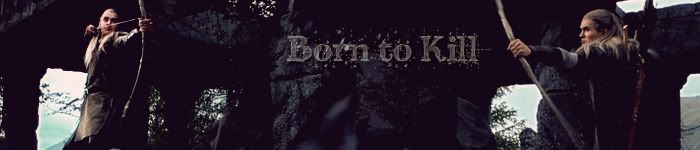
I didn't make quite as much as I was hoping to this Cookoff, but that said, I'm extremely proud of the work I did.

I've experimented with different kinds of blending and textures, and I must say that I've learned a lot in these two weeks. Not too happy with the coloring, though; I get stuck on that brown/pink color that I like so much and I wish I could move beyond it more. But towards the end I think I got better. /self reflection
Nurr, the challenges this year were amazing too.
I loved that each one focused on a different aspect of graphic-making, and that it was obvious for each challenge what its purpose was. Very helpful, I thought.

Now for some comments. I hope these help; everyone did a wonderful job, and they should be proud.
There's always room for improvement, though, right?
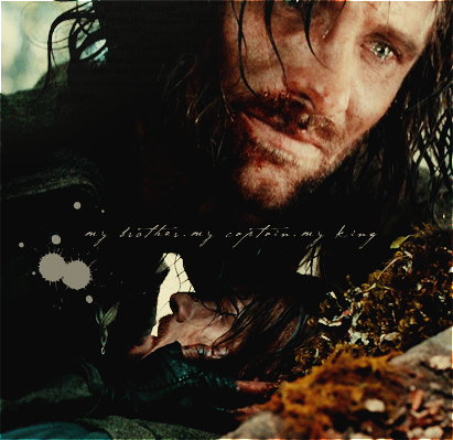
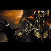
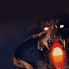
Smaug: Like Caunion said, you've come such a long way in a short time, and I think it even shows between the first graphics you posted and the last!
You have a unique style, too, which I think is brilliant. One thing that I think might help is trying to choose pictures that are either from the same scene, or ones with similar lighting. It makes the blending look more natural and less like a bunch of pictures forced together. That said, it's remarkable how you can make pictures with wildly different lighting blend as well as you do!
Favorite:
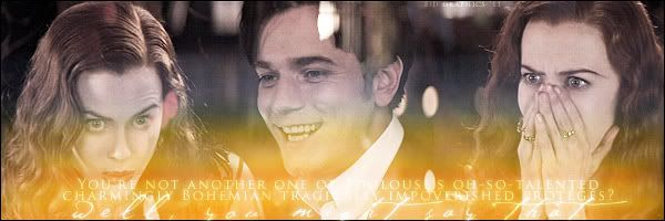
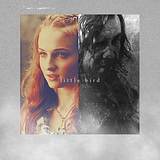
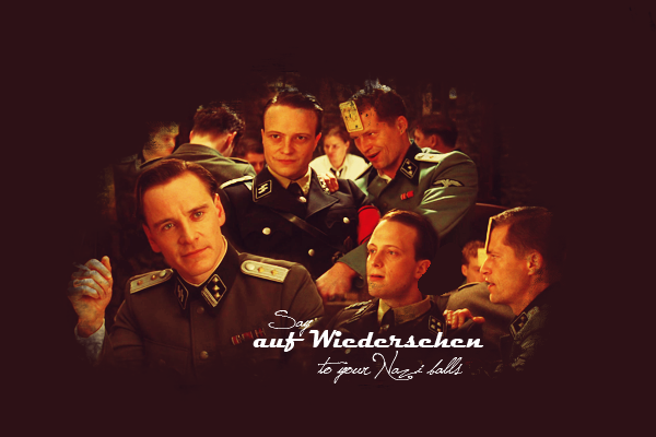
http://imageshack.us/photo/my-images/69/ringsk.jpg/Ennostiel: Lovely blending going on there. The coloring looks wonderful as well. I agree, though, that the textures can be overwhelming. What I would do is try erasing the texture where it overlaps the subject's face, or painting over the texture layer with a solid color in that area. That will keep the effect of the texture, but in a way that doesn't look unnatural.
Favorite:
http://i1094.photobucket.com/albums/i44 ... ers/10.jpg (The matching 11 and 9 ones were close seconds though!

)
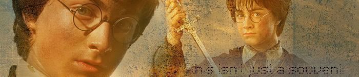
Harthad: Great start here, you've got a good eye for picture placement/cropping. That's half the battle right there. You're also very good at using text, which I find incredibly difficult to do well. A bit more in the way of coloring and textures would be nice; most of the images look pretty close to their original state, which is fine, but playing with colors and textures really adds a personal touch to them, as well as adding a mood to each piece.
Favorite:
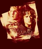
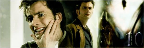
http://i1236.photobucket.com/albums/ff4 ... atar17.jpgLembas: Well, it's waaaay too difficult to come up with criticism for you.
Does "You didn't make enough" count? No? Okay. Well. More blending would definitely be great. Simplicity is wonderful, but when you're capable of making uber complex and fabulous pieces -- which you are -- why settle for simple?

Excellent job though. Coloring looks great, text looks great. Keep it up.

Favorite:
http://i10.photobucket.com/albums/a148/ ... aruman.png (Other contendors were every single piece you posted....
)
Nurrantiel: It might just be my computer, but a lot of pieces look a little too bright and saturated. I'd love to see what they look like on your screen, or on someone else's, because I can't imagine you'd purposely make them that way.
Aside from that though, they look great. The cropping is wonderful and you always find unique and interesting pictures to use. Fitting text on icons and having it look good is next to impossible, but you always manage to make it look good.
Favorite:
http://s954.photobucket.com/albums/ae23 ... nt=ten.jpg or
http://s954.photobucket.com/albums/ae23 ... t=eric.jpg (Love that Lighten blending style
)
Turwaithiel: Definitely a good basis here. The images you choose go well together in your banners, and therefore the blending looks very natural. However, I think you could work on cropping a bit more.
Sometimes it's very good and captures the subject's face clearly, but sometimes they're missing part of their chin or head and a bit of cropping or re-sizing might be beneficial. It's tricky to figure this out, but keep practicing and I'm sure you'll get it eventually. Keep trying different ways of positioning images on your banners -- experiment.
I'd love to see what you come up with.
Favorite:
http://s267.photobucket.com/albums/ii30 ... enstar.jpgManeth: The bright colors really make your graphics pop, which I like; they're very unique. This can get a bit tricky with skin, though, since higher saturation can make skin look too red or too yellow. What I'd recommend, if your program allows it, is going to the Saturation menu and lowering the saturation of the reds only. This will keep the blues, greens, purples, etc. bright and noticeable, but the skin looking natural and healthy.
If you want me to explain this in more detail, drop me a PM and I can give you a screencap of my program and show you what I mean, or maybe I could write up a guide to using the Saturation tool.
The text looks pretty good placement-wise, but maybe go easy on the Overlay setting -- it's a bit too bright in cases. I recommend Normal set to a lower opacity, and sometimes Difference set to a very low opacity can have an interesting effect.
Favorite:
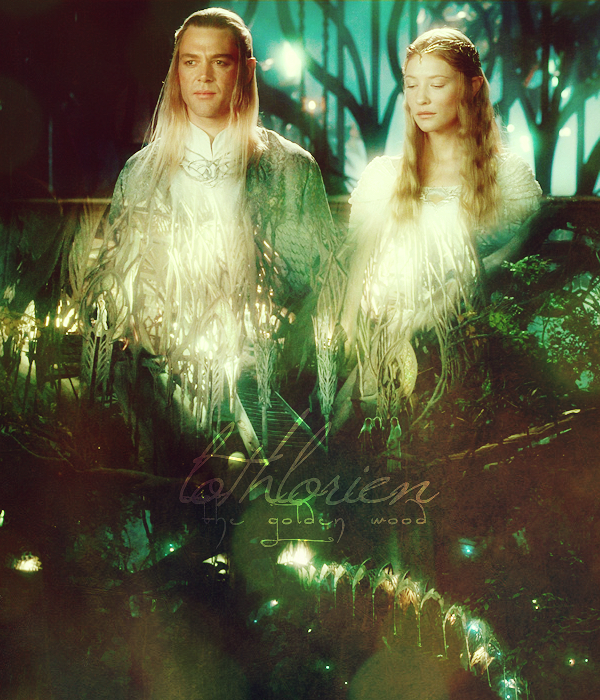
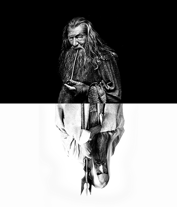
http://s1020.photobucket.com/albums/af3 ... t=mtgb.pngCaunion: Everything you make has this wonderful glowy effect, which I really like; your work is clean, well-blended, the images are placed very well, and the coloring always suits the images very nicely. What I'd like to see, though -- take this as you will -- is something completely different, just for fun.
All your work follows the same style; it's a great style, and I like it very much, but I'd be curious to see what would happen if you threw in a crazy texture, or tried a new style of blending, or something along those lines, just for the purpose of mixing things up. Sometimes it's fun to do that, even if the results are hideous (because 1% of the time, they actually turn out amazing).
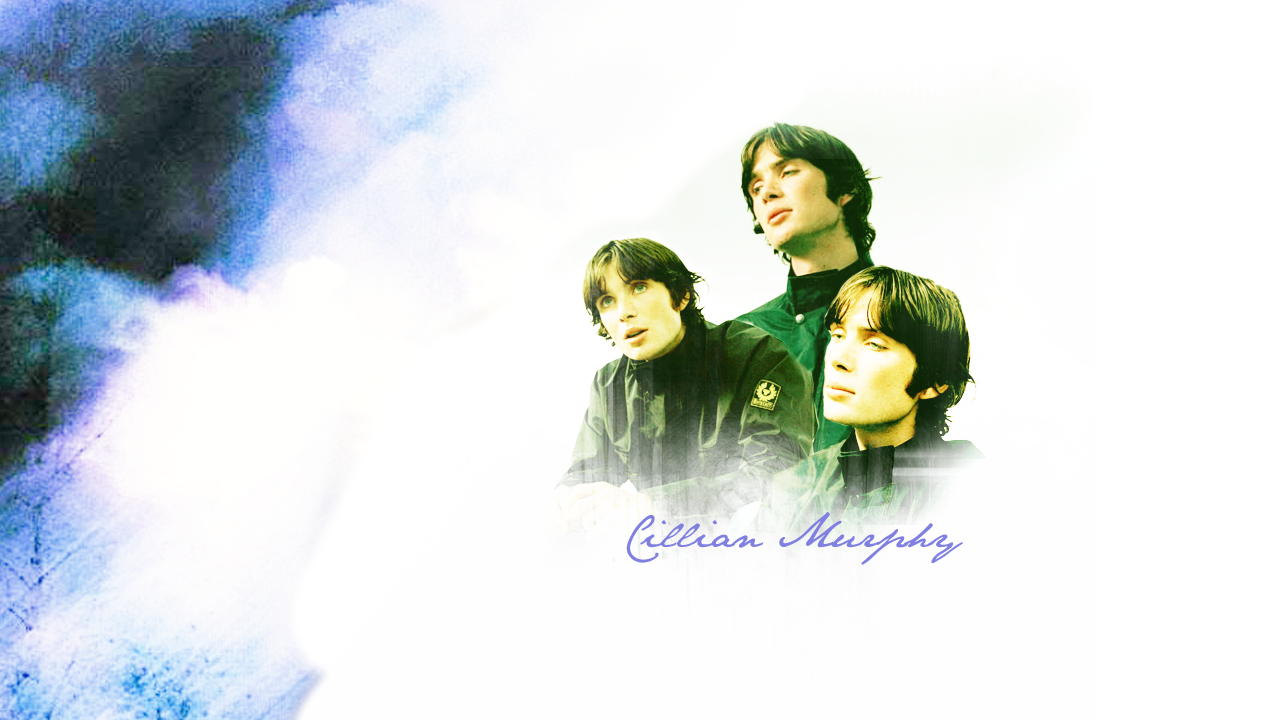
Favorite:
http://i49.photobucket.com/albums/f300/ ... illian.png (I love the placement of the three pictures, it's quite effective)
Well done everyone.
I can't wait to see what everyone does in the coming weeks, after all this practice!


")


")
 And thank you!
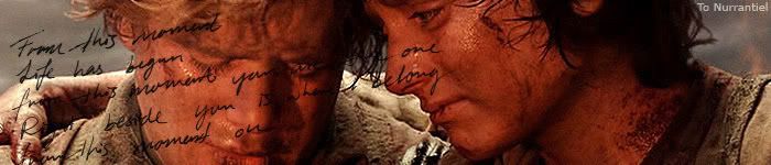


")


")


")

 And I love your last challenge entry, Shadow
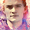
")


")
