Judging: Ariadne394Best use of texture:First: I love the way the texture looks on this one. It’s subtle, but it adds just the right amount of detail. It also matches the flowery theme very nicely. Overall, the perfect balance between texture and image.
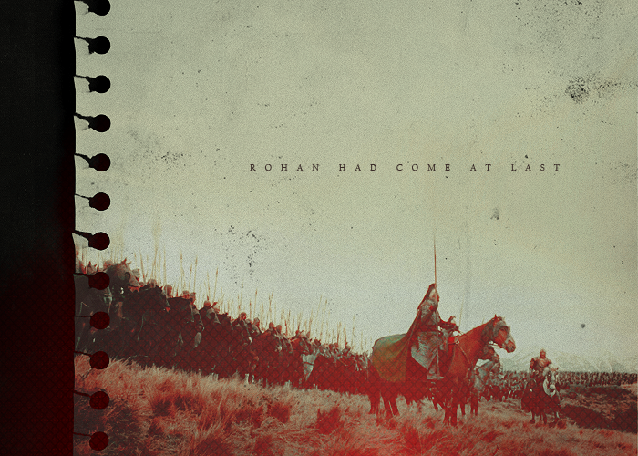
Second: This one has just the right amount of graininess. It gives it this amazing, almost vintage look to it, and it fits the mood of the blend very nicely. And once again, it’s there, but it isn’t overwhelming.
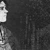
Third: I like that this one is a little different from the rest. I can see that you were experimenting with different kinds of textures, and this one is particularly nice. I also like that you weren’t afraid to erase the spots over Galadriel’s face, where the texture would have been distracting if you had left it.
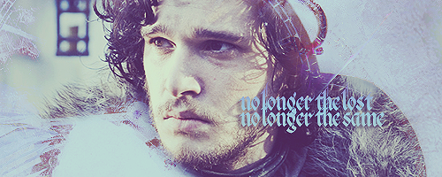
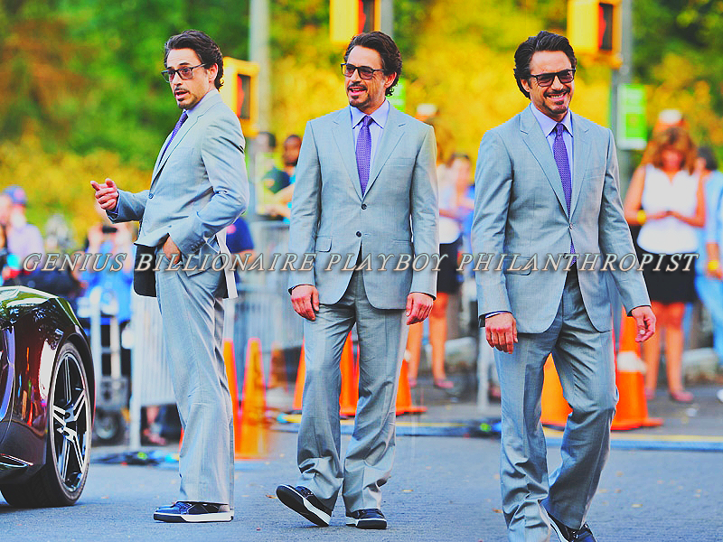
Best use of color:First: I adore this banner. It’s such a gorgeous shade of bright blue, but it isn’t overwhelming, and the contrast is perfect. Very well done.
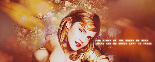
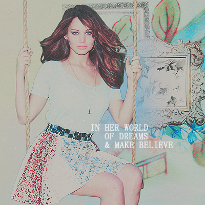
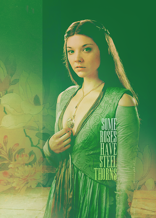
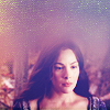
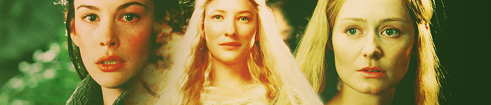
Second: I love the brightness of this one. The pinks and reds really pop, but you didn’t fall into the trap of having her skin look unnatural.
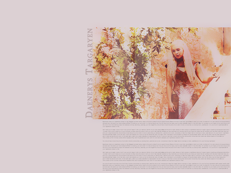
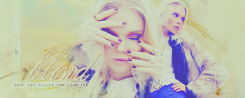
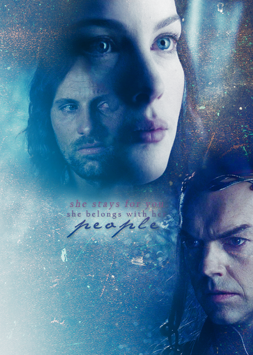
Third: The coloring on this one is subtle, but it’s actually very nice. There’s the right amount of contrast, and there’s a really lovely purple tone throughout the banner that pulls it together in a very nice way.
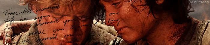
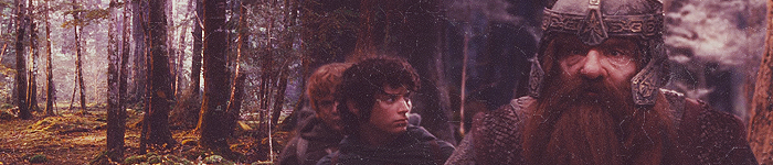
Best composition:First: This blend is put together so nicely. The text is in just the right spot compared with the door and Sam is placed very nicely along the side of the blend. The whole thing just fits together very nicely.
Second: Rule of thirds! The stripes look amazing, especially with the contrasting scenes of Rivendell in the middle and on the edges. Elrond is also placed just off-center enough that balances out very well. I love it.
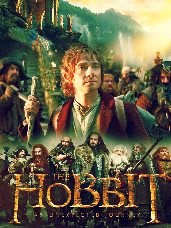
Third: The close up on the right and the smaller full-body shot (bonus points for the silly pose!) contrast very well. And then the text in the middle just pulls it all together. Everything is very well-placed.
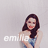
 Most unique graphic:First
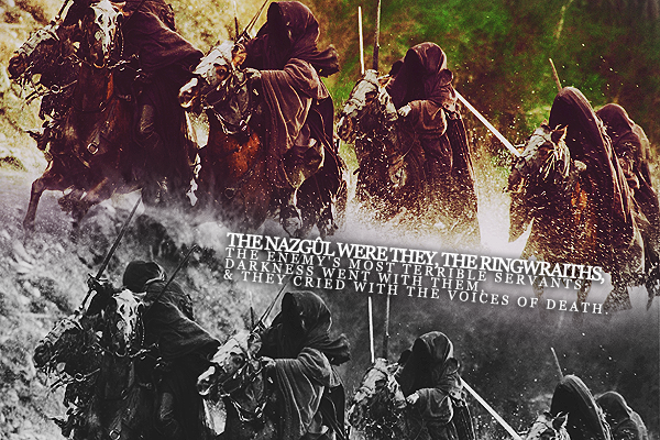
: The combination of effects on this banner is very interesting—the blurriness and the sepia go very well together, and the whole thing has this cool eery look to it. A little bit more sharpening might have benefitted, but I like the general direction this one took.
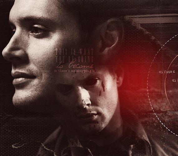
Second: It’s the choice of images in this one that I find unique. I’ve seen the left picture used before, but not the right, and something about the way they’re blended looks very different from the stuff one usually sees.
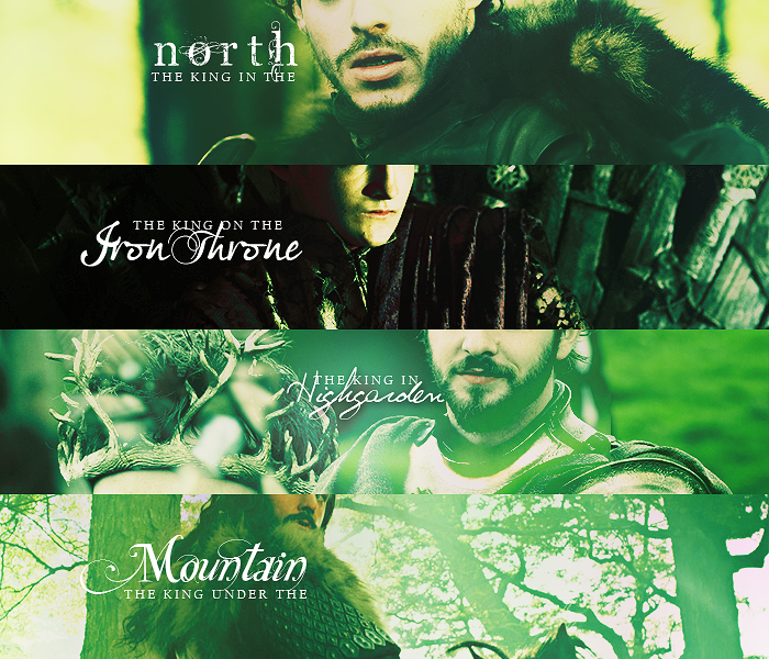
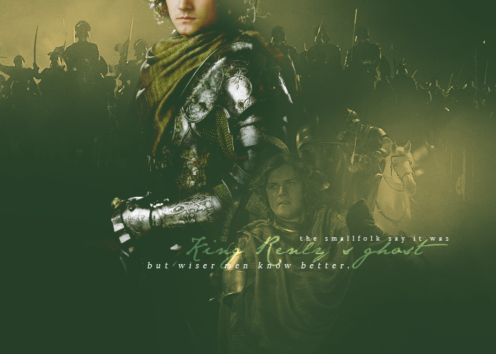
Third: The repeated image somehow manages not to be monotonous, and I like that you chose to have the text going straight up the side—most people shy away from different text angles, but it works very nicely here.
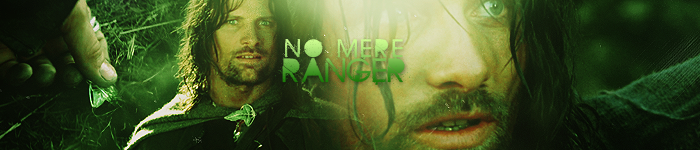
Best overall graphic:First: Everything about this banner worked out excellently, from the blending to the color down to the simple choice of images. I already mentioned how much I love this one, but it really stands out and I’d love to see more like it.
Second: Something about this one just works so nicely. It’s simple, but interesting, and the composition is just so pleasing. I might suggest making the text slightly more readable (via a drop shadow, perhaps) but I think it still works without being able to read all the words. Also, I like that this one isn’t overwhelmed by effects—it’s not blurry or oversharpened, it’s right where it needs to be.
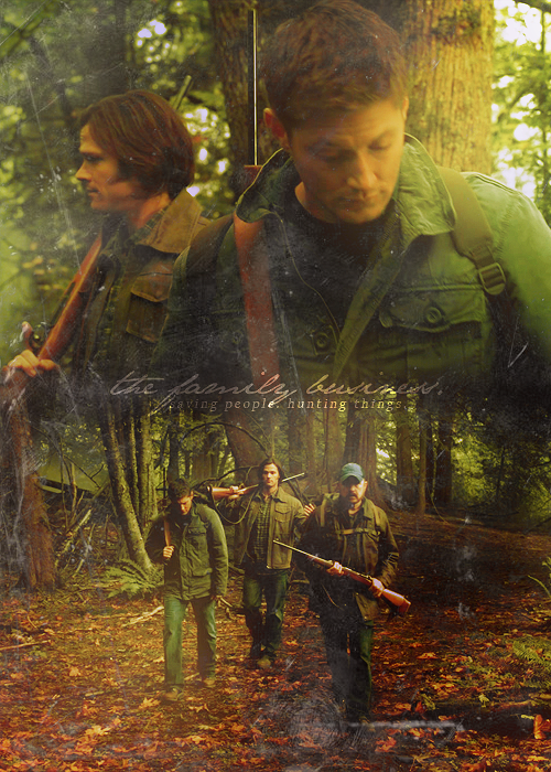
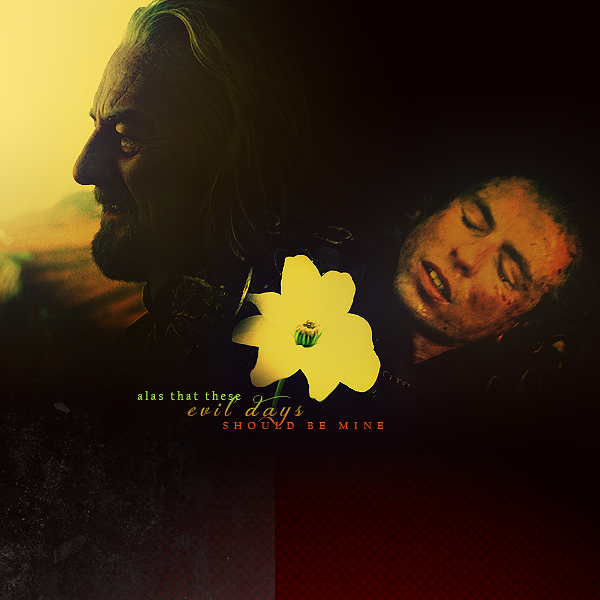
Third: Once again, the simplicity on this one is part of what makes it look so nice. The texture is there, but it’s delicate and adds just the right amount of interest to the blend. The images are well-placed, and I like that it doesn’t need text to highlight the scene’s emotion.
Overall, I’d say that you had the greatest success when you didn’t overdo the effects. Some of the icons are a little grainy and some have too much contrast, but when you let the images stay a little more “natural,” they ended up looking very nice. You’ve got the right idea, so keep experimenting and looking for new ways to color/blend/etc.


")


")


