 
|
Page 1 of 1
|
[ 9 posts ] |
|
| Author |
Message |
|
|
Post subject: Eowyn Wallpaper  Posted: Posted: September 11th, 2005, 12:19 pm |
|
Joined: 04 June 2005
Posts: 4449
Location: Northern USA

|
|
| Top |
|
 |
|
|
Post subject: Posted: September 11th, 2005, 2:29 pm |
|
|
|
|
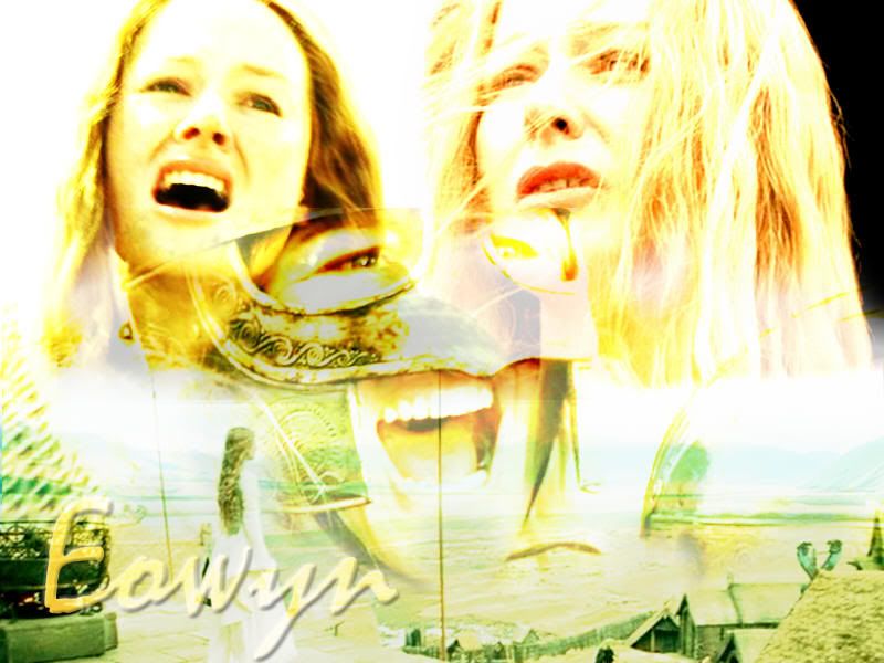
Uhm...quite honestly, it is not terribly good. Oh, it has potential! It's a great start! But the composition and placing of pictures could be better-for instance, her lip looks like it's bleeding, though it's only the dark part of a helmet. I like the colorscheme though. All in all...I've seen better, but it could be a truly incredible piece with a small amount of editing:)
|
|
| Top |
|
|
|
|
Post subject: Posted: September 11th, 2005, 2:56 pm |
|
Joined: 04 June 2005
Posts: 4449
Location: Northern USA
|
thanks for your critiques Blaithin  I have to admit, I was just messing around, and I didn't think it was some great piece of artwork or anything _________________ 
<center> icon & banner by me
skyward-thoughts</center>
|
|
| Top |
|
|
|
|
Post subject: Posted: September 11th, 2005, 7:23 pm |
|
Joined: 03 June 2005
Posts: 5602
Location: Canada
Country: ")
|
|
I like it a lot -- It's very different from any other wallpapers I've seen and I think it's really nice
_________________
Proud Member of the The Evilishy Nazgûl Alliance for World Domination
{Beri}
|
|
| Top |
|
|
|
|
Post subject: Posted: September 12th, 2005, 10:44 pm |
|
Joined: 04 June 2005
Posts: 4449
Location: Northern USA
|
thanks Beriadanwen _________________
<center> icon & banner by me
skyward-thoughts</center>
|
|
| Top |
|
|
|
|
Post subject: Posted: September 16th, 2005, 10:49 pm |
|
Joined: 04 June 2005
Posts: 1505
Location: California
Country: ")
|
Hmm . . . good color scheme as Blaithin pointed out. I do like it, seeing as how it is better than something I could have done.  Perhaps if you darkened it a tiny bit more, it would look a bit better . . . great job otherwise.  _________________ 
|
|
| Top |
|
|
|
|
Post subject: Posted: September 18th, 2005, 6:05 pm |
|
Joined: 04 June 2005
Posts: 4449
Location: Northern USA
|
thanks Elberethsq _________________
<center> icon & banner by me
skyward-thoughts</center>
|
|
| Top |
|
|
|
|
Post subject: Posted: September 26th, 2005, 12:13 am |
|
Joined: 28 June 2005
Posts: 2310
Location: USA
|
|
I love it!!! The only suggestions I would make, is maybe you could kinda erase the part of the helmet that makes the other pic look like her lip is bleeding...and also, on the right, I think it might look better if it is white.
But it's great!!! Good job!!!!
_________________
<center>
<a href="http://raindrops.lemon-drop.net/">Between the Rain Drops</a>
[ + @ # ? : ]
|
|
| Top |
|
|
|
|
Post subject: Posted: September 26th, 2005, 12:19 pm |
|
Joined: 04 June 2005
Posts: 1095
Location: West of the Moon, East of the Sun, and Several Miles from Anywhere
|
Overall I like it... the only thing I'd change, besides what people already said, is the text. I would have picked a different font - Texas Hero, maybe. Sort of like in this wallpaper: http://img221.imageshack.us/img221/6528/rotr0ka.jpg
Just keep practicing, and before you know it, you'll be the best graphic maker on the forum!  _________________ <center>  Gun-toting vikings? That's your theory?
</center>
|
|
| Top |
|
|
|
|
Page 1 of 1
|
[ 9 posts ] |
|
Who is online |
Users browsing this forum: No registered users and 12 guests |
|
You cannot post new topics in this forum
You cannot reply to topics in this forum
You cannot edit your posts in this forum
You cannot delete your posts in this forum
You cannot post attachments in this forum
|
Powered by phpBB © 2000, 2002, 2005, 2007 phpBB Group
Boyz theme by Zarron Media 2003
|
|


 !
!


