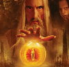
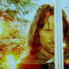
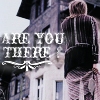
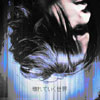
Thanks for the replys...it may look a little too dark because I tried to make it look like the middle image was standing out the closet so i faded the other images a little
That is really good for a first banner! But some of the pictures are freaky lookin' (looks like parts of the hair is missing), but I guess that adds to the neat effect...For the main picture, maybe you could put it over the text instead of the text over the picture. I love the way you did the text though!
Thanks Keyodie....I pasted as transparent selections so thats why the hair has a few spots where the background came through...also thats a really good idea about putting the middle pic over the text...however I don't know how to do that so guess I will have to look into it...lol
Users browsing this forum: No registered users and 12 guests
You cannot post new topics in this forum You cannot reply to topics in this forum You cannot edit your posts in this forum You cannot delete your posts in this forum You cannot post attachments in this forum