| Author |
Message |
|
|
Post subject: Laire's Drawings (warning, large pics)  Posted: Posted: January 14th, 2006, 2:12 am |
|
Joined: 03 June 2005
Posts: 296
Location: CA of the USA *cheers*

|
Well. Well. I'm going to rez this old thread.
I made this thread originally in early 2006 when I thought I was good. Hah. Hah. In the last 2 years I've made some great improvements, and I've posted some of my favorite pieces up here; most LOTR, some OT stuff as well. I'll scan around the boards and make sure I'm not breaking any rules in the process. *whistles*
Anyways, all my art is at http://ainulaire.deviantart.com. In there is also some of my photography, which I also enjoy. May add it up here again when I'm not feeling too lazy.
My training involves a few months in an art class where I learned to use pastel and charcoal, along with two classes at my high school. So not much. Most of it I've learned by myself over the last 4ish years.
Comments are, of course, always appreciated.
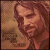
Aragorn, 2007:

Bah, he's so hot.
Aragorn and Arwen, 2007:

Cute together.
Cate Blanchett, 2007:

Beautiful woman.
Elf, 2007:

Random elf. Original FTW.
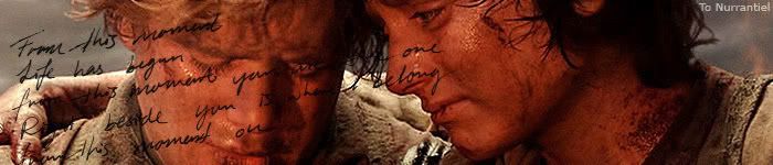
Fellowship, 2005:

Pastel. Love this pic.
Liv Tyler, 2007:

Another ridiculously gorgeous woman.
Sini, the adopted sis, 2006:

Isn't she precious?
... if you want to see more, check out the link above (or below! hehe). kthxbye  _________________ <a href="http://ainulaire.deviantart.com/">My DeviantArt Account</a> (there you can find the full version of the banner below)

Last edited by Ainu Laire on December 28th, 2007, 8:38 am, edited 4 times in total.
|
|
| Top |
|
 |
|
|
Post subject: Posted: January 14th, 2006, 2:25 am |
|
Joined: 28 June 2005
Posts: 2310
Location: USA
|
|
Oh wow, those are amazing!!! I love all of them! As for the picture, you might try capturing the top of the tree rather than the bottom, because that's where all of the twisting branches and stuff are...One thing I do when I take pictures of landscape or something, is have a pot with a bush or a plant in it, and then get the edge of the plant with it so it kinda forms a border. I don't take pictures much anymore, but I was wondering if you ever tried that?
_________________
<center>
<a href="http://raindrops.lemon-drop.net/">Between the Rain Drops</a>
[ + @ # ? : ]
|
|
| Top |
|
|
|
|
Post subject: Posted: January 14th, 2006, 12:43 pm |
|
Joined: 04 June 2005
Posts: 4449
Location: Northern USA
|
Beautiful stuff!  _________________ 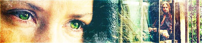
<center> icon & banner by me
skyward-thoughts</center>
|
|
| Top |
|
|
|
|
Post subject: Posted: January 14th, 2006, 5:02 pm |
|
Joined: 04 June 2005
Posts: 5471
|
|
Those are great! What did you use to draw the Fellowship of the Ring, Light in Mordor, and Black Rider?
|
|
| Top |
|
|
|
|
Post subject: Posted: January 14th, 2006, 5:38 pm |
|
Joined: 03 June 2005
Posts: 296
Location: CA of the USA *cheers*
|
keyodie: Thank you very much! I have caught the top of trees before, but for this one it was raining when I took it and bringing my camera up would have meant getting very, very wet and possibly damaging my camera >_< As for forming a border with a plant, no, I have not done that yet. I always love trying new things, so once I go out again I'll try it
Gilraen Ringeril: Thank you very much ^^
Elenya: Thanks! As for medium, I used soft Rembrandt pastels. _________________ <a href="http://ainulaire.deviantart.com/">My DeviantArt Account</a> (there you can find the full version of the banner below)
|
|
| Top |
|
|
|
|
Post subject: Posted: January 14th, 2006, 9:23 pm |
|
Joined: 04 June 2005
Posts: 2150
Location: Behind you with a squirtgun
|
You have a great gift in both drawing and photography. I lack the patience for drawing things, but I enjoy photography. I hope you keep making things,  _________________ <center> Proud Member many Clubs (specially the Nazgul Club) Nazgul #3
 </center>
|
|
| Top |
|
|
|
|
Post subject: Posted: January 15th, 2006, 3:29 pm |
|
Joined: 03 June 2005
Posts: 296
Location: CA of the USA *cheers*
|
|
Thanks, Tanthoronial. I really appreciate it ^^ I plan on doing both for many years.
_________________ <a href="http://ainulaire.deviantart.com/">My DeviantArt Account</a> (there you can find the full version of the banner below)
|
|
| Top |
|
|
|
|
Post subject: Posted: January 15th, 2006, 7:32 pm |
|
Joined: 04 June 2005
Posts: 2150
Location: Behind you with a squirtgun
|
Your welcome, and I'm glad you found something you enjoy _________________ <center> Proud Member many Clubs (specially the Nazgul Club) Nazgul #3
</center>
|
|
| Top |
|
|
|
|
Post subject: Posted: January 16th, 2006, 4:42 am |
|
Joined: 30 October 2005
Posts: 5188
Location: 'Dance like flame cuase theres no gravity, and now I am just a candle trying to stay lit...
Country: ")
Gender: Female
|
I love your work Ainu its simply awesome! Keep up the art youll be famous one day
~Eldar
_________________
New Account: Khaleesi
|
|
| Top |
|
|
|
|
Post subject: Posted: January 17th, 2006, 12:31 pm |
|
|
|
|
Wow, your artwork is so lifelike! I especially like the Fellowship and Nazgul ones. Keep up the good work!
|
|
| Top |
|
|
|
|
Post subject: Posted: January 19th, 2006, 10:27 pm |
|
Joined: 03 June 2005
Posts: 296
Location: CA of the USA *cheers*
|
|
Thank you to both Eldar and shire-rose! The Fellowship and the Nazgul tend to be well-liked. *pets* the Fellowship is probably my best.
_________________ <a href="http://ainulaire.deviantart.com/">My DeviantArt Account</a> (there you can find the full version of the banner below)
|
|
| Top |
|
|
|
|
Post subject: Posted: January 19th, 2006, 11:43 pm |
|
Joined: 24 June 2005
Posts: 261
Location: Right behind you... O_O
|
Your drawings are really good Laire!  I could tell it was Eowyn from the thumbnail! _________________ The past is just the future with the lights on.
:: deviantart :: my drawings ::
|
|
| Top |
|
|
|
|
Post subject: Posted: January 23rd, 2006, 12:13 pm |
|
Joined: 09 July 2005
Posts: 9460
Location: in the temple of love
|
Pheew! Wish I had that talent!
But the Tree in the dark had problems with showing 
_________________
<center>[font=Times New Roman]<img src="http://tinyurl.com/63ongu"><br><br>From sorrow & pain I find my strength ... the more pain I feel, the more I see /// July the 4th 2008, first day of my life...<br><br>I met Eru on September 5th 2006 ♥ (and April 15th 2008!)<br><br>Censorship Causes Blindness</center>[/font]
|
|
| Top |
|
|
|
|
Post subject: Posted: January 23rd, 2006, 11:45 pm |
|
Joined: 03 June 2005
Posts: 296
Location: CA of the USA *cheers*
|
|
Yea, my bandwidth for the month ran out because I did uber detailed reports from ORC and it seems like photobucket couldn't handle the amount of people viewing all of my photos XDD
_________________ <a href="http://ainulaire.deviantart.com/">My DeviantArt Account</a> (there you can find the full version of the banner below)
|
|
| Top |
|
|
|
|
Post subject: Posted: December 28th, 2007, 8:39 am |
|
Joined: 03 June 2005
Posts: 296
Location: CA of the USA *cheers*
|
|
Given a much-needed edit. Updated to display only art rather than photos and with much newer, better stuff. Aragorn is pretty ^^
_________________ <a href="http://ainulaire.deviantart.com/">My DeviantArt Account</a> (there you can find the full version of the banner below)
|
|
| Top |
|
|
|
|
Post subject: Posted: December 28th, 2007, 11:14 am |
|
Joined: 04 February 2006
Posts: 9445
Location: Southeast of the Northern part of West Hyglemr
Country: ")
Gender: Female
|
Wow. Those are all incredible. My favorite is Aragorn though. _________________ going on a journey through my old claims

|
|
| Top |
|
|
Who is online |
Users browsing this forum: No registered users and 10 guests |
|
You cannot post new topics in this forum
You cannot reply to topics in this forum
You cannot edit your posts in this forum
You cannot delete your posts in this forum
You cannot post attachments in this forum
|
Powered by phpBB © 2000, 2002, 2005, 2007 phpBB Group
Boyz theme by Zarron Media 2003
|
|