Joined: 10 July 2005 Posts: 23149 Location: Where there are handsome heroes and sexy villains.. all that need some lovin' ;) Country: Gender: Female
Ok, maybe it's not junk...or it might be I don't know....but it was the only thing I could think of beginning with "J". I think I've been improving recently with my graphic making, or that might just be me. I have been trying different techniques as well as having a go at creating a few blends and colourizations.
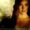
The Lothlorien blend was the first one I ever did and the latest one was the Fellowship. It may have too many pictures in but it's all my favourite scenes and I couldn't resist putting them in. There would be a few more banners but thanks PSP...there aren't...nuff said.
Joined: 13 August 2005 Posts: 2567 Location: Michigan
The Lothlorien blend is just gorgeous. I love the coloring and the blending is pretty good.
lol, I just recognized the background pattern you used for your Snapes and Malfoy banner. I used the same one in my Eragon banner. Well, you actually can't see much of it cause I added a whole bunch of effects and lightning brushes, but I promise it's there
Joined: 13 August 2005 Posts: 2567 Location: Michigan
Yes, it's cracked emerald. Must be one of those that came with PSP.
Johnny's Fan wrote:
I take it they are junk then?
They are definitly not junk. The Gimli banner is really cool. The way you did the texturing was good. You'll have to be patient for comments though. *sighs* I don't get very many comments myself.
Joined: 10 July 2005 Posts: 23149 Location: Where there are handsome heroes and sexy villains.. all that need some lovin' ;) Country: Gender: Female
Yes, cracked emerald was there when I first used it.
Yeah, I know their not junk really..I was just bumping it I suppose. I was really surprised how the Gimli one turned out. I'd never really used the textures before.
Yeah, they are a bit slow round here for comments! LOL Oro get's a lot but she's always adding to them.
Joined: 30 October 2005 Posts: 5188 Location: 'Dance like flame cuase theres no gravity, and now I am just a candle trying to stay lit... Country: Gender: Female
Joined: 10 July 2005 Posts: 23149 Location: Where there are handsome heroes and sexy villains.. all that need some lovin' ;) Country: Gender: Female
Thank you everybody for your comments. Their really appreciated. I think my favourite is my FOTR blend but I really like the colours on the Ian Mckellen one even if it's not blended properly.
Users browsing this forum: No registered users and 10 guests
You cannot post new topics in this forum You cannot reply to topics in this forum You cannot edit your posts in this forum You cannot delete your posts in this forum You cannot post attachments in this forum


")
 I think I've been improving recently with my graphic making, or that might just be me. I have been trying different techniques as well as having a go at creating a few blends and colourizations.


 There would be a few more banners but thanks PSP...there aren't...nuff said.


")