|
Page 1 of 1
|
[ 14 posts ] |
|
| Author |
Message |
|
|
Post subject: Which one?  Posted: Posted: January 17th, 2006, 7:49 pm |
|
Joined: 13 August 2005
Posts: 2567
Location: Michigan

|
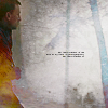
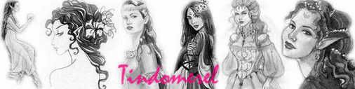
Opinion needed. #1, 2, or 3?
#1:

#2:

#3:
 _________________ <center>


</center>
|
|
| Top |
|
 |
|
|
Post subject: Posted: January 17th, 2006, 7:52 pm |
|
Joined: 06 May 2005
Posts: 15181
Location: Minas Morgul
|
|
Personally, I prefer the third one, there's a balance of the whiteness and golden yellow.
_________________
<center>
THE HALLOWFEST 2010
<a href="http://www.arwen-undomiel.com/forum/viewtopic.php?t=20958">information here</a>
</center>
|
|
| Top |
|
|
|
|
Post subject: Posted: January 17th, 2006, 7:58 pm |
|
Joined: 04 June 2005
Posts: 3863
Location: Behind You
Country: ")
Gender: Female
|
|
I agree w/ Kitioky..also the text's pretty readable in that one.
_________________ 
|
|
| Top |
|
|
|
|
Post subject: Posted: January 17th, 2006, 8:41 pm |
|
Joined: 03 May 2005
Posts: 4717
Location: Middle-earth
Country: ")
Gender: Female
|
|
Yup, I say third one, although I liked the second one too...
_________________ 
|
|
| Top |
|
|
|
|
Post subject: Posted: January 17th, 2006, 9:04 pm |
|
Joined: 04 June 2005
Posts: 4449
Location: Northern USA
|
I agree with Arwen....both the 2nd and 3rd are good  _________________ 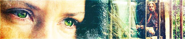
<center> icon & banner by me
skyward-thoughts</center>
|
|
| Top |
|
|
|
|
Post subject: Posted: January 18th, 2006, 12:05 am |
|
Joined: 30 October 2005
Posts: 5188
Location: 'Dance like flame cuase theres no gravity, and now I am just a candle trying to stay lit...
Country: ")
Gender: Female
|
I lovethe 4th one the most. Great job
_________________
New Account: Khaleesi
|
|
| Top |
|
|
|
|
Post subject: Posted: January 18th, 2006, 12:22 am |
|
Joined: 06 May 2005
Posts: 15181
Location: Minas Morgul
|
Eldárwen wrote: I lovethe 4th one the most. Great job [cough]
What fourth one?
_________________
<center>
THE HALLOWFEST 2010
<a href="http://www.arwen-undomiel.com/forum/viewtopic.php?t=20958">information here</a>
</center>
|
|
| Top |
|
|
|
|
Post subject: Posted: January 18th, 2006, 2:13 am |
|
Joined: 30 October 2005
Posts: 5188
Location: 'Dance like flame cuase theres no gravity, and now I am just a candle trying to stay lit...
Country:
Gender: Female
|
|
Ment 3. -_-.
_________________
New Account: Khaleesi
|
|
| Top |
|
|
|
|
Post subject: Posted: January 18th, 2006, 4:35 pm |
|
Joined: 30 December 2005
Posts: 113
|
|
definatly 3, good job
_________________ 

|
|
| Top |
|
|
|
|
Post subject: Posted: January 18th, 2006, 5:51 pm |
|
Joined: 19 December 2005
Posts: 737
Location: Who wants to know? :shifty eyes:
|
_________________ The Ever So Confused One
Sig ll Moi
|
|
| Top |
|
|
|
|
Post subject: Posted: January 19th, 2006, 12:15 am |
|
Joined: 13 August 2005
Posts: 2567
Location: Michigan
|
thnx people. _________________ <center>
</center>
|
|
| Top |
|
|
|
|
Post subject: Posted: January 19th, 2006, 2:25 am |
|
Joined: 29 November 2005
Posts: 149
|
|
I agree...number 3 but 1 has a nice suttle softness effect to it that I like
<cheers>
_________________ 
|
|
| Top |
|
|
|
|
Post subject: Posted: January 22nd, 2006, 10:39 am |
|
Joined: 27 August 2005
Posts: 66
Location: Valimar
|
Rain-maker wrote: definatly 3, good job
I agree, the third one has more contrast than the first two.  _________________ ~*Since the invention of the kiss, there have been five kisses that were rated the most passionate, the most pure... This one left them all behind.*~

|
|
| Top |
|
|
|
|
Post subject: Re: Which one? Posted: September 7th, 2025, 2:53 pm |
|
Joined: 20 January 2025
Posts: 166690

|
|
| Top |
|
|
|
|
Page 1 of 1
|
[ 14 posts ] |
|
Who is online |
Users browsing this forum: No registered users and 17 guests |
|
You cannot post new topics in this forum
You cannot reply to topics in this forum
You cannot edit your posts in this forum
You cannot delete your posts in this forum
You cannot post attachments in this forum
|
Powered by phpBB © 2000, 2002, 2005, 2007 phpBB Group
Boyz theme by Zarron Media 2003
|
|