| Author |
Message |
|
|
Post subject: Graphix by Katie (Lady Silme) *Updated*  Posted: Posted: January 29th, 2006, 4:32 pm |
|
Joined: 21 June 2005
Posts: 1597
Location: D-Town!!! (detroit MI)

|
_________________ 

Missing Charlie already!
Last edited by Eowyn Arelen on February 16th, 2006, 1:15 pm, edited 2 times in total.
|
|
| Top |
|
 |
|
|
Post subject: Posted: January 29th, 2006, 5:12 pm |
|
Joined: 03 May 2005
Posts: 4717
Location: Middle-earth
Country: ")
Gender: Female
|
Those are really pretty! My only suggestion would be that on the Land of Shadow one, you make the Eye of Sauron more the color and contrast of Mount Doom - I think it would blend better that way  Great job! _________________ 
|
|
| Top |
|
|
|
|
Post subject: Posted: January 29th, 2006, 5:20 pm |
|
Joined: 07 June 2005
Posts: 2370
Location: England, normally in my room
|
What a lovely soft, glowy effect on the top two--well done!  _________________ <center>
  
|
|
| Top |
|
|
|
|
Post subject: Posted: January 29th, 2006, 5:58 pm |
|
Joined: 21 June 2005
Posts: 1597
Location: D-Town!!! (detroit MI)
|
|
Thanx.
Arwen: The LOS one is pretty old. I was just looking through files and found it and relized I had never done anything with it.
_________________
Missing Charlie already!
|
|
| Top |
|
|
|
|
Post subject: Posted: January 30th, 2006, 2:03 pm |
|
Joined: 20 January 2006
Posts: 1429
Location: Hertfordshire, England
|
|
Woah! Those are REALLY gorgeous.
The colours are beautiful. -smiles-
I love the pale colours, they're so pretty.
_________________
"Anyone who lives within their means suffers from a lack of imagination" - Oscar Wilde
|
|
| Top |
|
|
|
|
Post subject: Posted: January 30th, 2006, 2:07 pm |
|
Joined: 29 August 2005
Posts: 66
Location: USA, Pryor, OK
|
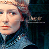
Oooooooooo  I really like the Eowyn ones! Very good blending. I am obsessed with all things Eowyn so I really like these. The other are also very good. I like the Gandalf/Frodo one best. And the one in your sig is cool 8) _________________ 

Lutheran Ringer For Christ!
|
|
| Top |
|
|
|
|
Post subject: Posted: January 30th, 2006, 2:59 pm |
|
Joined: 30 January 2006
Posts: 3071
Location: Sweden
Country: ")
Gender: Female
|
Omg, the ones with Eowyn is amazing! I <3 them!
You should be proud babydoll
Btw, what font have you used?
// Layla _________________ 
Tumblr ~ LotR Tumblr
|
|
| Top |
|
|
|
|
Post subject: Posted: January 30th, 2006, 3:04 pm |
|
Joined: 20 January 2006
Posts: 1429
Location: Hertfordshire, England
|
|
I was wondering that as well.
I think the second Eowyn one is my favourite, by the way.
_________________
"Anyone who lives within their means suffers from a lack of imagination" - Oscar Wilde
|
|
| Top |
|
|
|
|
Post subject: Posted: January 30th, 2006, 3:06 pm |
|
Joined: 30 January 2006
Posts: 3071
Location: Sweden
Country:
Gender: Female
|
|
| Top |
|
|
|
|
Post subject: Posted: January 30th, 2006, 3:15 pm |
|
Joined: 20 January 2006
Posts: 1429
Location: Hertfordshire, England
|
|
Same here!
_________________
"Anyone who lives within their means suffers from a lack of imagination" - Oscar Wilde
|
|
| Top |
|
|
|
|
Post subject: Posted: January 30th, 2006, 5:27 pm |
|
Joined: 21 June 2005
Posts: 1597
Location: D-Town!!! (detroit MI)
|
|
The font is AdineKirnberg-Script
_________________
Missing Charlie already!
|
|
| Top |
|
|
|
|
Post subject: Posted: January 30th, 2006, 5:29 pm |
|
Joined: 30 January 2006
Posts: 3071
Location: Sweden
Country:
Gender: Female
|
|
| Top |
|
|
|
|
Post subject: Posted: January 30th, 2006, 5:54 pm |
|
Joined: 21 June 2005
Posts: 1597
Location: D-Town!!! (detroit MI)
|
Welcome
 _________________
Missing Charlie already!
|
|
| Top |
|
|
|
|
Post subject: Posted: January 30th, 2006, 6:27 pm |
|
Joined: 20 January 2006
Posts: 1429
Location: Hertfordshire, England
|
|
Ooo, thank you! ^_^;
It's absolutely beautiful, you know.
_________________
"Anyone who lives within their means suffers from a lack of imagination" - Oscar Wilde
|
|
| Top |
|
|
|
|
Post subject: Posted: January 30th, 2006, 10:09 pm |
|
Joined: 21 June 2005
Posts: 1597
Location: D-Town!!! (detroit MI)
|
|
Thanx
_________________
Missing Charlie already!
|
|
| Top |
|
|
|
|
Post subject: Posted: February 1st, 2006, 1:04 am |
|
Joined: 02 September 2005
Posts: 2093
|
_________________  <br><br><a href="http://immortalkiss.sarrand.net/"><img src="http://immortalkiss.sarrand.net/ik_lb6.jpg" border="0"></a>
|
|
| Top |
|
|
Who is online |
Users browsing this forum: No registered users and 7 guests |
|
You cannot post new topics in this forum
You cannot reply to topics in this forum
You cannot edit your posts in this forum
You cannot delete your posts in this forum
You cannot post attachments in this forum
|
Powered by phpBB © 2000, 2002, 2005, 2007 phpBB Group
Boyz theme by Zarron Media 2003
|
|


