I think they're very good for a first timer; much better than MY first attempt!
Just a couple of constructive comments:
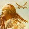
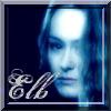
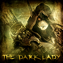
1. The writing looks out of place on all of the banners that you've done writing on... if I were you I'd choose a colour more closer to the blend (eg. for the Braveheart one I'd use a reddish-brown colour), and I'd also use a nice effect on the text too, but I understand that these are your first tries

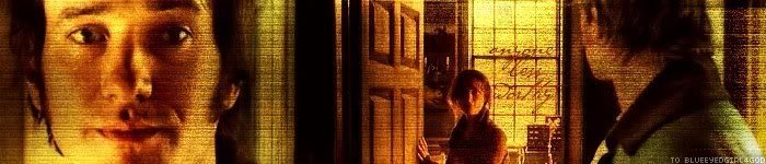
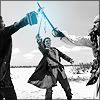
2. Nothing to do with the blend as such, but perhaps choose better quality pictures? Some of them look a little blocky (probably through no fault of your own) - a place for good LotR pictures is the main A-U site - at the navigation, just click 'Gallery'. Believe me, you'll have a job finding higher quality pics than the collection she has. I don't know where you'd find other high-quality pictures, but I'd take time looking around if I was you
I hope I don't sound really rude - but they are very very good for first attempts! I can see that you'll be very good in a short amount of time!


")


")