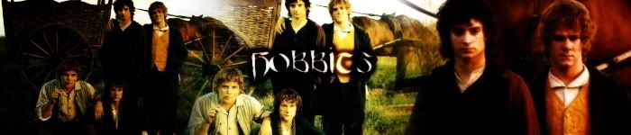
Click the link and tell me what you think. It's the one on the far right of the top row-of course. I'm pretty proud of it as it uses my personal star brushes and my personal texture.
Joined: 06 May 2005 Posts: 15181 Location: Minas Morgul
Hmm.......Well, I like the brushes and how it's placed --- but I think the contrast on the right hand picture is a bit too much and the fact that the blue very suddenly turns to a red theme is a bit too 'shouting'.
_________________ <center>
THE HALLOWFEST 2010 <a href="http://www.arwen-undomiel.com/forum/viewtopic.php?t=20958">information here</a>
Joined: 20 January 2006 Posts: 1429 Location: Hertfordshire, England
Interesting, interesting.
I really like the blue half, the way it phases into the second image. I'm not sure about the right-hand image...it's very bright compared to how soft the left is..
_________________ "Anyone who lives within their means suffers from a lack of imagination" - Oscar Wilde
Joined: 20 January 2006 Posts: 1429 Location: Hertfordshire, England
-smiles-
You could just put a contrast filter and dull it down a little?
The whole thing in blue might look nice, if you kept it all one colour with different shades?
_________________ "Anyone who lives within their means suffers from a lack of imagination" - Oscar Wilde
Users browsing this forum: No registered users and 9 guests
You cannot post new topics in this forum You cannot reply to topics in this forum You cannot edit your posts in this forum You cannot delete your posts in this forum You cannot post attachments in this forum


 It's the one on the far right of the top row-of course. I'm pretty proud of it as it uses my personal star brushes and my personal texture.


 I appreciate that, much.

