|
Page 1 of 1
|
[ 14 posts ] |
|
| Author |
Message |
|
|
Post subject: My last banners  Posted: Posted: June 13th, 2005, 9:33 am |
|
Joined: 04 June 2005
Posts: 254
Location: Basque Country

|
_________________ 
<If>
Last edited by Amon_shi on June 13th, 2005, 1:56 pm, edited 1 time in total.
|
|
| Top |
|
 |
|
|
Post subject: Posted: June 13th, 2005, 10:37 am |
|
Joined: 05 June 2005
Posts: 4930
Location: Puerto Rico
|
Awesome work DHE!!!
I love the Arwen one and the Harry Potter one 
|
|
| Top |
|
|
|
|
Post subject: Posted: June 13th, 2005, 1:23 pm |
|
Joined: 04 June 2005
Posts: 1062
Location: Go ahead and guess.. Here's a clue: I'm somewhere on earth
|
|
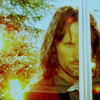
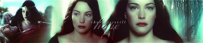
Geat work! I especially like the Arwen one! But I've got just one question.. The flower brush you used on your Arwen banner (the one on the left).. where did you get it from?
_________________ <center> 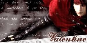 Status:
 Suffering from a slow internet connection. =P</center>
|
|
| Top |
|
|
|
|
Post subject: Posted: June 13th, 2005, 1:58 pm |
|
Joined: 04 June 2005
Posts: 254
Location: Basque Country
|
Here!!
http://www.annikavonholdt.com/&/
I thin it is called the flowers of evil, in the vintage gallery!!
(BTW, thanks to TM for this link  ) _________________
<If>
|
|
| Top |
|
|
|
|
Post subject: Posted: June 13th, 2005, 2:54 pm |
|
Joined: 03 May 2005
Posts: 4717
Location: Middle-earth
Country: ")
Gender: Female
|
Cool! I like the blending style and colors you're using  I have a few suggestions though...
- Try not to put text on characters' faces...it ends up taking away from the banner.
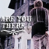
- Try not to skew pictures. I love the HP banner, but Harry's face looks like it might have been resized height-wise to skew it a little.
- Although Scriptina's a cool font, I might use a wider variety, just because it's a little overused among the banner-making community.
Great job! _________________ 
|
|
| Top |
|
|
|
|
Post subject: Posted: June 13th, 2005, 3:15 pm |
|
Joined: 07 June 2005
Posts: 2370
Location: England, normally in my room
|
Love the blending effect on the banners very nice! _________________ <center>
|
|
| Top |
|
|
|
|
Post subject: Posted: June 13th, 2005, 3:15 pm |
|
Joined: 04 June 2005
Posts: 254
Location: Basque Country
|
Thank you for your suggestions!! aye, it is true.. Scriptina is a famous font hehehe... and the Harry potter banner one... yah, I know what are you saying... porr Harry lol  _________________
<If>
|
|
| Top |
|
|
|
|
Post subject: Posted: June 13th, 2005, 3:19 pm |
|
Joined: 03 June 2005
Posts: 4079
Location: In my dreams
Country: ")
Gender: Female
|
|
Great job DHE! I especially like the Arwen and Aragorn one and the Lament for Gandalf one.
_________________ 
|
|
| Top |
|
|
|
|
Post subject: Posted: June 13th, 2005, 5:12 pm |
|
Joined: 04 June 2005
Posts: 659
|
|
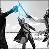
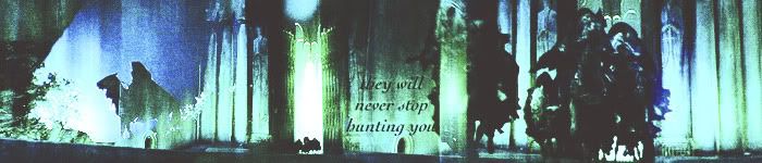
wow those look really nice! I love the lament for Gandalf one!
_________________ 
|
|
| Top |
|
|
|
|
Post subject: Posted: June 13th, 2005, 5:19 pm |
|
|
|
Awsome my Elf friend!
|
|
| Top |
|
|
|
|
Post subject: Posted: June 18th, 2005, 10:03 am |
|
Joined: 04 June 2005
Posts: 1062
Location: Go ahead and guess.. Here's a clue: I'm somewhere on earth
|
DHE wrote: Here!! http://www.annikavonholdt.com/&/I thin it is called the flowers of evil, in the vintage gallery!! (BTW, thanks to TM for this link ) Thanx a lot, DHE! I found it! _________________ <center>
Status: Suffering from a slow internet connection. =P</center>
|
|
| Top |
|
|
|
|
Post subject: Posted: June 18th, 2005, 1:30 pm |
|
|
Eä |
| Moderator |
 |
 |
Joined: 04 June 2005
Posts: 12592
Gender: Female
|
Very nice Aragorn and Arwen banner, I like that the colors are so summer'ish, that's different but pretty, though I'm with Arwen on not put text on the characters face!
Really good blending on the lament for Gandalf and Harry Potter!
And then I was so happy to see another banner with Arwen at Bruinen. It's one of my favorite scenes (visually) and I haven't seen many banners on it  _________________ >>Be the change you wish to see in the world<<
Banner credit: Shadowcat & Nurrantiel Mashiara
|
|
| Top |
|
|
|
|
Post subject: Posted: June 21st, 2005, 5:49 pm |
|
Joined: 04 June 2005
Posts: 1505
Location: California
Country:
|
The first one is very stunning indeed - excellent choice of colors. So bright. But in the Harry Potter banner, Harry looks a bit . . stretched. Something happened to his face. _________________ 
|
|
| Top |
|
|
|
|
Post subject: Posted: June 24th, 2005, 9:18 pm |
|
Joined: 04 June 2005
Posts: 13518
Location: Skógum Svíþjóðar
Country: ")
Gender: Female
|
|
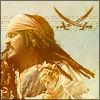
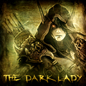
Ahh i LOVE the vampires one!! IWTV is one of my favorite movies of all time!! I went to the cemetary and plantation in New Orleans where they filmed it.
Anyways, all of your banners are really really cool-looking!!
_________________ 
.*+I'VE MET ANTIGONE, MONTANABOHEMIAN, RAIVYNN PHOENIX, BERIADANWEN & PIRATEOFTHERINGS+*.
(¯`•¸·´¯`·._.·[TRUE VAMPIRES DON'T SPARKLE]·._.·´¯`·¸•´¯)
|
|
| Top |
|
|
|
|
Page 1 of 1
|
[ 14 posts ] |
|
Who is online |
Users browsing this forum: No registered users and 20 guests |
|
You cannot post new topics in this forum
You cannot reply to topics in this forum
You cannot edit your posts in this forum
You cannot delete your posts in this forum
You cannot post attachments in this forum
|
Powered by phpBB © 2000, 2002, 2005, 2007 phpBB Group
Boyz theme by Zarron Media 2003
|
|