Arwen-Undomiel.com
http://www.arwen-undomiel.com/forum/

Banner Tutorial by teh Skitteh
http://www.arwen-undomiel.com/forum/viewtopic.php?f=37&t=20698
Page 1 of 1

Author:  Shadowcat [ January 24th, 2010, 11:48 pm ]
Post subject:  Banner Tutorial by teh Skitteh

Well, I made a cool banner, Ara wanted tutorials, I saved the .psd... so here you go, fellows. :P


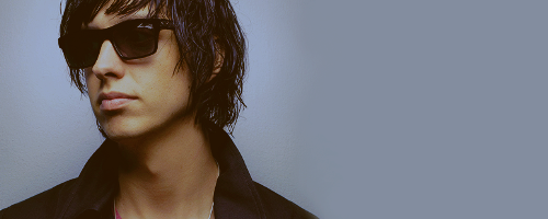
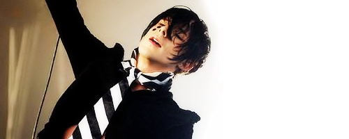
1. I started out with a picture of Chris Corner… dancing? singing? crying? Anyway, I used this picture. I placed it on my canvas (500x200) and adjusted it (sharpened, added contrast, etc.) until it looked decent.

Image

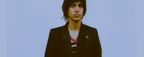
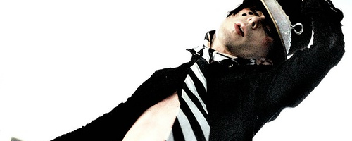
2. Next I added yet another picture of Chris, set to Normal 100%. (Yes, this covered up the first picture, but we’ll need that one later.) I left it the way it was, because it already was plenty sharp and contrasted, albeit pixelly. It worked in this particular case though.

Image

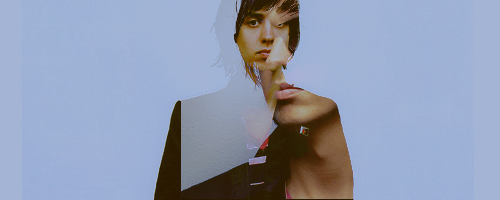
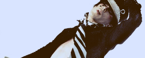
3. Next I added a brown exclusion layer, set to 73% for a bit of color.

Image

4. I mucked around with the colors some more and made a Curves Layer with the following settings:
Red:
1st point, 28 > 39
2nd point, 68 > 75
Blue:
1st point, 38 > 64
2nd point, 135 > 134

Image

5. I went back to the base picture and duplicated it, and brought it to the top. I set it to Soft Light 100%.

Image

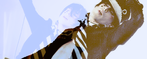
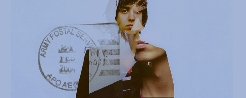
6. Then I added text (lyrics from IAMX’s Spit It Out) underneath the Soft Light layer, and a 1px border.

Image


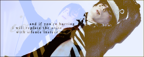
And that, my friends, was it. Not terribly complicated, but with the right pictures it made a nice effect. :) I'd love to see what you come up with, if it works for other images as well. :P

Author:  Will [ January 25th, 2010, 4:18 am ]
Post subject: 

Great tuutorial Shadow :) I'll be sure to try it! Please put on some more tutorials. I'd love to learn more of your PS tricks :)

Author:  SilverRose [ January 25th, 2010, 11:29 am ]
Post subject: 

Me liketh! I can't use the color curves (poor Elements doesn't have it), but I'm definitely going to try out the exclusion color layers when I get home. :)

Author:  Shadowcat [ January 25th, 2010, 11:59 am ]
Post subject: 

@Will - Definitely will be making more, no worries. :P


@Silvereh - Actually a dark red Lighten layer would probably have the same effect as the Curves layer, now that I look at it. :lol:

Author:  SilverRose [ January 26th, 2010, 5:37 pm ]
Post subject: 

Just to let you know, I adore the nickname "Silvereh". ;)

I haz made something! I didn't really follow your tutorial, but I took your tips on exclusion, lighten, and the darker color tones to make this. I can happily say that I didn't use any textures (my normal resource for color)! I played around with the color a LOT. Thank you so much! :hug:

Image

Author:  Shadowcat [ January 31st, 2010, 6:39 pm ]
Post subject: 

I keep forgetting to tell you how pretty that banner is. :teehee: I love it, it looks great. :D

Author:  Shadowcat [ June 13th, 2010, 4:47 pm ]
Post subject: 

*blows away the dust* I return. With a curiously similar banner. *cringe* Anyway. This one got quite strange.


1. I started with a picture of Julian Casablancas looking cool, because I basically had no idea what I was doing when I started out (yes, this happens a lot, I admit. It’s not such a bad thing, really). I duplicated that layer twice, setting the first to Screen 37% and the second to Soft Light 37% (this will vary depending on your image).

Image

2. The coloring’s not the main focus of this tutorial, so I’ll briefly go over it. I added a brown Exclusion layer (100%) and a purple Luminance (L) layer at 26%, then upped the contrast with a Curves layer. It looked like this:

Image

3. This was where things got tricky and bizarre. I found another picture of Julian and stuck it beneath the Exclusion layer (to make things easier we‘ll call that Jules 2 for now). I went to Edit > Copy Merged and pasted it at the top as a new layer.

Image


I set it to invisible, then went back and set Jules 2 to invisible as well, which put us back with the original image and coloring.

Edit > Copy Merged for this as well, and paste that as a new layer at the very top, set to Lighten 100%.
This layer and the one beneath it should now both be visible (uncheck the ‘invisible’ box).

Then I moved the Lighten layer until it was in a spot that looked interesting.

Image

4. I was originally going to add lyrics from a song by The Strokes, but nothing looked right, so I stuck a brush overtop instead.

Image

And there you go. :)


Sorry for this being unnecessarily complicated. I wish you the best of luck in deciphering it, though it should give you some idea of how I created my banner. :P

Author:  Nurrantiel Mashiara [ June 14th, 2010, 10:20 pm ]
Post subject: 

You're wonderful. :D


I didn't quite get the "Copy Merge" bit, but I managed to get it to work out anyway, so yay!

Page 1 of 1 All times are UTC - 5 hours [ DST ]
Powered by phpBB © 2000, 2002, 2005, 2007 phpBB Group
http://www.phpbb.com/