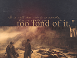
Duplicating this:

Made in GIMP, easily translatable.
First I found a screencap that I wanted to use. I used this scene from ROTK because of the quote I would eventually use. I did not resize the screencap.
Make a new image with a black background layer; make it was wide as your screencap and about a third more than the height of your screencap. You can make it more, it you want. Mine ended up being 1024x768. Copy and paste the screencap onto your new image and position it to the very bottom.
Add a fill layer of fff0c8 and set to multiply.
Add a fill layer of 000d2f and set to Screen, then duplicate it twice and change the top layer to Subtract. (In other programs all you need is one fill layer set to Exclusion).
Add a fill layer of ffc6ce and set to Overlay.
Add a fill layer of bedfdf and set to Burn.
Add a fill layer of 909090 and set to Lighten Only at 20%.
Add a fill layer of 000000 (black) and set it to Overlay at 60%.
Add a Transparency layer. Then I added this texture, inverted it, and anchored it. Then I set it to Screen at 30%. (You can make it more if you want).
Flatten your image. Then duplicate your base layer.
I took a bright red color, went to paintbrush tool, and set opacity to 10% and a very large fuzzy brush. I added a red splotch kinda in the middle and on the screencap and black side.
Add a text layer. I used a color that was about like f3c08a. I do not know what font it is I used for the first half of the quote, but a close one is Miss. For the rest of the quote I used Time New Roman.
Add another text layer for the elvish that is reversed. (This can be english, too, and not as faded if you wish). The text color is black, set at Overlay. In photoshop you can simply just flip it, but in GIMP it's a little bit more tricky. You have to actually rotate the text around and position it just right to get it where you want it.
And there you go! The coloring is not quite the same but very close.

 here's what I did, you sure you got the right colours?

 Love the font you used!