| Author |
Message |
|
|
Post subject: Re: A-U Revival: layout & coding  Posted: Posted: March 21st, 2011, 4:44 pm |
|
Joined: 30 December 2006
Posts: 3507
Location: Over the Edge of the Wild
Country: ")
Gender: Female

|
^It looks absolutely stunning, but it's maybe just a little bit long? I think it'd look even better if it were a wee bit shorter  _________________
by Lembas
|
|
| Top |
|
 |
|
|
Post subject: Re: A-U Revival: layout & coding Posted: March 21st, 2011, 5:18 pm |
|
Joined: 10 July 2005
Posts: 23149
Location: Where there are handsome heroes and sexy villains.. all that need some lovin' ;)
Country: ")
Gender: Female
|
|
| Top |
|
|
|
|
Post subject: Re: A-U Revival: layout & coding Posted: March 21st, 2011, 7:06 pm |
|
Joined: 03 May 2005
Posts: 4717
Location: Middle-earth
Country: ")
Gender: Female
|
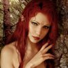
Thanks for the input, guys! I totally didn't take my own advice and start working with a large version the first time around...which showed  So this time I worked a lot bigger and then downsized my results. So, here's what I've got:  I think it looks much much better, but let me know if you can see any flaws I should fix _________________ 
|
|
| Top |
|
|
|
|
Post subject: Re: A-U Revival: layout & coding Posted: March 21st, 2011, 7:09 pm |
|
Joined: 30 December 2006
Posts: 3507
Location: Over the Edge of the Wild
Country:
Gender: Female
|
That looks SO much better  I'm debating myself over whether I think it looks like it's hanging a bit too far to the left, but I think it might just be the angle of her body and the shadow on her neck... _________________
by Lembas
|
|
| Top |
|
|
|
|
Post subject: Re: A-U Revival: layout & coding Posted: March 21st, 2011, 7:12 pm |
|
Joined: 04 June 2005
Posts: 13518
Location: Skógum Svíþjóðar
Country: ")
Gender: Female
|
|
I think it looks perfect, Arweb! If you don't know it's been manipulated I don't think you'd be able to tell at all.
I know the light hits her on the right (her left), but maybe, just maybe add the tiniest bit of subtle shadow on the right side of the pendant? Because if this would be a real pendant, it would 'pop' out from the skin more and not lie so flat. Not sure how this would work though.
_________________ 
.*+I'VE MET ANTIGONE, MONTANABOHEMIAN, RAIVYNN PHOENIX, BERIADANWEN & PIRATEOFTHERINGS+*.
(¯`•¸·´¯`·._.·[TRUE VAMPIRES DON'T SPARKLE]·._.·´¯`·¸•´¯)
|
|
| Top |
|
|
|
|
Post subject: Re: A-U Revival: layout & coding Posted: March 21st, 2011, 8:06 pm |
|
Joined: 03 May 2005
Posts: 4717
Location: Middle-earth
Country:
Gender: Female
|
Ana - I'm not sure about the placement, either. If I just look at her head and neck, it looks right, but if I look, uh, further down (awwwwwkward), I feel like it's off-center. I guess I can try moving it over to see if it looks more natural. Eru - I'll try a hint of a shadow and see how it looks It's tough to get the angle of the main lighting to look natural while remembering that there's never just one source of light and one shadow. It'll be interesting JF, how are the hobbitses coming along? _________________
|
|
| Top |
|
|
|
|
Post subject: Re: A-U Revival: layout & coding Posted: March 21st, 2011, 8:26 pm |
|
Joined: 10 July 2005
Posts: 23149
Location: Where there are handsome heroes and sexy villains.. all that need some lovin' ;)
Country:
Gender: Female
|
|
| Top |
|
|
|
|
Post subject: Re: A-U Revival: layout & coding Posted: March 21st, 2011, 11:59 pm |
|
Joined: 28 April 2006
Posts: 1519
Location: Oriendel, in the Woods of Amon Hen
Country: ")
Gender: Male
|
|
You all have such a talent with photoshop/photo manipulation. You are doing some amazing work and I can't wait to see what it looks like in the end.
_________________ Annoying-Amount-of-Smileys Nazgul
Co-Force of Evil Posting

|
|
| Top |
|
|
|
|
Post subject: Re: A-U Revival: layout & coding Posted: March 23rd, 2011, 2:49 pm |
|
Joined: 03 May 2005
Posts: 4717
Location: Middle-earth
Country:
Gender: Female
|
 Okay, with thought to the comments, I moved the Evenstar over just a tiny bit to the right of the screen (Arwen's left, of course) and gave it just a hint more shadowing so (hopefully) it doesn't have quite as much of a floating in space effect. Let me know if this looks better or if you think I should change something else. Otherwise, back to you, JF! _________________
|
|
| Top |
|
|
|
|
Post subject: Re: A-U Revival: layout & coding Posted: March 23rd, 2011, 3:42 pm |
|
Joined: 10 July 2005
Posts: 23149
Location: Where there are handsome heroes and sexy villains.. all that need some lovin' ;)
Country:
Gender: Female
|
|
| Top |
|
|
|
|
Post subject: Re: A-U Revival: layout & coding Posted: March 23rd, 2011, 4:08 pm |
|
Joined: 04 June 2005
Posts: 13518
Location: Skógum Svíþjóðar
Country:
Gender: Female
|
@Arweb - It's absolutely perfect! It looks like it's actually there. Yer so talented.  @JF - Maybe, once your list of all errors you've found is complete, somebody with Firefox (and perhaps Safari and Google Chrome as well) could double check to see whether those errors are universal or only IE errors. But obviously, even if the errors only show up on IE, they should still be fixed since there are still people out there (silly people!) who use IE. As for the header being different sizes, that's really strange. Perhaps Arweb can shed some light on this. _________________
.*+I'VE MET ANTIGONE, MONTANABOHEMIAN, RAIVYNN PHOENIX, BERIADANWEN & PIRATEOFTHERINGS+*.
(¯`•¸·´¯`·._.·[TRUE VAMPIRES DON'T SPARKLE]·._.·´¯`·¸•´¯)
|
|
| Top |
|
|
|
|
Post subject: Re: A-U Revival: layout & coding Posted: March 23rd, 2011, 4:21 pm |
|
Joined: 03 May 2005
Posts: 4717
Location: Middle-earth
Country:
Gender: Female
|
Huzzah! Okay, I bow out of the layout stuff for now then Uhh, galleries. As whoever has the pleasant task of recoding A-U will see, I used to be a really messy coder To be fair, the codes I used were fairly acceptable back when I was building stuff, but they're really not anymore. I was using a lot of tags like <font size="+3"> or delineating font sizes by points rather pixels. As long as the coders change these messy bits to more standard units, the fonts should display the same on any browser. I don't know about the image loading, though. That's out of my technical depth _________________
|
|
| Top |
|
|
|
|
Post subject: Re: A-U Revival: layout & coding Posted: March 23rd, 2011, 7:22 pm |
|
Joined: 30 December 2006
Posts: 3507
Location: Over the Edge of the Wild
Country:
Gender: Female
|
Wonderful, Arwen, it looks great _________________
by Lembas
|
|
| Top |
|
|
|
|
Post subject: Re: A-U Revival: layout & coding Posted: March 23rd, 2011, 7:53 pm |
|
Joined: 10 July 2005
Posts: 23149
Location: Where there are handsome heroes and sexy villains.. all that need some lovin' ;)
Country:
Gender: Female
|
|
| Top |
|
|
|
|
Post subject: Re: A-U Revival: layout & coding Posted: March 23rd, 2011, 8:50 pm |
|
Joined: 04 June 2005
Posts: 13518
Location: Skógum Svíþjóðar
Country:
Gender: Female
|
|
As I FF user, I haven't even noticed that the text was small on the header. I would have been none the wiser, had you not pointed it out. It doesn't look strange if you don't know it's supposed to look different.
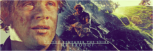
I definitely prefer the second picture, but with just a tad bit less glow (like you already said). In the first picture, both of the hobbits look a little like somebody hit Crtl+v (though Sam more so than Frodo).
_________________
.*+I'VE MET ANTIGONE, MONTANABOHEMIAN, RAIVYNN PHOENIX, BERIADANWEN & PIRATEOFTHERINGS+*.
(¯`•¸·´¯`·._.·[TRUE VAMPIRES DON'T SPARKLE]·._.·´¯`·¸•´¯)
|
|
| Top |
|
|
|
|
Post subject: Re: A-U Revival: layout & coding Posted: March 23rd, 2011, 9:06 pm |
|
Joined: 27 February 2006
Posts: 11433
Location: My Imagination
Country:
Gender: Female
|
|
...I'm sorry for kind of dwindling off in my... duties? for AU's revival. Life and all that.
But I'm peaking my head in and seeing how it's going... I just want to say how much I love how the banner is progressing! It's coming wonderfully and beautifully along! I especially love the addition of the Evenstar!
But with the hobbits... they look a bit small compared to the trees(even for hobbits) to me. I like the second one better with the less glow, it makes it look less like a photo manip and more like they belong in the shot... but they still look too small proportionately to me. But other than that... I love it!
_________________ 
(}--{)Imagination Inspires Ideas -Zandain(}--{)
Married Cloud Strife 9/17/08
|
|
| Top |
|
|
Who is online |
Users browsing this forum: No registered users and 12 guests |
|
You cannot post new topics in this forum
You cannot reply to topics in this forum
You cannot edit your posts in this forum
You cannot delete your posts in this forum
You cannot post attachments in this forum
|
Powered by phpBB © 2000, 2002, 2005, 2007 phpBB Group
Boyz theme by Zarron Media 2003
|
|


 On the first header I altered the colour, blended them in more. The second one I went more technical and based on the sunlight on the flowers around them, added a little light accordingly. Looking at Frodo, his bottom half should be in the sun as he's walking into a more shaded area, whereas Sam's head and backpack are fully in the sun (based on the very bright sunlight on the lower tree trunk which he has now walked in front of and I am sounding like a geek). I am aware I need to erase the glow a little bit because you can see more of it than there should be, but tell me if you think it looks OK or not.
