| Author |
Message |
|
|
Post subject: Re: A-U Revival: layout & coding  Posted: Posted: March 23rd, 2011, 10:40 pm |
|
Joined: 10 July 2005
Posts: 23149
Location: Where there are handsome heroes and sexy villains.. all that need some lovin' ;)
Country: ")
Gender: Female

|
Ok, well I'll see what I can do regards removing some of the glow and then we'll take it from there. 
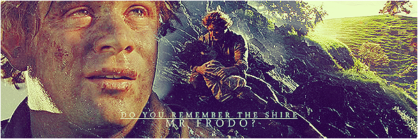
My main problem with the Hobbits is perspective. I don't want them to be too big because a) they'll either move the focus off Arwen or b) they'll look like they're only a teensy bit in the distance, when actually I think they should seem to be further back, if that makes sense. I can try and make them bigger if you'd like and see how that looks. I'll go and fix the previous version right now and then make them bigger. 
Anyway, I have been thinking about this whole process with the header recently and I've really liked the fact that even though I have been making this header, everyone has joined in with helping me with their suggestions and comments, and then Arwen stepping in when I was struggling and being willing to help. I don't know about anyone else, but I think this has been a really great way to go about doing this, and I was thinking it's a pity a couple more people couldn't contribute to this graphically in someway to really make this a "team" effort. I just think it would be nice to do.  So that's why I was wondering if there is anyone who would like to take charge of doing the text? So that's why I was wondering if there is anyone who would like to take charge of doing the text?
It doesn't matter if no one wants to, or if people think it's a bad idea, because then I'll just go ahead and do it as planned. But I just had this idea (admittedly at 6am  ) and wanted to share it. ) and wanted to share it. EDIT: So here is the first version with the glowy light toned down a bit, and with the excess around Frodo and Sam erased.  Here is the larger Frodo and Sam version with the same glowyness. They are each about 15 pixels larger and they don't look as bad as I thought they would, so maybe if needs be, I could risk making them bigger? Probably need more light on Sam's head looking at it on here as it's too similar in colour to the tree.   [/color]
_________________ 

^ By me and my SS *squiggle hugs*
|
|
| Top |
|
 |
|
|
Post subject: Re: A-U Revival: layout & coding Posted: March 24th, 2011, 6:56 am |
|
Joined: 04 June 2005
Posts: 13518
Location: Skógum Svíþjóðar
Country: ")
Gender: Female
|
I actually prefer Sam and Frodo being smaller rather than larger. In the second banner they look like they're 5' or something. But maybe that's just me. I would be more than willing to help out with the text! I could try out different fonts and different variations on effects and whatnot and people can decide which one they prefer the most. _________________ 
.*+I'VE MET ANTIGONE, MONTANABOHEMIAN, RAIVYNN PHOENIX, BERIADANWEN & PIRATEOFTHERINGS+*.
(¯`•¸·´¯`·._.·[TRUE VAMPIRES DON'T SPARKLE]·._.·´¯`·¸•´¯)
|
|
| Top |
|
|
|
|
Post subject: Re: A-U Revival: layout & coding Posted: March 24th, 2011, 7:32 am |
|
Joined: 30 December 2006
Posts: 3507
Location: Over the Edge of the Wild
Country: ")
Gender: Female
|
|
I agree with Eru, they look better when they're smaller. Mostly because they look like they're farther away, and not like they walked past Arwen a second ago. Sam could maybe be just a little bit bigger than he is in the first picture though, because he's closer to us than Frodo, you know?
_________________
by Lembas
|
|
| Top |
|
|
|
|
Post subject: Re: A-U Revival: layout & coding Posted: March 24th, 2011, 2:28 pm |
|
Joined: 03 May 2005
Posts: 4717
Location: Middle-earth
Country: ")
Gender: Female
|
I agree with Eru and Ana - I like the smaller hobbits better. I don't think proper scale is a problem in the least. Obviously Arwen's not supposed to be, well, in the forest right alongside the hobbits, and I sort of liked the idea that the hobbits are walking through this giant forest where the trees absolutely dwarf (or hobbit ) them. The lighting's looking fabulous! I might still tone down the glow just a bit, like between Frodo's body and the bottom of his walking stick, for example. I would also make Frodo's head a little less contrasty. But it's really looking fantastic! I also like your idea of having different people working on different stuff on the header And it was really cool getting constructive feedback about the Evenstar bit, because it turned out waaaay better after you advised me to give it another go after the first attempt. So it would be fun if Eru wanted to do the text! Have we given any thought on how to handle the navigation bar? _________________ 
|
|
| Top |
|
|
|
|
Post subject: Re: A-U Revival: layout & coding Posted: March 24th, 2011, 3:41 pm |
|
Joined: 10 July 2005
Posts: 23149
Location: Where there are handsome heroes and sexy villains.. all that need some lovin' ;)
Country:
Gender: Female
|
|
| Top |
|
|
|
|
Post subject: Re: A-U Revival: layout & coding Posted: March 24th, 2011, 4:43 pm |
|
Joined: 16 March 2006
Posts: 20465
Location: Gondolin
Country: ")
Gender: Female
|
|
Looks lovely! I'm not too fond of the big white translucent block behind the navigation though. Anyway we could make that blend better, ex., the current layout's navigation?
_________________ 
|
|
| Top |
|
|
|
|
Post subject: Re: A-U Revival: layout & coding Posted: March 24th, 2011, 4:57 pm |
|
Joined: 10 July 2005
Posts: 23149
Location: Where there are handsome heroes and sexy villains.. all that need some lovin' ;)
Country:
Gender: Female
|
|
| Top |
|
|
|
|
Post subject: Re: A-U Revival: layout & coding Posted: March 24th, 2011, 5:36 pm |
|
Joined: 30 December 2006
Posts: 3507
Location: Over the Edge of the Wild
Country:
Gender: Female
|
|
I agree with Haldir that the block doesn't look too good, but if we could make it look less block-y it'd look better I think. Like if you look at some of the previous layouts there either isn't one at all or it's sort of blends into the image (like in 4.2).
_________________
by Lembas
|
|
| Top |
|
|
|
|
Post subject: Re: A-U Revival: layout & coding Posted: March 24th, 2011, 6:50 pm |
|
Joined: 10 July 2005
Posts: 23149
Location: Where there are handsome heroes and sexy villains.. all that need some lovin' ;)
Country:
Gender: Female
|
|
| Top |
|
|
|
|
Post subject: Re: A-U Revival: layout & coding Posted: March 24th, 2011, 6:54 pm |
|
Joined: 30 December 2006
Posts: 3507
Location: Over the Edge of the Wild
Country:
Gender: Female
|
Yeah. I actually love the one beneath as well, because the banner sort of blends into the part beneath it and you can't really tell where it stops. Which is cool, but not exactly easy to do with the one we have now because there are so many different colors We should probably agree on what sections we're having sometime soon too, so the banner can be completely finalized _________________
by Lembas
|
|
| Top |
|
|
|
|
Post subject: Re: A-U Revival: layout & coding Posted: March 24th, 2011, 7:00 pm |
|
Joined: 10 July 2005
Posts: 23149
Location: Where there are handsome heroes and sexy villains.. all that need some lovin' ;)
Country:
Gender: Female
|
Yes, I tried doing some similar with it being green and it looked nice, but if you look at AU now, the navigaition is an ice blue and then hits the black of the layout. If we are to have a green background, having a green navigation bar may clash. So I tried it with the same blue as on Arwen's dress and that I think would work nice with a green background, as it works in the header having blue and green.
Yes, we do need to sort those out. I think we decided that the quizzes would be added to a general "humour" or "fun" section. I don't think at the moment we should worry about having contests, as someone said, we have contests on the forum and if people want contests they should join . I think the "awards" section should really go into "site" to make it neater same perhaps with "links" and as we really only want fan videos and fan art, could that not go under "media" instead. But having said that, I think with Eru's help, we could have a really awsome fanart section with tons of stuff, so having its own section still might be easier.
_________________
^ By me and my SS *squiggle hugs*
|
|
| Top |
|
|
|
|
Post subject: Re: A-U Revival: layout & coding Posted: March 24th, 2011, 7:10 pm |
|
Joined: 30 December 2006
Posts: 3507
Location: Over the Edge of the Wild
Country:
Gender: Female
|
I think quzzies, humor and games can be added to a general "fun" section, because they're all similar. And I agree that "site" "link" and "awards" can be put together as well. So what we're left with then is "Home" "Books" "Films" "Hobbit" "Elvish" "Fun" "Site" "Chat" "Misc" (maybe come up with a new name for that one if it's only like graphics tutorials and stuff?) "Gallery" "Media" (can this one be put together with misc?) and "Fan". Did I miss any? EDIT: I just realized this sounds like me making a decision. Which it is not, I'm just pitching an idea  _________________
by Lembas
|
|
| Top |
|
|
|
|
Post subject: Re: A-U Revival: layout & coding Posted: March 24th, 2011, 7:26 pm |
|
Joined: 10 July 2005
Posts: 23149
Location: Where there are handsome heroes and sexy villains.. all that need some lovin' ;)
Country:
Gender: Female
|
|
| Top |
|
|
|
|
Post subject: Re: A-U Revival: layout & coding Posted: March 24th, 2011, 7:29 pm |
|
Joined: 30 December 2006
Posts: 3507
Location: Over the Edge of the Wild
Country:
Gender: Female
|
|
^That looks good to me, except "Goodies" sounds a bit too similar to both Fun and Media. I think we should definitely rename it though, Misc is just a little too vague if we're only having tutorials and that kind of stuff there.
_________________
by Lembas
|
|
| Top |
|
|
|
|
Post subject: Re: A-U Revival: layout & coding Posted: March 24th, 2011, 8:11 pm |
|
Joined: 10 July 2005
Posts: 23149
Location: Where there are handsome heroes and sexy villains.. all that need some lovin' ;)
Country:
Gender: Female
|
|
| Top |
|
|
|
|
Post subject: Re: A-U Revival: layout & coding Posted: March 24th, 2011, 8:29 pm |
|
Joined: 04 June 2005
Posts: 1505
Location: California
Country: ")
|
I don't mean to interrupt on the discussion for the images (great job by the way!), but this thread seems the best place to ask this: can we set up a brief meeting for the five coders to get together and discuss what we want to change and how? The coding discussion has kind of gotten loss in a multiplicity of threads so a live chat would really help in making speedy decisions. The AU chat would be pretty convenient, but I'm not sure about other people's schedule. Sometime next week perhaps? And as a reminder, the five coders I believe are: Haldir Johnny's Fan Nurrantiel Mashiara Telpeath Elberethsq I believe Eruraina had said that Haldir and I should work on the larger scale changes for the site, such as structure. Telpeath seems to have quite a bit of experience, so he should probably join in on those changes too. Then Nurrantiel and JF will work on smaller changes (updating links, fixing images, whatever). Once we meet, we can decide what big changes we want for the site, how to do them, who does what, and plan out a rough schedule to carrying out those changes. Then we can ask Arweb for server access.  _________________ 
|
|
| Top |
|
|
Who is online |
Users browsing this forum: No registered users and 6 guests |
|
You cannot post new topics in this forum
You cannot reply to topics in this forum
You cannot edit your posts in this forum
You cannot delete your posts in this forum
You cannot post attachments in this forum
|
Powered by phpBB © 2000, 2002, 2005, 2007 phpBB Group
Boyz theme by Zarron Media 2003
|
|


 I really need to get PSP8.