Please scroll down for the results of Round 14 and awards.
_______________________________________________________
Basic info -- recopied for reference.
+++++++++++++++++++
[x] Good day to all. This is a contest that which is very much different from all the other general contests. Only this contest, you have to be more creative with a limited amount of choices that are offered to you.
[x] The name of the game: As it is, it is called the Screencapture Contest, and as you may have noticed there are rounds to this contest meaning I will continue with contests in the same routine [with variables...well..varying.

]
[x] Basically I will provide one or more screencaptures of various things. Whether it be Lord of the Rings, Harry Potter, a picture of a book, or a landscape capture. You will then use those screencaptures to make your graphic [avatar, banner, etc.].
Rules:
- You must
only use the screencaptures given to you.
- You must use them to make the required graphic (ie. Round: Avatar)
- Your entry must be a newly made entry. [Preferably with some kind of signature.]
- There will be no limit to the entries (meaning any number of people may enter), as long as it is entered by the date. Any entry given latter the date will be shown and recognized but will not be included in the judging (unless given a very good reason as to why you entered late).
[x] Judging: Judging the graphics will be up to other moderators and/or random members. However there will be no poll. I will survey individual people. There will be a 1st place, 2nd place, 3rd place, and honorable mention and Host's Choice.
[x] Awards: Will not be guranteed the best in the world. I will try and see if anyone will be willing to make the awards at the end of contests or I will do to the best of my ability to make them, though take my word for it, my skills suck. I do, however, have the almighty useful Photoshop 7.0. I'll cook something up if I must.
++++++++++++++++++++++++++
<center>
Screencapture Contest - Round 15</center>
<center>
Theme: Pride & Prejudice</center>
<center>
Graphic: Bookmark</center>
<i>Images:</i>
Removed for ending of contest.
 Notes:
---The rules above apply.
---You do not have to use all the pictures.
---The initial bookmark must be 175 x 550 pixels.
---Anyone can enter (permission not needed) --- no limit of participants. One entry per participant.
---Post the
LINK to your entry in your post. Try not to use the image tool.
---Entry is due by Friday, November 3, 2006 at 11:30 pm EST.
---Good luck and HAVE FUN!

++++++++++++++++++
Members Entered:
[x] Gilraen Ringeril -
Entry
[x] ForeverFrodo -
Entry
[x] Pandora -
Entry
[x] pirateoftherings -
Entry
[x] Morwen Anduril -
Entry
[x] Nurrantiel -
Entry
[x] Altariel Frodo -
Entry
[x] Riniel Anariel -
Entry
[x] Johnny's Fan -
Entry
++++++++++++++++++
Awards/Results of Round 14 [Luna Lovegood]
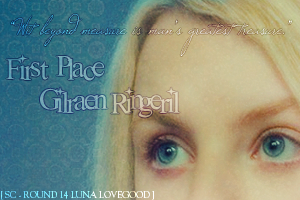
Our 1st Place: GILRAEN RINGERIL -------------- One of our tied 2nd placer: SAM THE BRAVE
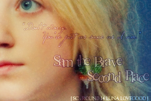
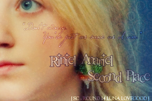
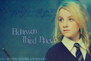
Our other tied 2nd placer: RINIEL ANARIEL -------- Our 3rd Place: ELDARWEN
Our Honorable Mention: LIMWEN - VILLYA ----- Our Host's Choice: MORWEN ANDURIL
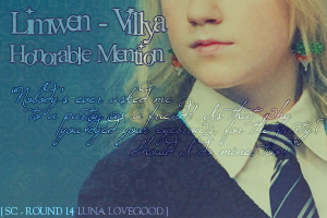
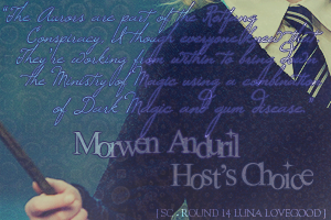 P.S.
P.S. I made the awards again. Photoshop-hosted. If something's wrong, try again later.
P.P.S. Geez! Trying to get votes was like pulling teeth!
Those who voted/judged:
1. ViviElessar
2. Eyalan
3. Mrs.Gamgee
4. Johnny's Fan
5. Luthien Star-Lover
6. hammondg
7. Joelle
8. Gwenneth
For those who voted, THANK YOU SO MUCH.
Comments:
Everyone:
“Over all this was a great group of banners, nice jobs with colours and textures, most of these banner were very eye-catching and eye-pleasing. Each of the artists knew what they were doing.

” –Mrs. Gamgee
“Although all these sig sets were lovely, I have to be honest and say that I was disappointed that the variety wasn't very great. Although only one picture was provided I would have liked to have seen more creative entries using it. Nevertheless, very well done everyone, this was a really, really hard contest to judge .

” –Johnny’s Fan
“Everyone's entries look so amazing! Each one has it's own unique style and coloring. I would to be the one to have to choose my favorite!

” –Sam the Brave
Gilraen Ringeril:
<i>“Love this one! The texture is gorgeous. The text is great and the font. Amazing work!!!” –ViviElessar
“Nice banner! You did well with the grunge effects and colour, and the cool repeating thing with the words that you did looks really awesome too! Nice work!” –Mrs. Gamgee
“<I>Avatar</I> - very nice and simple. I like the text with the little heart and is just adds something. Like the fact it matches the banner. <I>Banner</I> - The positioning of the pictures is nice and the textures work really well. The text is a bit intrusive though, something simple like the text on the avatar would have perhaps been better.” –Johnny’s Fan
“I loved the grungy look she gave her piece. The text is absolutely fabulous!!” –Riniel Anariel
“I love the texturing of yours as well as the text. When sometimes a heavy use of texturing is not such a good thing, I thought that the way you used it really added to your final product. The text is really neat. I've always loved that almost echoing, repeated effect.” –Sam the Brave
“I love the use of texture and text. Wonderful job!” -Joelle
"This entry was so cute and I'm happy to be putting it as my signature. I like the grungy texture but specifically the text, it just fits Luna so perfectly!

" -Kitoky</i>
IdrilFalastari:
“These are really cool! The only thing I may suggest is to next time in some way tie in the avvie with the banner, in colour or something. But I really like the colours in this, I really like that bold magenta-y color at the far right, very nice, I really like the brushes and colors on that right side of the banner. All in all it's just a very cute banner, sorta girly....very Luna.” –Mrs. Gamgee
“<I>Avatar</I> - I love this avatar! It's beautiful! The colour, text and brushes are lovely. I think the banner should have matched or vice versa as it looks a little odd. <I>Banner</I> - I like the colours on this. It's different from the rest. The textures are nice and the brushes and text work well.” –Johnny’s Fan
“Beautiful work as always. Little to much brushing going on for my taste, but it works really nicely!! Amazing texture.” –Riniel Anariel
“You have such a talent with brushes and texturing. You have a very recognizable style. I love your banner and icon. The coloring is very well done. I like the red and pink look of your banner. I also loved the effect of the brushes with the wand in the icon that make it look like 'magic'.” –Sam the Brave
"This one is beautiful too, I love the bright and rich colors. Though I know you switch banners when you switch the blue one to purple, though when you did that, I thought it would be better to make the avatar a little more tinted purple than it is right now. The brushes are good and I just like whole MAGIC feel. I thought it should've gotten an award even though it didn't place." -Kitoky
Limwen - Villya:
<i>”Love the bright colors used!” –ViviElessar
“I’m not sure what it is that I like about this banner. It’s something you did with the lighting and the nice subtlety of the colours! It looks terrific and the purpley shading along with the oranges and yellows sets it apart, this one’s very nice! Kudos! Very, very nice job, My favorite one on here.” –Mrs. Gamgee
“<I>Avatar</I> - Nice and simple and it matches the banner almost. I really like the text as it gives the avatar a little something. <I>Banner</I> - Like the avatar it's nice and simple and I like the colours and the textures used. The text works well, but it's a pity that the font didn't match the avatar or vice versa.” –Johnny’s Fan
“I love this one the most. Great use of gradients. It has such great texture and i love the glow.” –Riniel Anariel
“I really liked the effects on your banner. I don't know exactly what they are, but they give it a nice, subdued texture and very neat, bright, clear look. The coloring was interesting because it wasn't all in the same palatte. There's a bit of yellow and orange and blue in there. It was cool to see a banner with all sorts of different colors like that.” –Sam the Brave
“I love the colors/textures as well as the simple font used for the text. Nice work!” -Joelle
"It had a very autumn feel to it and Luna Lovegood does feel like an autumn type person.

I love the avatar specifically." -Kitoky</i>
Sam the Brave:
“I like this one a lot, the glowy effect looks awesome, and it's something that I can't do, which makes it cooler.

It’s very cool and mysterious looking, very midnights…blech I’m terrible at explaining myself, but anyways, I also like the fading colors from dark to light, in the middle there.

And the brushes by her name are so adorable and cute, I think the stars contribute to the whole starry midnight effect there. Haha. Great job!” –Mrs. Gamgee
“<I>Avatar</I> - Beautiful! The only one that didn't have a picture of Luna! Totally different and I love it! And it matches the banner (yay!). <I>Banner</I> - It's lovely and simple, the pictures are differently arranged, the glow works well, the colour is lovely and I really like the text and brushes. I can't fault or suggest anything about this banner.” –Johnny’s Fan
“Beautiful use of the pics. I <b>LOVE</b> the text. There is a little too much blur (it looks a bit out of focus), but it is lovely!!” –Riniel Anariel
“Lovely blur effects and wonderful text, especially on the avatar. Loved that you could make an avatar without her face. Lovely work!” -Joelle
"It's very glowy! And I also like how the avatar is more text than a picture of Luna though the cut off name seems a bit unbalanced. Love the texture." -Kitoky
Pandora:
<i>“I like this one mainly because of the three different views. The small one in the middle is something different from the rest of the ones on here. The avvie with the half Luna on there also looks really good. The cool dotted texture also works very nicely on there. Well done!!” –Mrs. Gamgee
“<I>Avatar</I> – Nice and simple. I like the fact it matches the banner and that you haven’t tried to crowd it with too much text. <I>Banner</I> – The colours and textures are nice and work well. I like the positioning of the images, as they are different to the rest. The centre image is good although I think making the “grey” blend with the banner would have made it stand out less. The text is nice and simple and works well.” –Johnny’s Fan
“Lovely!! I like the use of the texture as the background, it gives an individuality to your work. Brilliantly done!!” –Riniel Anariel
“I loved your placement and text. Where most people used the picture twice blended together, you found another way to incorporate it, and I think that gave it a nice look. The text is very cool. I have no idea what font the 'lovegood' is in, but it's really neat.” –Sam the Brave
"This one is quite different from the rest. The dots are interesting. The avatar is VERY neat." -Kitoky</i>
Bubble Black:
“I like this one because is very simple, not too many things going on there, which is good. The small text works prefectly.” –ViviElessar
“I’m not sure what it is I like about this one, but it’s really cool. You did great with the blending, and the blue is really cool! I really like how she’s of center and it’s only half of her in the avvie, it looks awesome.

Nice job!” –Mrs. Gamgee
“<I>Avatar</I> – Really nice colour and I like the way the image has been placed. Text brush is a nice touch but should probably stand out a little bit. <I>Banner</I> – Again, a really nice colour and I like the way the images glow. There seems to be a little too much going on in the centre though with the “scratches” the text brush and the text.” –Johnny’s Fan
“Also one of my favs!! Amzingly there isn’t too much going on, but in this case less is more. Simple yet elegant. Amazing Job!!!” –Riniel Anariel
“I loved that your banner's style was a lot more conservative. You really brought out the blueness in her eyes and the picture was nice and clear. The effects were scarce, and not heaped on like some. I thought it was a nice change though. I thought your text was very well done and uniquely placed.” –Sam the Brave
"This one is very stylish! Very blue, and I love the little brushes and grunginess. Kinda electrifying." -Kitoky
Morwen Anduril:
<i>“This one’s really cool, at first I was sorta like “eh” but looking at it. It’s awesome. I really like the difference with the color and the more beige one, and how you blended them together it looks really cool. And in the avvie too, how you have the circle of colored Luna, it looks really cool, one suggestion, it’s would have looked a little better if that black-and-white area had been the same beige color as the banner, but no worries it’s looks really great!” –Mrs. Gamgee
“<I>Avatar</I> - I like the fact that you have tried to be different. Your set certainly stands out from the rest. Very unusual avatar and it works well. <I>Banner</I> – I really like what you have done with the colours, and the way you have gone from sepia (although black and white would have matched your avatar

)to colour is well done. I also like the text as it’s really simple and neat.” –Johnny’s Fan
“I have to say Morwen did the most with her/his piece. I like the color to antique look the banner has.
I really like the rough edges. Unique in a very good way!!” –Riniel Anariel
“I thought your banne was very interesting. The varied coloring and textures were a neat effect, and really set your banner apart from the others. It was like each part of it used a different part of the picture and was colored a different way. It really made for a nice product.” –Sam the Brave
“I love the use of cropping, color, and textures. Very creative!” -Joelle
"I LOVE this one. The more I look at it the more I love it! It's very creative. And I love the sudden color contrast." -Kitoky</i>
Riniel Anariel:
“I really like this one! It's the one that stood out the most, the colour for one thing, looks really cool! I really like those little squares of her face too, I really like the positioning of it all, of the main words and of her name on the side as well, it's all very united, all in all it’s really a great job! Very well done!” –Mrs. Gamgee
“<I>Avatar</I> - I really like the colour, it’s lovely. Until you see the banner the avatar looks a little weird seeing these faces but at least it matches! The text is nice and neat. <I>Banner</I> – I love what you have done with the images, they just look really different. The colour is again lovely, and I like the text as it’s different to everyone else’s. I like the fact you have tried to be different but I think the three “mini-Luna’s” actually spoils it a bit, as without them the banner really stands out, what with everything else.” –Johnny’s Fan
“I loved the color of your banner. It's a really neat purple magenta *stares at color* ish color. I thought it was neat how you had the picture in that almost sepia toning wheras the background was that color I really like.I liked the little round boxes all tilted in different directions. That looks really cool.” –Sam the Brave
"I like the smooth texture that Luna has but the colors seem kinda monotonous besides the purple theme. The little Lunas are awesome as well.

" -Kitoky
Eldarwen:
<i>“The whole yellow-ish tone works very well. Love the font used.” –ViviElessar
“I like the texture on this one, and the subtle line thing that you've got going on through the banner, the border too, and the font used for her name as well

. This one just looks awsome, not much else I can say about it, it's great job! KuDoS! “ –Mrs. Gamgee
“
Avatar – Nice and simple. I like the fact it matches (yay!) and the way you can have placed the image. <I>Banner</I> – I really like the whole look of this banner. The colours are really nice and the textures really add something. The images well placed and the text is nice and simple. The textures are really good though. “ –Johnny’s Fan
“Very cheery and bright. Love the color. Great use of texture. Overall amazing job!! “ –Riniel Anariel
“You're banner is stunning. The textures and coloring and text just all fit extremely well together to create a beautiful image. They go together so well that it's hard for me to pick one piece of it out to describe. I just really liked the whole product. It's really well done.” –Sam the Brave
"Very golden! It's so bright! Very beautiful, creative. The texture background is fitting.

" -Kitoky</i>
++++++++++++++++
Thanks for participating!
-[kitoky]