Awards/Results of Round 03
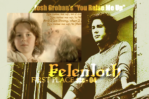
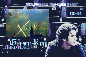
First Place: Kelenloth _________________ Third Place: Gilraen Ringeril
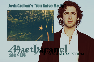
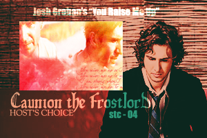
 Honorable Mention: Maetharanel _____________ Host's Choice: Caunion the Frostlord
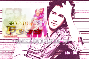
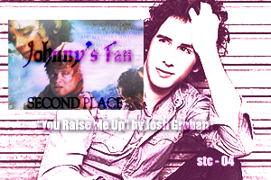
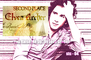
 Second Place: THREE WAY TIE --- Kess, Johnny's Fan, Elven Archer
<center>
</center>
I apologize for the crappiness of the awards, I could've done better but I wanted to have them made and posted soon and I've been very short on time lately.
Those who voted/judged --- the godly beings as they are.
1. Silme Meleth
2. Rose of Rivendell
3. Ms. Gamgee
4. keyodie
5. Zandain
6. MontanaBohemian
>> Comments
--------EVERYONE :: “Oh, this vote was SO difficult, it never ceases to amaze me how just how much talent there is her eon A-U, you guys were all fantastic, and this was a fantastic batch! “ –Ms.Gamgee
“You all did an absolutly fantastic job. Once again, I love seeing so many talented artists together!

Two thumbs up to everyone.” –Elven Archer
“Great job, everyone, except the first bloke over there. Like I was saying, great job all of you. You did a fabulous job with it and keep up the good work.” –Caunion the Frostlord
“Beautiful entries this round. Everyone did an excellent job and it was a pleasure to comment on them as they were all wonderful.” –Johnny’s Fan
--------CAUNION THE FROSTLORD :: “Haha, I have that texture.

I really like the colours in this one, nice and bright. Nice text placement, too.Nice job!” –Ms.Gamgee
“Oh you coloring is sooo pretty! The oranges/red/yellows is a really cool combination! Although I really don't know what the pictures are of, they're very nice, and so is the text. Nice job Caunion!:)” –Elven Archer
“The color scheme in this blend is gorgeous, and the blending turned out beautifully! The only thing I may have done different is use a simpler font for the lyrics part of the text.” –Limwen – Villya
“I wished I did a better job blending it. Oh well.” –Caunion the Frostlord [Kit: Well, I like it.]
“Wow, fantastic colours. Great use of texture as well. The blending is also really nice. I’m not sure what relevance the pictures have to the song, as I am not familiar with the theme, but I’m sure they must do.
The text is nice and easy to read, it’s a shame they don’t blend in a little more.” –Johnny’s Fan
--------------NURRANTIEL MASHIARA :: “Oh, I love the theme of the sky and that statue. Is that supposed to represent God? Or just for the effect? I like the purple and blues, very, very nice, and really cool job with the text! Looks awesome!” –Ms.Gamgee
“Your gradient is beautiful....really pretty. The pictures are blended well, although I can't see them very well. But your text is just awesome! The placement of it all is amazing, and it's very readable! Kudos!” –Elven Archer
“A very interesting blend! The mix of colors is really beautiful and the stock pictures show up only a tiny bit! I'm not quite sure what the pictures (looks like a cloud and some waves) but this blend is beautiful!” –Limwen – Villya
“Really interesting. I like the way you really can't see what's going on over there. Adds a really surreal notion to it.” –Caunion the Frostlord
“*jawdrop* Those are the most amazing colours my eyeballs have ever seen. I can’t quite make out what all the images are, but they have been blended really well. I also love the speckled texture. I like the different fonts you used for the song, some parts are easier to read than others, but I really like the way you have displayed the text.” –Johnny’s Fan
--------------- KESS :: “My first thought: adorable! The pastel tones are really cute and go very well with the theme. I really, really like the style/picture placement, and that box with the brushes on the side for the text is very cute! Very nice!” –Ms.Gamgee
“I like how you used 3 different pictures (I think) repedatively, but with different effects. The brush you put under the text looks awesome, and it's just a great blend!

” –Elven Archer
“I love the repeating picture effects you added... The text fits very nicely in the floral box! The rainbow colors are very eye catching, but the pictures are a little blurry in some places. But I believe you explained that when you posted your entry!” –Limwen – Villya
“Oh, really nice. I love the blending and the colour scheme you used.” –Caunion the Frostlord
“What can I say about Evanageline and Matthew? I love the images you used, really different and not something most people would have thought of. I really like how you have displayed the images and the colours you have used. I love the way you have used the text and made it part of the design. It’s really eye-catching.” –Johnny’s Fan
--------------JOHNNY'S FAN :: : “I like the really touching theme that you’ve chosen, great job with that. You’ve got a very nice blending style in this blend and lovely job with the subtle colours and choice of pictures.” –Ms.Gamgee
“You stole my idea!

Lol, jk JF! It looks great and you didn't steal it. Your blend is just superb and I love you did two different fonts. It really set it off. Your colors work really well too. Excellent work my friend!” –Elven Archer
“How could I not love a blend with Sam & my dear Frodo? Gorgeous blend, wonderful colors! The text is a little hard to read in places, but other then that this blend is magnificent!” –Limwen – Villya
“Really nice blending there. And a really nice subject as well.” –Caunion the Frostlord
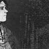
------------GILRAEN RINGERIL :: “Love it! The bird as a choice of subject is a cool idea considering it can symbolize so many different things, and that looks like a dove too. But I especially like the texture in this blend, and the text and that x, and the church in the distance, everything works well and fits in perfectly looks really great! I mean…very nice, awesome work!” –Ms.Gamgee
“The dove, the atmosphere of the blend, just beautiful” –Zandain
“Wow.....wow. Well the colors are definatly extravagent in this one, but it dosn't look bad at all. I love the way you place all the pictures, but the text looks totally awesome!

I just have to say wow!” –Elven Archer
“This is such a beautiful blend! I really have hardly anything to say but great job! I love the coloring, how blue it is, then it has that golden coloring/texture. The text is beautiful, may I ask what font you used for the 'You Raise Me Up' part? Gorgeous job!” –Limwen – Villya
“The blend looks absolutely lovely! The texture and brushes are really nice. Quite smashing” –Caunion the Frostlord
“Your use of textures never ceases to amaze me. I like the images you have used, but I really love all the textures and effects. They really make this piece work. I like the way you have arranged the text and the cross is a nice touch.” –Johnny’s Fan
--------------- ~RINIELARANEL~ :: “Cool subject, you’ve got a nice style of blending here and nice job with the text placement.” –Ms.Gamgee
“I love the idea of Faramir and Eowyn, I would have never ever thought of that, but it's really cool! Your blending is excellent and I like all you different brushes and text. Amazing work.” –Elven Archer
“First off, I love the Eowyn/Faramir idea! It fits perfectly with the lyrics and everything! I love the faded look in this blend. How it isn't overwhelmed with color all over the place. Eowyn has a brush on her face that makes a little unclear, and the text is a little hard to read, but other then that wonderful job!” –Limwen – Villya
“Great subject. The texture looks nice with it.” –Caunion the Frostlord
“A lovely theme. I think the blending on this is really, really good. I love the images you chose and the textures really work well. The text is a bit hard to read, but it suits the blend well. The butterfly brushes are a nice touch.” –Johnny’s Fan
----------------ELVEN ARCHER :: “Ooh! Splendid! I LOVE that big font! What font is that!? =0 I love the mix of these pictures, to me it really captures the essence of the song, even with the church, since the song is meant to have a religious context anyway. And the mixing of the rainbow and water drops, I really love it all! Fantastic job!” –Ms.Gamgee
“The colors, the blend is fantastic, the perspective of the picture leads you to her and she´s flying..!” –Zandain
“Hmmmm.....well I actually kind of like this one. I like the color the best, it's a color I usually have trouble achieving. But it's alright overall. Nice work!” –Elven Archer [Kit: Confidence is Key!]
“I love the way your blend features around creation! The raindrops, the church, and the girl. I really like the rainbow. Very pretty blend, simple in a way, and very beautiful! You really seem to focus on the lyrics.” –Limwen – Villya
“That looks really nice, EA. Is the rainbow part of a picture or a brush? It looks really nice with all of the picture” –Caunion the Frostlord
“Nice choice of pictures. I like the colours and the textures you have used. I also like the way you have used different fonts but made the text clear and easy to read.” –Johnny’s Fan
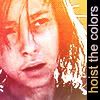
----------------FOREVERFRODO :: “Ooh, very nice bright colours, I love this shade of orange.
And nice blending of the pictures and picture placement. Nice job.” –Ms.Gamgee
“Willabeth! *huggles it* Yay for Will and Lizzie! I really like tis one though. The color really sets the tone for the pictures, and it just looks awesome! Go you!
” –Elven Archer
“A very good pairing for this song! I love the warm, yellow colors in the blend. The text is a little hard to read, but it is a very pretty blend anyway!” –Limwen – Villya
“I really like the colours on it. And the blending is absolutely wonderful. Great job.” –Caunion the Frostlord
“Wow, glowy and…orange. Good theme choice. The blending is really good, and I love the brushes and textures you have used. The text is really hard to read though, which is a shame as I think the lyrics suit the images really well.” –Johnny’s Fan
---------------LOTRFREAK13 :: “*gasp* Oh wow! This is so cool looking! I really like how it ironically fits in with the song, you took the song and gave it a dark context, very cool idea on your part. Kudos. This style is just awesome, the lights and darks, the contrast between grays and colours, awesome, just amazing! Lovely, lovely work.” –Ms.Gamgee
“I really like how the whole thing is desturated, except for one colored picture, makes it stand out more. Your effects are really awesome, so is your text....it's just plain cool!” –Elven Archer
“I love the mix between black/white and color! It gives it this very old, faded look that fits very well. The text is very beautiful, and fits well because of the look of the blend... I love the border you gave this piece, it gives it an overall touch! Gorgeous job!” –Limwen – Villya
“The thing that really caught my eye is the blending. Lovely job. It looks fantastic! And I like the way you had everything black and white except the guy. Who is he anyways?” –Caunion the Frostlord
“Really nice blending. I love the fact that only one image is in colour. You can’t read the text very well, but it does really seem suit the overall blend.” –Johnny’s Fan
---------------LIMWEN - VILLYA :: “Ooohhh, I adore this type of faded & scratched up style. GREAT blending, and picture placement! That picture of Boromir on the top right is really nice! And even though the text is plain, it looks perfect where it is. Very nice.
” –Ms.Gamgee
“Oh Boromir and Faramir is such a good idea! I love the coloring, and the blending. It's all simple, but beautiful. The text is very nicely placed and I can read it well. Gorgeous!” –Elven Archer
“Really creative subject idea! And the blending is just fabulous. Really wonderful.” –Caunion the Frostlord
“I love the choice of pictures and the way you have blended them. I like the muted colours as well and the spidery scratches (how do you do that?!
). The text is a bit hit-you-in-the-eye but it actually works really well with the blend.” – Johnny’s Fan
--------------SMEAGOLLUM :: “awww, this one is so cute! The writing on the notebook was a very bright idea, and the polaroids look very cool. Very cute work!” –Ms.Gamgee
“Well at first I couldn't really read this, but after looking at it for a while I was like "Oh!". So yeah, now I can read it now. It's a very creative idea, and I just love it! (especially the 'Jesus'

)” –Elven Archer
“I love the picture frame effect, and I really love the notebook/journal idea! Very creative! You did a wonderful job of making it look like it was just supposed to be that way! Wonderful job!” –Limwen – Villya
“Really original. I just love the way you have the words on the notebook paper. And of course, we do need something like him, don't we?” –Caunion the Frostlord
“This is certainly different. It’s a very simplistic looking piece but it’s also very striking and there’s actually a lot to it. Very creative.” –Johnny’s Fan
----------------LITHIUM :: “Oh, I really like it!! I love how it has this misty magical feeling, how things are blurry/shiny, the shiny brushes are a great effect and the circles look great! VERY nice job with the text! I like how you changed it around without making it look tacky, and the base picture is just so cute in itself! Great job! Quite fantastic.
” –Ms.Gamgee
“Oh this is soooo cool! I love the texture, but the different fonts, and the text looke awesome! It's just so........cool! I love it, that's all I have to say!
” –Elven Archer
“Gorgeous job! I love the text, and the stock picture is very beautiful! I love the border you added, and the coloring is so pretty! Wonderful job!” –Limwen – Villya
“Ooh, parasailing. I've done it before and it was really fun. Oh back to the comments. I absolutely love the brushes you used. Quite fantastic!” –Caunion the Frostlord
“Wow, another unsual theme. I really like how this looks, the images, the lighting, the stars the text. The Hollywood/King Kong font shouldn’t work but it works really well. I like how you have arranged the lyrics as well.” – Johnny’s Fan
-------------MAETHARANEL :: “Of course, it’s Maetharnael’s to pop up with something purely Maetharanel, it’s really cool. Like I was telling LOTRfreak13, It’s great how you took the subject of a generally happy something and twisted it to make something a little moodier and dark. The font is so cool, the texture(s) on here rock, and the colours and brushes, it’s just awesome, of course.
” –Ms.Gamgee
“Quite different, the pic and the text: opposites attract.” –Zandain
“Your coloring is just

! It's fantastic! I like how it's just one picture, but you added so many effects. The text looks cool, but again the coloring is just....wow!” –Elven Archer
“I love the midnight effect added to this blend! It's crisp and clear, even though it still has this night-time shiny effect to it. Beautiful is really all I can say!” –Limwen – Villya
“Wonderful entry as usual. I just love the lighting in that one.” –Caunion the Frostlord
“Wow, fantastic colouring. And I love the image you have chosen, It suits the words so well. And the way you have arranged the lyrics and the font you have used, suits the blend so, so well.” –Johnny’s Fan
-------------KELENLOTH :: “Aaw, it’s such a lovely topic that you’ve chosen. Nice blending and blending. Nice job.” –Ms.Gamgee
“An emotional scene in LotR, love the whiteness of the blend, makes me.” –Zandain
“Oh I love the idea of Aragorn and Eldarion. It fit's really well. Yours is very simple, but very good. I like how you did two verses, instead of one, and it looks awesome! Good job sis!
” –Elven Archer
“I love the idea of Eldarion and Aragorn! Beautiful and touching blend! It simply fits with the lyrics! Wonderful job!” –Limwen – Villya
“Really great idea for it. You have really captured the emotion of that scene in that blend.” – Caunion the Frostlord
“Nice theme. I like the images you have used and the way you have blended them. I like the way you have made the text easy to read. The fact the text stands out, actually works very well.” –Johnny’s Fan
+++++++++++++
-[kitoky]


")
 ....errm...*ahem*...sorry, got carried away there.


")

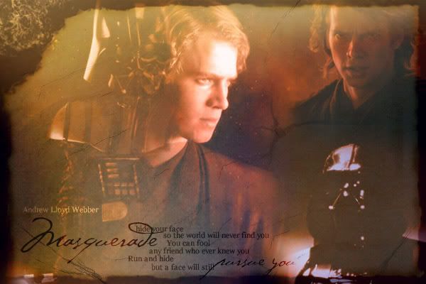
 My creativity is not as strong as my love for Masquerade.


 I love this song!


