| Author |
Message |
|
|
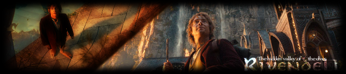
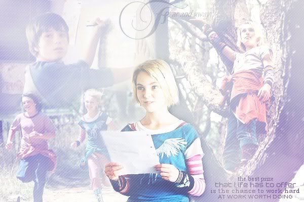
Post subject: Meganelf is finally manning up[updated12.28] comments please  Posted: Posted: July 28th, 2008, 8:04 pm |
|
Joined: 06 June 2005
Posts: 1093
Country: ")

|
|
| Top |
|
 |
|
|
Post subject: Posted: July 28th, 2008, 8:19 pm |
|
Joined: 02 February 2007
Posts: 2563
Location: Valinor
Country: ")
Gender: Female
|
|
Wow. I love your stuff! Your graphics are amazing! I especially like your Les Mis banner.
_________________ 
Married Artemis Fowl on July 16, 2007
[!+^$%=#?&]
The Seemingly Nice But Actually Really Nasty Nazgul
School ate my life. *sigh*
|
|
| Top |
|
|
|
|
Post subject: Posted: July 28th, 2008, 8:22 pm |
|
Joined: 06 June 2005
Posts: 1093
Country:
|
Freya Baggins wrote: Wow. I love your stuff! Your graphics are amazing! I especially like your Les Mis banner.
thanks Freya!
I played Enjolras in our musical, so I got a little inspired 
I'm glad you like them! _________________ 

Want a banner? Click here!
|
|
| Top |
|
|
|
|
Post subject: Posted: July 28th, 2008, 8:25 pm |
|
Joined: 02 February 2007
Posts: 2563
Location: Valinor
Country:
Gender: Female
|
|
Heh... I played 'ponine so I have a soft spot for all Les Mis characters. *grin*
_________________
Married Artemis Fowl on July 16, 2007
[!+^$%=#?&]
The Seemingly Nice But Actually Really Nasty Nazgul
School ate my life. *sigh*
|
|
| Top |
|
|
|
|
Post subject: Posted: July 30th, 2008, 4:33 pm |
|
Joined: 06 June 2005
Posts: 1093
Country:
|
|
| Top |
|
|
|
|
Post subject: Posted: July 30th, 2008, 8:54 pm |
|
Joined: 07 September 2005
Posts: 2685
|
|
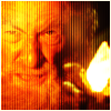
That Joker banner is supremely creepy and supremely awesome. Great job!
|
|
| Top |
|
|
|
|
Post subject: Posted: July 30th, 2008, 9:48 pm |
|
Joined: 14 June 2005
Posts: 8567
Location: Missoula, Montana
Country:
Gender: Female
|
YAY!
Teh Meganelf finally has a gallery! 
I've always enjoyed your stuff. Always lovely. And I like all the stuff you've posted.
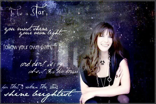
And that EVANRUDE banner! *SQUEEEEEEEEEE* It's SOOO adorable. 
Well keep up the good work.  _________________ "So what? So plenty!"

Sig: Teh Nurr
I've met Eru & Eä & Ellie & teh Arweb & Naur & Elenya & POTR!
POLKA WILL NEVER DIE!
♥
|
|
| Top |
|
|
|
|
Post subject: Posted: July 30th, 2008, 9:54 pm |
|
Joined: 10 July 2005
Posts: 23149
Location: Where there are handsome heroes and sexy villains.. all that need some lovin' ;)
Country:
Gender: Female
|
|
| Top |
|
|
|
|
Post subject: Posted: July 30th, 2008, 10:34 pm |
|
Joined: 25 November 2005
Posts: 4985
Location: I'm everywhere at once. I am currently lost in the land of quotes.
|
|
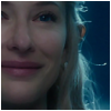
Wow - everything's really great - I especially like your blends.
_________________ 
^Sig set made by me. PM for requests.
"I am he [she =P] that liveth, and was dead; and, behold, I am alive for evermore, Amen; and have the keys of hell and of death."
|
|
| Top |
|
|
|
|
Post subject: Posted: July 31st, 2008, 2:30 pm |
|
Joined: 06 June 2005
Posts: 1093
Country:
|
Aliana Fae wrote: That Joker banner is supremely creepy and supremely awesome. Great job! Thanks  I tried really hard to not even look at it while I was making it! I haven't even seen the movie yet just because I'm so scared of clowns!  MontanaBohemian wrote: YAY! Teh Meganelf finally has a gallery! I've always enjoyed your stuff. Always lovely. And I like all the stuff you've posted. And that EVANRUDE banner! *SQUEEEEEEEEEE* It's SOOO adorable. Well keep up the good work. Aw, thankies Montana! I haven't seen you in a while. I'm glad you like them still!! Johnny's Fan wrote: Very nice work. You've got an eye for what images work well together and your blending is very good.
I would say try and experiment a little more with the text. Less is more sometimes. Try using fonts that suit the image more, and perhaps use the overlay or soft mode. Or in some cases pale colours with a dark border really help to make text stand out if the image is light coloured.
I tend to use textures simply for the colour. The more extravagent ones I tend to stay away from, or if I find one that works for half of my banner, I delete the other half, and copy the bit that works, mirror it, match it up, and hope it suits the rest of my image. If not, try again with another texture until you find one that works for all the image. Try not the allow the texture to rule the image, you still need to see what's underneath. Sharpening your image can really help if your texture is a bit much.
Thanks you so much, JF (really, I admire your work so much). I've always had a little bit of troubles with text--especially recently since I'm working off of a different computer and there's only about 20 different fonts! So I'm trying to use DaFont to compensate, but it's hard  And thank you for the texture advice! I'll try to keep it in all in mind for my next batch! Arya Undomiel wrote: Wow - everything's really great - I especially like your blends.
Thanks I'm glad you like them _________________
Want a banner? Click here!
|
|
| Top |
|
|
|
|
Post subject: Posted: August 6th, 2008, 1:03 pm |
|
Joined: 06 June 2005
Posts: 1093
Country:
|
_________________
Want a banner? Click here!
|
|
| Top |
|
|
|
|
Post subject: Posted: August 7th, 2008, 2:14 am |
|
Joined: 05 July 2006
Posts: 12949
Location: With her nose in a book
Country: ")
Gender: Female
|
|
| Top |
|
|
|
|
Post subject: Posted: August 7th, 2008, 11:38 pm |
|
Joined: 06 June 2005
Posts: 1093
Country:
|
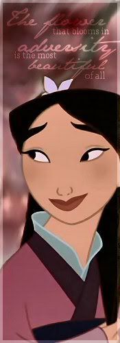
Turwaithiel Swann wrote: I LOVE IT! All of it. Simply stunning. And where do you find your pics for Mulan? I love that movie!
*rushes to request something *
I got them from the zip files from http://magicalscreencaps.com/caps.php
there are some great screencaps on there.
and I'm totally ready if you wanna request something _________________
Want a banner? Click here!
|
|
| Top |
|
|
|
|
Post subject: Posted: August 8th, 2008, 2:11 am |
|
Joined: 05 July 2006
Posts: 12949
Location: With her nose in a book
Country:
Gender: Female
|
|
| Top |
|
|
|
|
Post subject: Posted: August 9th, 2008, 1:08 pm |
|
Joined: 29 July 2005
Posts: 11978
Country:
Gender: Female
|
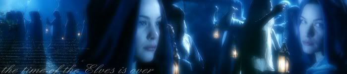
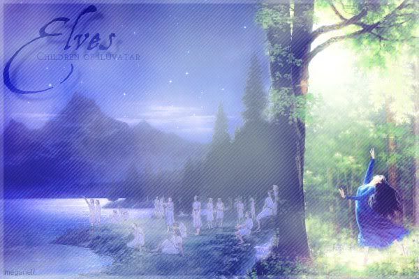
All of your work looks fantastic, but the only thing I wanted to tell you about is your borders... see, sometimes bigger borders can make the image feel too boxed in.. perhaps you could try using borders that aren't as big. Like this banner looks really great ::
Quote: 
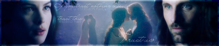
[they're some of the most wonderful things in the graphic world]. Simple, clean lines are always the best... it may not seem like it, but simple is always better (again, referring to that previously mentioned Arwen/Elves banner) and you don't need to make banners look over the top to make them look good.
I hope this was helpful; constructive critism is always good to hear and I hope you're not offended by anything I wrote... I'm not trying to make you mad, just help you out when it comes to graphic arts. It's taken me about two years to perfect my style, and it's still not the best. So it all depends on the person and what kind of skills they have. Just don't get frustrated if things don't work out right away - you'll improve each time and learn a lot of new things; especially if you look up some tutorials on google - they can be very helpful.
|
|
| Top |
|
|
|
|
Post subject: Posted: August 9th, 2008, 6:15 pm |
|
Joined: 06 June 2005
Posts: 1093
Country:
|
Aramel Elyanwe wrote: All of your work looks fantastic, but the only thing I wanted to tell you about is your borders... see, sometimes bigger borders can make the image feel too boxed in.. perhaps you could try using borders that aren't as big. Like this banner looks really great ::Quote:
[they're some of the most wonderful things in the graphic world]. Simple, clean lines are always the best... it may not seem like it, but simple is always better (again, referring to that previously mentioned Arwen/Elves banner) and you don't need to make banners look over the top to make them look good.
I hope this was helpful; constructive critism is always good to hear and I hope you're not offended by anything I wrote... I'm not trying to make you mad, just help you out when it comes to graphic arts. It's taken me about two years to perfect my style, and it's still not the best. So it all depends on the person and what kind of skills they have. Just don't get frustrated if things don't work out right away - you'll improve each time and learn a lot of new things; especially if you look up some tutorials on google - they can be very helpful.
All of this is great--and don't worry, I'm not offended!! Constructive criticism is probably the only way I expand my knowledge. I have been working on smaller boarders, as well as the way I use textures (thanks to JF of course).
My biggest problem is that I USED to have a style, which was very texture heavy, lots of brushes, and, well, more "angsty" looking. And then, one day it was gone. so I'm just trying to find myself again...
But thank you so much. I should get some more up soon, then maybe you can see some of my fresher stuff. _________________
Want a banner? Click here!
|
|
| Top |
|
|
Who is online |
Users browsing this forum: No registered users and 11 guests |
|
You cannot post new topics in this forum
You cannot reply to topics in this forum
You cannot edit your posts in this forum
You cannot delete your posts in this forum
You cannot post attachments in this forum
|
Powered by phpBB © 2000, 2002, 2005, 2007 phpBB Group
Boyz theme by Zarron Media 2003
|
|


