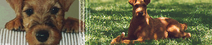
Oh wow, those are amazing. And absolutely adorable!

EDIT:
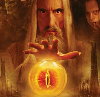
Minas Morgul: This is one of your old ones isn't it? I think I've seen this one a long time ago, or perhaps I'm mistaking it for someone else's. This one's pretty interesting, the blends are odd but it fits quite well and the font for Minas Morgul is eerily awesome.
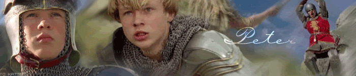
"Everything Beings Here": My two favorite characters from Narnia movie.
! I'm biased! I think this banner's great ---- I like that the font flashes brightly across.

The border is very nice but not that distinct, which is good.
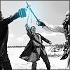
Witch King: I've seen this one before, I think this was Lady Dark Moon's. I just think this banner is just so cool, it's so eerie and evil. [shivers in delight]
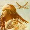
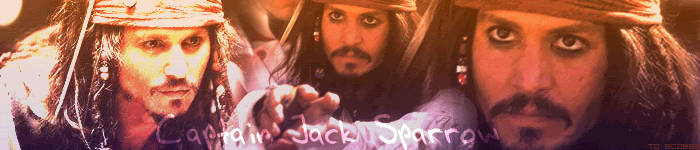
PotC Poster: This is pretty good, I like how you put the starrs names at the top like all the posters do.
The arrangement of pictures are pretty symmetrical as well.
One Ring to Find Them: Hey! I I've seen this one before as well! This is Lady Dark Moon's.........right? [scratches head] It looks alot better when it's not .gif that's for her. Very nice.
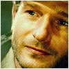
 Robert Pattinson:
 I've definitely seen this one. Oh how popular he's gotten these days. --- Good blends, and I like the X brush there in the middle.
Brad: It's cute. Very boyish and lazy actually.
I'm not one for lots of glittery stuff that flashes but ....actually yeah, I'm just not one for those. I like how the pictures are seperated though and I like the brush there in the background of the left picture.
Emma Watson: Ack! Emma Watson is just so pretty!
I love the adding of flower images. The faded picture in the middle seems kinda off, it could be a little more faded because the contours you can see and I think you meant it to be in the background. The blended image on the right is kinda strange as well, since you can see the color of her skin clearly --- but it makes me think that that one is intended to be like the middle picture and was mean to be faded.
Arwen & Aragorn theme: Hmmm....a bit too many images are being blended together....You can barely make everything out....There is also a sudden change of lighting in the Arwen on the left which makes it stand out a little more, drawing the attention away from everything else.
Galadriel: Again, like the A&A banner, this banner has alot of images being blended together, and some not quite matching the brightness that the others have.
Star Wars: A New Hope: Another one of those banners where something can be ruined by blending TOO many pictures together. I can understand if this was one of your first banners --- you can't make out alot of things and it just doesn't look right.
Star Wars: The Empire Strikes Back: " .... " ..... "
Star Wars: Attack of the Clones: Ack! Blend CENTRAL! I must admit that picture of Count Dooku is totally awesome though.
Star Wars: Phantom Menace: Hmmm....well....yeah....loads of blending....I didn't even notice Yoda and Padme in the background...
Star Wars: Revenge of the Sith: Blending galore! Eek!
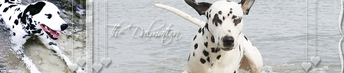
Hobbits: Adorable banner! Though the balance of brightness and darkness is off in each hobbit, you might want to try and find the perfect level of brightness and darkness or use a color filtre.
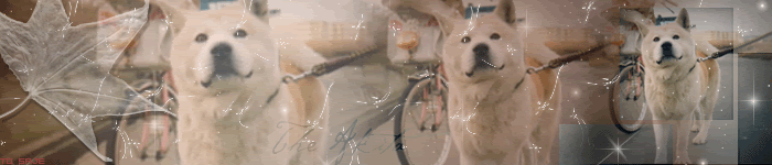
Otto: A nicely blended banner and I like how things are laid out.
"Lord of all Horses: Nice blend ----- pretty simple, plain, but the font could be bigger ---- it seems tiny and I think it'd look better and more noticeable if it were bigger.
Cate: Hey...is this the one in your signature? Or is it a different one....Hmmm. Well it's really pretty, I like how you used a faded flower against her eyes, that's beautiful!
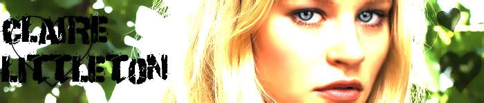
We Are Lost: I'm not much of a LOST watcher but I think the theme of that is brilliant.
We Are Lost2: What I said on the first one.
I love the picture with Charlie and his fingers though .
Legolas: Hmmm, actually I don't know what to make of this because I've seen so many Legolas banners like it! I do like the shadow of the Legolas though.
Legolas2: Another nice one, I think I like this one better because it's blue themed.
I like the two pictures, they match, but athte same time, don't match, it's cool!
Arwen Leaving: Awesome blend, it gave me the feeling of old and vintage.
Songs of Slaying: Hmm...wow this is a rare one, this is the first banner where I've seen pictures of Eowyn from that scene used as a banner --- the text is disturbing actually....The light blend in the middle though....hmm, seems out of place....I don't know if that was something you couldn't help but it's just kinda degrades hte banner a bit.
Cedric: Yey! Another one! This one is pretty cool, I like how the solid image of Cedric on the right stands in front of the border lines but the faded images in the background are being cut through.
Galadriel/Ring/Army: No idea what the font says.......'is the story and the lightning?' Don't know the first word though. The blend is pretty cool, and dark.
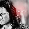
Miranda Otto: First thought that came to mind was blurry.
Pirate Dedication: Very nice blend! I've no problem with this one.
Evenstar: Hmm, a nice layout of the pictures and how faded which one is. I like how it gets more faded as it goes right.
Very unique.
Arwen Undomiel: I've definitely seen this one. Very sparkly, and surprisingly the diagonal white lines works with the banner.
To Be Continued....


