|
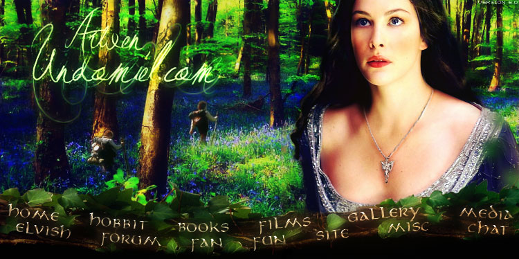
This banner tutorial is primarily for Paint Shop Pro users. It is meant to be used after mastering the basics (it's not going to tell you how to do every single step). Hopefully it will introduce you to new ways of making banners or new effects! You will need:
Open up a blank 700x150 rectangle. Resize the Aragorn picture to 600 px wide (keep aspect ratio!). Copy it into the blank banner, to the right side - make the window cross-bar to the upper right of Aragorn's face lead directly into the top right corner of the banner; the distance from Aragorn's eyes to the top of the banner and the distance from his mouth to the bottom should be about equal. Promote it to a layer. Mirror your Arwen image, resize to 500 px wide and sharpen it once. Copy it into the banner, keeping in mind the same eyes/mouth distance part. Make the strand of hair on the left lead directly into the bottom left corner of the banner. Promote the picture and set the layer blend mode to Darken. Click on the Aragorn layer. Go back to your original albeit resized picture of Aragorn. Crop out an approximately 120px wide section of the absolute left of the picture (use the whole height). Copy it onto the banner (remember, your Aragorn layer is selected!) and onto the left part - the part where the white of the Arwen picture is showing. Let the bottom part of your cropped-Aragorn bit show (the darker part). At this point, your work should look close to this. Right-click your cropped bit to lock it in. Take your eraser, set it to 100 opacity and 255 size, and erase the left bit so that Arwen's face is clear but her hair still has that blue-ish window background. Select Layer 1, go to fill, and fill it with a color close to 445455. Erase the part around Arwen's face. Click on the Aragorn layer again and erase right around the right edge of Arwen's hair, just enough so that the outline of her hair is now visible. Sharpen your Aragorn layer once. Go back to your Arwen layer. Adjust the color balance to something close to 21, 67, 100. Clarify it (Effects >> Enhance Photo) set on 5. Sharpen it again. Clarify it on 5 again. Gamma Correct it to 0.76. Merge the layers! Open up the Virtual Photographer plugin and go to the Romance preset. However, select Green Punch for the photographic style, and drag the slider all the way to the right. Repeat this effect. Duplicate the layer, go to the layer properties, and set it to Soft Light. Give it a Gaussian Blur of 3.00. Duplicate this layer. Merge everything. Copy the first texture on top, promote to a layer, make it into a negative, and set the layer properties to Exclusion. Gamma Correct it to .50, and color correct it to -29, -19, 100. Merge layers. Repeat the Virtual Photographer step you performed earlier, with the same settings. Copy the second texture on top, placing it so the yellowish part is just about in the middle of the banner. Set the layer properties blend mode to Screen. Merge layers, and adjust the color balance to 100, 10, 17. Go to Virtual Photographer and select the preset Disposable. Set the film speed to 25 ASA and set the slider all the way to the left. Use this effect three times, including the first time. This is your final base banner! By now you should have something looking like this. It's now time to add text. You can add whatever you want, of course, but here's the tutorial example. Start with an italic S in font Minster No 5, size 60, color white. Set it so the tail of the S is about equal distance from the right side of Arwen's face and the bottom of the banner. Write "tar-crossed" ("Star-crossed" without the capital S) in Zapfino, size 48. Zapfino does not include a hyphen, so use Sheer Beauty for the hyphen, same size. Make sure it's not written in italics. These two pieces of text ("S" and "tar-crossed") should be separate layers. Set both to an opacity of 10 and set the layer blend mode to Dodge. Tada! You're done. The faded look of the banner is intentional; however, if you desire a more contrasted look, duplicate the layer, set the blend mode to Overlay and the opacity to 50, and give it a Gaussian Blur of 5.00. The faded result should look like this; the contrasted version should look like this. Hope you enjoyed this! Keep in mind that if some steps seemed out of order or repetitious or badly organized, it's because I wrote this tutorial as I was making the banner, recording each step as I tried it, and I can't plan out how I'll make the banner in the beginning. In fact, I had no idea what I wanted the final banner to look like when I started, so that's why the tutorial veers off in several directions. |