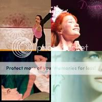
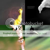
1st place: 2
2nd place: 7
3rd place: 10
4th place: 5
Honorable mention: 4
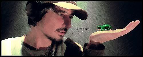
One thing I noticed with several of the entries, is that even though there's plenty of negative space, it's just kind of...
there. It doesn't really do much for the graphic one way or the other. My only advice would be to try to pick an image(s) and text that work more
with the shape you're using, instead of around it or against it, or even acting like the two have nothing to do with each other.
... that probably doesn't make much sense, does it?

Well, if it does, than good, I hope it helps and doesn't discourage anyone (this isn't meant to be a put-down!). And kudos to Aliana Fae for picking such an interesting subject. ^.^


")


")


 )
)
