| Author |
Message |
|
|
Post subject: Penicil Art  Posted: Posted: November 11th, 2005, 1:59 am |
|
|
Jo |
| Moderator |
 |
 |
Joined: 03 June 2005
Posts: 1302

|
I'm not great with pixel art but I'm pretty good handling a pencil, I'd like to see other forum members art, I'd prefer to see non-LOTR based art (I know there are many obsessed with LOTR but just this once, lets have a break)


Your turn.
_________________
We're one world, one people weather we like it or not.. we can pretend we're divided into races and countries.. But the reality is that it is one world and it is one people.
|
|
| Top |
|
 |
|
|
Post subject: Posted: November 11th, 2005, 3:59 am |
|
Joined: 05 June 2005
Posts: 488
Location: Puerto Rico
|
|
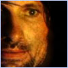
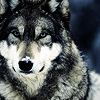
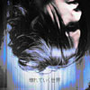
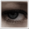
Well here's a few of my non-LotR ones, the first one's one of my favorites.
<img src="http://tinypic.com/fkwcgh.jpg" alt="Image hosted by TinyPic.com">
<img src="http://tinypic.com/fkwchh.jpg" alt="Image hosted by TinyPic.com">
<img src="http://tinypic.com/fkwciq.jpg" alt="Image hosted by TinyPic.com">
<img src="http://tinypic.com/fkwcat.jpg" alt="Image hosted by TinyPic.com">
_________________ 
|
|
| Top |
|
|
|
|
Post subject: Posted: November 12th, 2005, 7:25 pm |
|
Joined: 03 July 2005
Posts: 9846
Location: city that never sleeps
|
|
no way, you drew that? can I have your autograph?
_________________ 
|
|
| Top |
|
|
|
|
Post subject: Posted: November 12th, 2005, 9:30 pm |
|
Joined: 28 June 2005
Posts: 2310
Location: USA
|
^Love this one! I like how you did her dress.

^Are you kidding me? Are you sure it's not a photograph? Give me an autograph too!! 
_________________
<center>
<a href="http://raindrops.lemon-drop.net/">Between the Rain Drops</a>
[ + @ # ? : ]
|
|
| Top |
|
|
|
|
Post subject: Posted: November 13th, 2005, 12:44 am |
|
Joined: 04 June 2005
Posts: 1519
Location: Pemberly mansion : )
|
|
Those are amazing!!!
_________________ ~*~Mrs. Darcy~*~ 
|
|
| Top |
|
|
|
|
Post subject: Posted: November 13th, 2005, 12:13 pm |
|
Joined: 05 June 2005
Posts: 488
Location: Puerto Rico
|
|
Wow thanks for the comments. BTW Eruanna, the bottom one's amazing, well they both are, but I really like that one.
_________________
|
|
| Top |
|
|
|
|
Post subject: Posted: November 13th, 2005, 6:59 pm |
|
|
Jo |
| Moderator |
|
|
Joined: 03 June 2005
Posts: 1302
|
thanks
Dp you have an account at deviant art? if you dont already you really should get one
_________________
We're one world, one people weather we like it or not.. we can pretend we're divided into races and countries.. But the reality is that it is one world and it is one people.
|
|
| Top |
|
|
|
|
Post subject: Posted: November 18th, 2005, 9:45 pm |
|
Joined: 06 May 2005
Posts: 15181
Location: Minas Morgul
|
Eruanna: Absolutely beautiful pictures!! What kind of tools did you use? To color it? One tiny critique is that I think your main focus should proportions between body parts. The size of the body parts sometimes don't work well with other parts of the body. Sorry if it seems rude! Kudos though!
Eruadan wrote: Well here's a few of my non-LotR ones, the first one's one of my favorites.
<img src="http://tinypic.com/fkwcgh.jpg" alt="Image hosted by TinyPic.com"> And no doubt mine as well! I adore Hector from the movie TROY! And you did excellently with the pencil work and shading on the hair! What beautifully done curls! I think I've fallen in love with Hector all over again because of this! Quote: <img src="http://tinypic.com/fkwchh.jpg" alt="Image hosted by TinyPic.com"> You did excellently in this as well! I'm curious as to how you achieved the value that dark around the image. The blending of the shades could be smoother or the pencil shading could be done a little bit lighter.... Quote: <img src="http://tinypic.com/fkwciq.jpg" alt="Image hosted by TinyPic.com"> Awesome picture! I wonder if his hair would really look that sharp if his mask is pulled off.... If it could, I need his shampoo brand! Oh, I'm teasing! I think you did this picture well, and how long did it take you to make those webs?! I think, you could add a bit of background to it though, to make the web and the whiteness of his face stand out a bit, I think maybe add a value just enough so that they stand out. Quote: <img src="http://tinypic.com/fkwcat.jpg" alt="Image hosted by TinyPic.com">
Okay, this picture is simple and lovely, though I'm quite jealous of how you drew the flowers.! My only thing is that there should be a background especially for this picture because of the whiteness of her hair and of her face and of everything! It'll help put a definite shape around her face and make her hair stand out more if there's a valued background in there.
Both: Do you guys sign your pictures? I think you should! These are amazing!
_________________
<center>
THE HALLOWFEST 2010
<a href="http://www.arwen-undomiel.com/forum/viewtopic.php?t=20958">information here</a>
</center>
|
|
| Top |
|
|
|
|
Post subject: Posted: November 19th, 2005, 11:48 am |
|
Joined: 05 June 2005
Posts: 488
Location: Puerto Rico
|
|
Thanks Kitoky, the Hector one's a usual favorite and one of my best. About the PotC one, the dark area around it is an 8B pencil, probably the darkest one available, it's almost pure graphite, VERY DARK, VERY MESSY. This drawing's relatively old, probably one of my first ones, when I didn't know a whole lot about blending and shadowing. The thing is they've been sprayed with fixative so I can't do a lot to fix that one. The bottom two, I have been meaning to work in backgrounds, just trying to find in the proper ones. The Spider-man one, I've found a cool night city shot that goes great with it so hopefully I'll get to show you a new version soon! I did want to show a more recent drawing, still not finished, but almost and its turning out quite nicely. It's a LotR image, and I know we were supposed to be showing non-LotR images, but its the only one Arwen doesn't have from me in the Fan Art page for this site and I wanted to get your opinions. Remember its not finished yet, but hit me with your best critique!!
<img src="http://tinypic.com/fvv76f.jpg" alt="Image hosted by TinyPic.com">
And to Eruanna: I didn't have a DeviantArt account, but I got one, and got a bunch of my stuff submitted!!!! I use the same username so you can find it quite easily. Do you have one too?
_________________
|
|
| Top |
|
|
|
|
Post subject: Posted: November 19th, 2005, 1:40 pm |
|
Joined: 30 October 2005
Posts: 5188
Location: 'Dance like flame cuase theres no gravity, and now I am just a candle trying to stay lit...
Country: ")
Gender: Female
|
|
WOW!! !I wish I could draw like that
_________________
New Account: Khaleesi
|
|
| Top |
|
|
|
|
Post subject: Posted: November 19th, 2005, 3:15 pm |
|
Joined: 06 May 2005
Posts: 15181
Location: Minas Morgul
|
|
Eruadan: How on earth are you doing the hair?!
I think there should be a big more of a definitely value shaping where they kiss. That's my only critique sadly! So live with it!
_________________
<center>
THE HALLOWFEST 2010
<a href="http://www.arwen-undomiel.com/forum/viewtopic.php?t=20958">information here</a>
</center>
|
|
| Top |
|
|
|
|
Post subject: Posted: November 19th, 2005, 4:56 pm |
|
Joined: 05 June 2005
Posts: 488
Location: Puerto Rico
|
Kitoky wrote: Eruadan: How on earth are you doing the hair?! *sighs* Alas the hair, doesn't it look nice? The hair actually takes the longest, and there's quite a few layers involved to get it to look like that. First of all, you need to define the highlights (by highlights I mean where the light strikes). That shade goes first, and you draw all the hair with that shade.... every.....single.....strand...., then you'll start adding the darker tones at the ends, leaving the highlights untouched. It also helps to draw continuous long lines, since each hair is a single line, not one line that stops halfway and starts again at the same point. This will help it look like it flows, really helpful with long hair. Kitoky wrote: I think there should be a big more of a definitely value shaping where they kiss. That's my only critique sadly! So live with it!
Aaaarrgh!!! I know, and the worse part is, that it's all up to my talent to figure it out cuz the definition in the pic Im using sucks. The thing with kisses is you try to define as much as you have to and not a little more, because if it looks bad, it'll look unrealistic and will draw attention away from the drawing, but I'll let you know how it turns out! _________________
|
|
| Top |
|
|
|
|
Post subject: Posted: November 19th, 2005, 6:50 pm |
|
Joined: 21 June 2005
Posts: 1597
Location: D-Town!!! (detroit MI)
|
|
*stares with mouth open* I am in shock. I can only draw smilee faces! And little cartoon flowers. Oh exept I am amazingly good at stick figures! lol. I am shocked! i am very jealous! I want to draw like that!
_________________ 
Missing Charlie already!
|
|
| Top |
|
|
|
|
Post subject: Posted: November 19th, 2005, 7:50 pm |
|
Joined: 06 May 2005
Posts: 15181
Location: Minas Morgul
|
Eruadan wrote: Kitoky wrote: Eruadan: How on earth are you doing the hair?! *sighs* Alas the hair, doesn't it look nice? The hair actually takes the longest, and there's quite a few layers involved to get it to look like that. First of all, you need to define the highlights (by highlights I mean where the light strikes). That shade goes first, and you draw all the hair with that shade.... every.....single.....strand...., then you'll start adding the darker tones at the ends, leaving the highlights untouched. It also helps to draw continuous long lines, since each hair is a single line, not one line that stops halfway and starts again at the same point. This will help it look like it flows, really helpful with long hair. So....When you pass over the highlights, you're not actually stopping the stride of the pencil? You're just not using pressure? Eruadan wrote: Kitoky wrote: I think there should be a big more of a definitely value shaping where they kiss. That's my only critique sadly! So live with it! Aaaarrgh!!! I know, and the worse part is, that it's all up to my talent to figure it out cuz the definition in the pic Im using sucks. The thing with kisses is you try to define as much as you have to and not a little more, because if it looks bad, it'll look unrealistic and will draw attention away from the drawing, but I'll let you know how it turns out! Well, I don't know...It's your drawing....it just seems like their lips are just smushed together and are one...of course they are but I don't mean like that....It seems like they're morphed together, y'know what I mean?
But I really love all the details, the flowers on Aragorn's mantle, the curves and strides of his armor, and his ring even! Gorgeous detail!
_________________
<center>
THE HALLOWFEST 2010
<a href="http://www.arwen-undomiel.com/forum/viewtopic.php?t=20958">information here</a>
</center>
|
|
| Top |
|
|
|
|
Post subject: Posted: November 19th, 2005, 10:49 pm |
|
Joined: 05 June 2005
Posts: 488
Location: Puerto Rico
|
_________________
|
|
| Top |
|
|
|
|
Post subject: Posted: November 20th, 2005, 5:26 pm |
|
Joined: 06 May 2005
Posts: 15181
Location: Minas Morgul
|
|
I do draw --- though it's mainly of anime. Those Japanese style artwork. But I am taking a Draw/Design I class in school and so far, we've only done projects of objects. We're doing a self-portrait project right now.
_________________
<center>
THE HALLOWFEST 2010
<a href="http://www.arwen-undomiel.com/forum/viewtopic.php?t=20958">information here</a>
</center>
|
|
| Top |
|
|
Who is online |
Users browsing this forum: No registered users and 10 guests |
|
You cannot post new topics in this forum
You cannot reply to topics in this forum
You cannot edit your posts in this forum
You cannot delete your posts in this forum
You cannot post attachments in this forum
|
Powered by phpBB © 2000, 2002, 2005, 2007 phpBB Group
Boyz theme by Zarron Media 2003
|
|