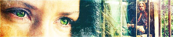
Arwen blend-It's really good overall. But there are a few minor things I thought I could mention...the main picture is a little too blurred, and the pictures in the background seem a bit too faded...and I can't really see the pictures. Also, in the bottom right corner, there are some lines running through that pic of Arwen...was it possible to get rid of it, or was it just the picture? And maybe you could center the text a little...but this is a really good blend!
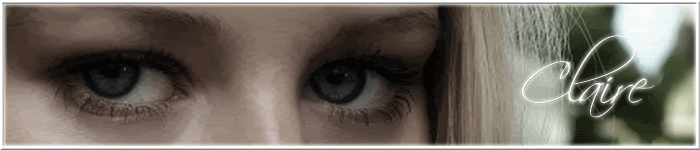
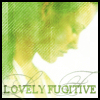
Eowyn blend-Really nice! But the picture on the right seems a little out of balance...maybe you could move it up a little. And also, you might try setting the color balance to the same level for all of the pictures except the main one...the main picture should be brighter and clearer than the rest. And the text doesn't seem to fit too well with the blend...maybe you could try making it clearer and maybe have it glow a little so it's simaler to the color in the background? Sorry, I don't use PSP so I can't give you any suggestions...

This blend is really pretty!
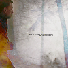
Aragorn blend-This is the best out of all of them! The pictures fit together, and they are really well blended. Again, maybe you could un blur the main picture of Aragorn, and is it possible to make the green in the background brighter? Also, I think the top (the white part) should be cut off since it kind of dims the glowiness (:p) of the green. But this is really good!
They are really good, especially for a beginner! Just keep working at it, and try to add more effects, and you'll be on your way to making really good graphics!


 Blends are 800x600 and can double as wallpaper if your desktop is the same resolution.


 [/img][/i]


 Those are GREAT for your first blends! The only suggestion I have is to make them a little less blury (at least on the faces)