|
Page 1 of 1
|
[ 9 posts ] |
|
Author |
Message |
|
Post subject: Rate please and Opions Posted: January 18th, 2006, 12:08 am |
|
Joined: 30 October 2005 Posts: 5188 Location: 'Dance like flame cuase theres no gravity, and now I am just a candle trying to stay lit... Country:
Gender: Female
|
Hey I made a new banner, thanks A-u.com for the pictures and inspiration to make this banner. I would like Opions, and suggestions. If you guys dont mind.

_________________
New Account: Khaleesi
|
|
Top |
|
 |
|
Post subject: Posted: January 18th, 2006, 12:23 am |
|
Joined: 06 May 2005 Posts: 15181 Location: Minas Morgul
|
I think it's nice. Though the I in Undomiel is a bit protruding into the second picture of Arwen.
_________________ <center>
THE HALLOWFEST 2010 <a href="http://www.arwen-undomiel.com/forum/viewtopic.php?t=20958">information here</a>
</center>
|
|
Top |
|
 |
|
Post subject: Posted: January 18th, 2006, 12:26 am |
|
Joined: 15 January 2006 Posts: 1543 Location: somewhere
|
very nice... i like! makes me want to cry though... oooh i just realised that this post makes me a dwarf yay
_________________ <center>
Thinking of new sig set...
|
|
Top |
|
 |
|
Post subject: Posted: January 18th, 2006, 12:40 am |
|
Joined: 03 May 2005 Posts: 4717 Location: Middle-earth Country:
Gender: Female
|
I'd say 3.5, rounded to four. I love the colors and textures and blending, but the darkness of the text's shadow stands out a little too much, and I agree that the "i" on Arwen's face doesn't quite fit. Great job otherwise though!
_________________ 
|
|
Top |
|
 |
|
Post subject: Posted: January 18th, 2006, 2:12 am |
|
Joined: 30 October 2005 Posts: 5188 Location: 'Dance like flame cuase theres no gravity, and now I am just a candle trying to stay lit... Country:
Gender: Female
|
Thanks ill keep it in mind your suggestions next time I make a banner guys. 
_________________
New Account: Khaleesi
|
|
Top |
|
 |
|
Post subject: Posted: January 22nd, 2006, 8:23 am |
|
Joined: 01 January 2006 Posts: 517 Location: Helsinki
|
I like it  Nice and simple. Good job!
_________________ <center>  </center>
<center> Remember Cedric Diggory</center>
|
|
Top |
|
 |
|
Post subject: Posted: January 22nd, 2006, 3:52 pm |
|
Joined: 06 January 2006 Posts: 1036 Location: Battlestar Galactica
|
The color composition is nice! The text seems maybe a bit large and intrusive. Good job with the blending!
PS love your avvie
_________________
<center>Nothing but the Rain</center>
|
|
Top |
|
 |
|
Post subject: Posted: January 22nd, 2006, 11:10 pm |
|
Joined: 27 August 2005 Posts: 66 Location: Valimar
|
I gave it a 4 - I think it's great... better than I could do!! I also agree with Kitoky and Arwen the Webmistress about dotting your i's... if you move the pic of Arwen (right-side) a few centimetres to the left it would be perfect. Also I love the pic on the left side - awesome!!!
_________________ ~*Since the invention of the kiss, there have been five kisses that were rated the most passionate, the most pure... This one left them all behind.*~

|
|
Top |
|
 |
|
Post subject: Posted: January 23rd, 2006, 12:52 am |
|
Joined: 03 June 2005 Posts: 5602 Location: Canada Country:
|
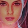
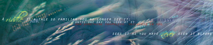
I gave it a 4 because I really like the colouring, texture, choice of pictures. The writing is really nice but it's too big I think, and like others have said looks strange covering her face. And like Varda said, the right pic of Arwen moved to the left a bit would make it perfect 
_________________ Proud Member of the The Evilishy Nazgûl Alliance for World Domination {Beri}
|
|
Top |
|
 |
|
Page 1 of 1
|
[ 9 posts ] |
|
Who is online |
Users browsing this forum: No registered users and 0 guests |
|
You cannot post new topics in this forum You cannot reply to topics in this forum You cannot edit your posts in this forum You cannot delete your posts in this forum You cannot post attachments in this forum
|
Powered by phpBB © 2000, 2002, 2005, 2007 phpBB Group
Boyz theme by Zarron Media 2003
|
|