PARTICIPANTS:
.*+Lúthien Star-Lover+*. >>
Entry
LOTRfreak13 >>
Entry
IdrilFalastari >>
Entry
Pandora >>
Entry
pirateoftherings >>
Entry
Haldir o Lórien >>
Entry
SuperGirl >>
Entry
<s>brego145</s>
Twippo >>
Entry
<s>alaithmindil</s>
Elvishmouse >>
Entry
Still Flying >>
Entry
ForeverFrodo >>
Entry
Elvishgirl >>
Entry
Lalaithmindil >>
Entry
Will >>
Entry
Nauriel Rochnur -
Entry
With Eruadan and Kitoky judging.
<center>++++++++++++++++++++++++++++</center>
[x] Awards made by Eruadan [x]
.
.
.
[Eruadan] We had a great time judging this contest, but it was also really hard. We realized it wouldn’t be fair to simply place you guys in 1st, 2nd, 3rd positions just because all your entries had very different styles and themes. So instead, we created categories and judged your entries according to those. Considering we’re both aspiring artists, Kitoky and I took the liberty of commenting on all entries just to let you guys know our thoughts on your work.
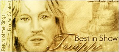
<i>Best in Show:</i> <b>Twippo</b>
[Eruadan] Best in Show simply gathers everything that makes a great overall entry. It’s clear that Twippo has skills, pulse with a pencil, and a strong technique, but he also showed he had a good eye for space and composition. The piece is well-balanced and you can’t deny that the likeness to David Wenham was achieved with simple but bold use of pencil. My only advice would be to keep an eye out for contrast. Many times when working with pencil, it’s easy to cover all the white areas without noticing, taking away your only source of “light.” In that case, it’s a good idea to add some darker shades to create contrasting areas, particularly when working with perspectives.
[Kitoky] No doubt Twippo shows a more sophisticated, classic art entry with his submission. Putting aside how well it was drawn, like Eru pointed out, we must take a nod to how much time went into the submission. I imagine Twippo only took 2 and a half weeks to work on his entry, maybe even less. I imagine Twippo probably worked on his entry for 4 or 5 hours a day, so it takes a lot of dedication to keep working on the entry. If it were me, it would take more to 2-5 months, at the least.
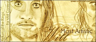
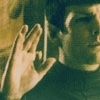
<i>Most Artistic:</i> <b>Will</b>
[Eruadan]I thought this one was particularly interesting and a close contender in other categories. Will’s drawing has definitely got the elements of an illustration, with the border, the text, the slight background and a very nice sketch of Aragorn. Even though the resemblance could use some work (only if you’re going for a Viggo-ish Aragorn), this was a very good piece.
[Kitoky] I can see the resemblance to movie-Aragorn, and I'll clap to that alone. Looking at Will's entry, it's like looking a graphic, only drawn, and there's something about that that amazes someone. The borders and the layout of the pictures are well done, the copying of (what looks like) Cezanne font in 'Aragorn' was well done and the elvish writing, though not original, added a charm.
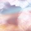
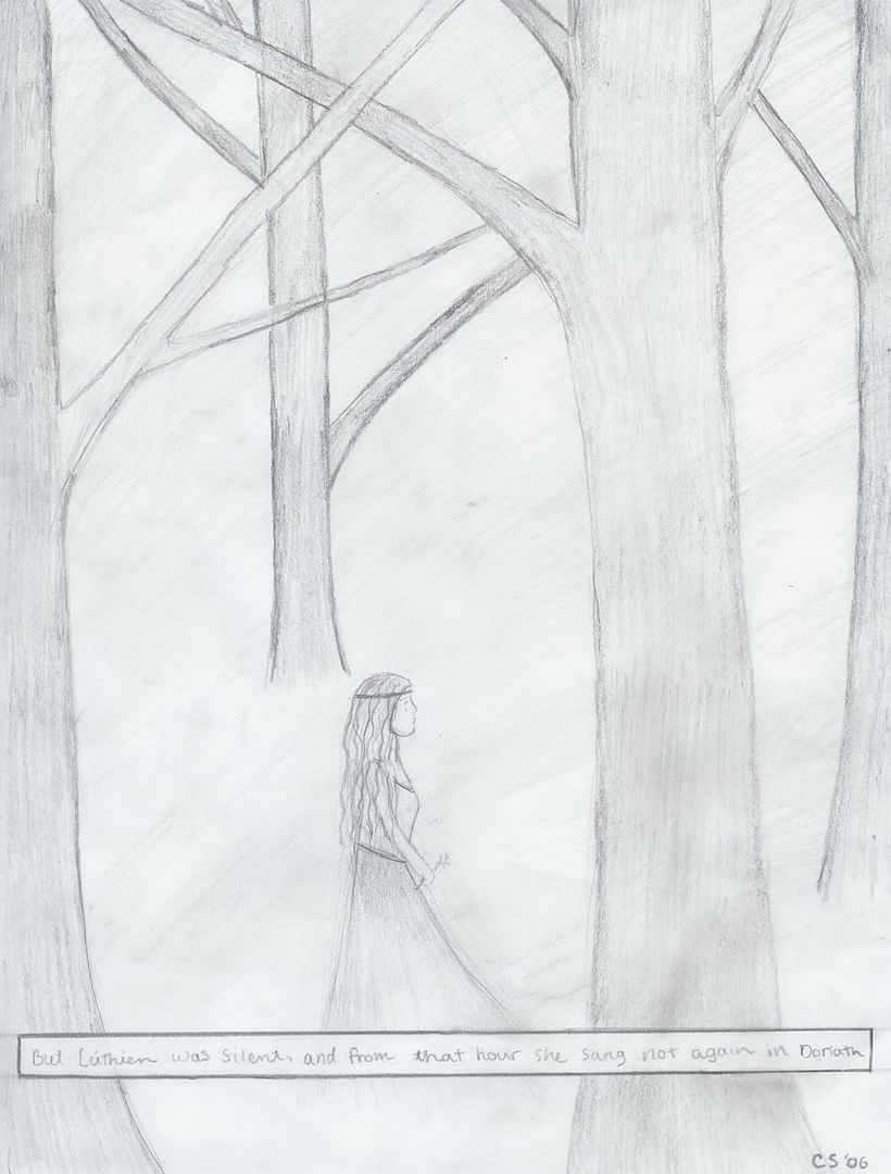
<b>.*+Lúthien Star-Lover+*.</b>
[Eruadan] Although I’m not a big fan of text on actual artwork, I really liked the line used in this piece. Overall it has very good composition and well-balanced, with Luthien being placed in the center and bottom, and the trees, some of them closer, some further. I would’ve worked a little bit more on detailing and improving the illusion of space.
[Kitoky] Agreeing with Eru, if your image does not need the whole paper, you don't really need to use the whole paper. Though, everyone knows, I am a fan of simplicity. The whole theme and the mood of the entry was touching, and the text added to the tone but this is an artwork contest, so I'm judging really more on art.
<b>LOTRfreak13</b>
[Eruadan] I work a lot with portraits so naturally I was attracted to this one as well as others. There’s definitely good line-work and that overall sketchy look which works great if you know where to emphasize. If you’d like to improve it a little, maybe strengthen certain lines and reconsider some of your angles.
[Kitoky] Line art is definitely a plus in this one, but it feels too plain. The portrait needed something, maybe color, maybe a bit of personality, a bit of something else but lines, angles, and curves.
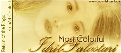
<i>Most Colorful:</i> <b>IdrilFalastari</b>
[Eruadan] This was a lovely entry. And I’m not just saying that because it was in color, because I’m the first one who fancies ink and graphite. These look like pastels or comte, I’m not sure, but I really enjoyed the overall feel of the texture in the material as well as the actual drawing. The eyes and the _expression were very well done and the hair also has that dreamy flowing look as if supernatural which is a strong element in Tolkien artwork, that whole feeling that we’re somewhere else when you look at it. Improving this particular piece would really depend on the direction you’re going for, whether it be an animated look, a realistic feel, or just a more abstract composition.
[Kitoky] On the other hand, I, being a huge fan of color (because I lack the skill to add color to my own artwork) this piece drew me the most, it reached out to me. The colors are very well blended, very smooth, elegant. Something I believe highly in is that the eyes are windows to the soul, and the eyes in this particular piece are extremely enchanting. And with a subject like Melian, you don't really have a reference to base it on besides the bare text from the books and that is, by itself, is amazing.
<b>Pandora</b>
[Eruadan] When I saw this, I thought of the artwork used in the DVD booklets and menus, which I love. It was that simplistic feel to it, crisp lines, etc. I’m assuming this was taken with a camera, not scanned, but the flash glare works great anyways; gives it that glowy look some people use to draw the elves. My only other comment would be that it looks a bit unfinished.
[Kitoky] I had hoped Pandora would've added something to it as well since, like Eru had said, looks unfinished. But I what I like about this entry is that it is her -perception- of Legolas. That means not influenced by the actor from the movies and that's important when reading the books. The way you imagine the characters does not have to always coincide with the image you see on the screen.
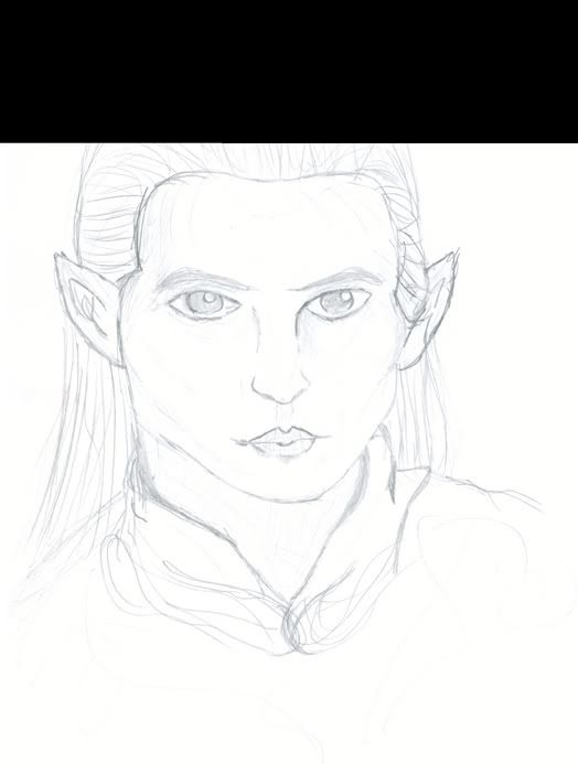
<b>Pirateoftherings</b>
[Eruadan] This is certainly a piece that draws attention. The colors and figure are strong and bold and it definitely is an attractive drawing. I thought the idea of the text overlaying across the head was an interesting concept, although I think it could’ve been a bit more developed. Watch out for solidifying areas with color, it makes them look flat and takes away from the artwork, unless your statement needs to say flat. It sounds weird but you get all sorts of weird comments like that in art school.
[Kitoky] It's really all about what you want the audience to get from your artwork. Very bright. The colors give it an edgy kind of feel. A dangerous, foreboding feeling.
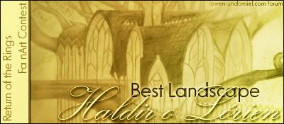
<i>Best Landscape:</i> <b>Haldir o Lórien</b>
[Eruadan] I really applaud your choice in deciding to portray one of Tolkien’s landscapes and architectural marvels. Even though this is based on the film’s portrayal of Lothlorien, actually on the Conceptual Artist’s view, I really thought this showed hard work and technique. My advice is to try and make it your own; copying is great practice for developing your hand, but giving it your own twist makes it unique.
[Kitoky] I agree with Eruadan's comments. Basing a work off of something is defined as fan art, but if you add something to it, it's your artwork. Not your fanart, but your artwork. This is really to congratulate on your precise lines and shading.
<b>SuperGirl</b>
[Eruadan] Old Man Willow!! This was a very close call and I definitely have to congratulate one of the few entries that elaborated something beyond the movies. I think you had a very good plan going using only selected colors on certain areas and leaving the white of the paper visible all over the paper. It’s actually a good technique when taken to its full extent. All in all, very good work.
[Kitoky] When you look closely at ths piece, you see three things. One; scribbles. Two; color. Three; charm. It just works. Even though the artwork itself is unsophisticated, it is so subtle that looking closely, you see what the artist sees, even in their head. I can look at this piece, and in my head, it starts fading into the actual setting it was based off of. The expression on Old Man Willow is probably my favorite thing about this entry. Out of the mystical rest of the entry, comes this pure expression of personality. It's what you want the audience to see. You want to show them the personality of the piece.
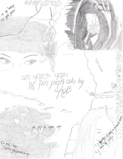
<b>Elvishmouse</b>
[Eruadan] At first I thought this was hard to read, composition-wise, but the more I looked at it, the more interesting I found it. I really liked the fact that you used the maps’ elements to complement your drawing.
[Kitoky] It's certainly very creative. With color, it could be a mural, and I like to think of it like that. It's a unfurnished mural. With maps, and odd pictures and different text.
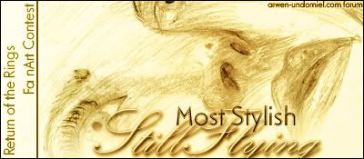
<i>Most Stylish:</i> <b>Still Flying</b>
[Eruadan] The thing that grabbed me the most was the angle of the face and the technique. The _expression alone speaks for itself which is why we thought it deserved an award.
[Kitoky] I just loved this piece because it's so unconventional. It's angled almost like a photograph and probably the most different of all the entries.
<b>ForeverFrodo</b>
[Eruadan] This was particularly funny. Now, I haven’t read through this thread so I don’t know your own descriptions of your work, but this looks like Math was particularly boring that day, which is great because I have sketches on all my notebooks so its cool that I’m not the only one who dozes off into Middle-earth from time to time. Very nice Frodo sketch.
[Kitoky] Even if Math -wasn't- boring that day, I would still sketch something, but nothing nearly as good as that in a boring day of Math. :}
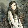
<b>Elvishgirl</b>
[Eruadan] This is an incredible Gollum drawing, the more I look at it, the more detail I see and the harder the judging in this contest got. I love the fact that you picked a character people usually don’t consider when doing original LotR artwork, even if Gollum is possibly the most famous Lord of the Rings character since the movies hit worldwide. Once again, very nice work.
[Kitoky] Personally, I see too much of this type of fanart of Gollum. Meaning, I keep seeing that same kind of reference picture in all fanart. It would've been nice to see a different angle of the Gollum character. Though I really like the graininess to this piece.
<b>Lalaithmindil</b>
[Eruadan] I thought this was a very nice idea, to use the song as part of the artwork, although I usually don’t like text in actual drawings, but that’s a personal thing. I wouldn’t have used the song as the central part of the composition though; it takes away from the piece. You look at it and the first thing that comes to mind is that you’re seeing a song lyric, not a drawing and your lovely sketches become decorations.
[Kitoky] What Eru said.
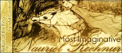
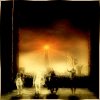
<i>Most Imaginative:</i> <b>Nauriel Rochnur</b>
[Eruadan] I love high contrasts, so this was also one that grabbed my eye. The simple idea that the horse and rider are lighting the forest as they go is just something that came popping in my mind as I stared at it. As said in a previous comment, it gives it that other-wordly feeling that just says Tokien on so many levels. I love the movement, the fluidity of the background, the position of the horse in mid-air. Very nice work.
[Kitoky] I agree with Eru. It says Tolkien. Just.... Tolkien and that's really all that matters.
<center>++++++++++++++++++++++++</center>
I know it was a long run guys --- but thanks for sticking it out with us and it was a GREAT contest!


 could I have about two weeks, maximum?
")
 about two weeks
")


