<b>My Comments:</b>
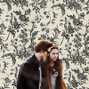
<b>Johnny's Fan:</b> As always I love Johnny's Fan's themes of a banner, usually a scene of sorts which tend to always be different from the other banners. This one particularly shows the pride and prejudice between Elizabeth and Mr. Darcy and it fits with the contest.

The set up of the banner is neat, Elizabeth on one side, Darcy on the other and their battle arena of a room of dancing people in the middle. The blending is beautifully done!
<b>Morwen Anduril:</b> This entry was just beyond cute. I love the relationship between Elizabeth and her eldest sister, Jane. The two of them have great sisterly love for one another and I think the whispered gossips portrays their close relationship well. The blending is very well done and the border/brushes and texture are LOVELY.
<b>Riniel Anariel:</b> Riniel's entry was VERY eye-catching because of it's vivid colors and great contrast, and it was beautifully done. Both blended-wise and her use of manipulating the color saturation and different layers was magnificent. The text could be a TINY bit more readable. I could tell it said "You have smitten me." but only barely. The dots along the banner is also very neat.
<b>Nurrantiel:</b> It's greatly blended, but it seems a bit too plain and overcrowded with so many pictures blended into one piece. But I'm not complaining much, there's no such thing as too much Mr. Darcy!
<b>Still Flying:</b> This one is one of my favorites because of it's simplicity. Using one picture and flipping it around to make a banner was clever and the pictures are just the most adorable things. Also very well blended, blending is hard when you're only work with one picture, flipped. Love it, love it, love it.
<b>Altariel Frodo:</b> Simple and bright. I love it. The faded "Pride and Prejudice" behind Darcy and Elizabeth was very well done, and I never realized that "Darcy and Elizabeth" have the SAME exact number of letters as "Pride and Prejudice". EXCELLENT WORK!
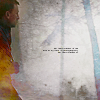
<b>No More Despair:</b> If this is one of your first banners, you did an excellent job on it. Though, it's best to explore the blending tool and to know how to add textures and stuff. I love the font though and how it overlays onto the background.
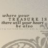
<b>Limwen - Villya:</b> Simple and with a nice theme. What more could I ask for?
Some of the color fills you did are neat and just the overall change of hue in the picture is very very well done.
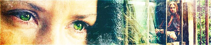
<b>Gilraen Ringeril:</b> Shows Elizabeth's great personality! Excellent work! I love the contrast, and the effects you put on it are awesome. The box brushes are also very cool. Beautiful!


 Wonderful entries everyone!
")


 Thanks guys!


")


