Please scroll down for the results of Round 13 and awards.
_______________________________________________________
Basic info -- recopied for reference.
+++++++++++++++++++
[x] Good day to all. This is a contest that which is very much different from all the other general contests. Only this contest, you have to be more creative with a limited amount of choices that are offered to you.
[x] The name of the game: As it is, it is called the Screencapture Contest, basically I will provide one or more screencaptures of various things. Whether it be Lord of the Rings, Harry Potter, a picture of a book, or a landscape capture. You will then use those screencaptures to make your graphic [avatar, banner, etc.].
Rules:
- You must
only use the screencaptures given to you.
- You must use them to make the required graphic (ie. Graphic: Avatar)
- Your entry must be a newly made entry. [Preferably with some kind of signature.]
- There will be no limit to participants, as long as his/her entry is entered by the date. Any entry given latter the date will be shown and recognized but will not be included in the judging (unless given a very good reason as to why you entered late).
[x] <i>Judging</i>: Judging the graphics will be up to other moderators and/or random members. However there will be no poll. I will survey individual people. There will be a 1st place, 2nd place, 3rd place, Honorable Mention, and Host's Choice.
[x] <i>Awards</i>: Will not be guranteed the best in the world. Recently, I've come to be making the awards myself --- but if I am way too busy to sit down and even get online, I will probably contact someone to make the awards for me --- if I do need someone to make them, I'll post a note about it and he/she can contact me. The first person to offers to make the awards, I will choose.
++++++++++++++++++++++++++++++++++
<center>
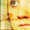
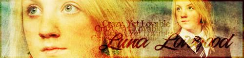
Screencapture Contest - Round 14</center>
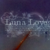
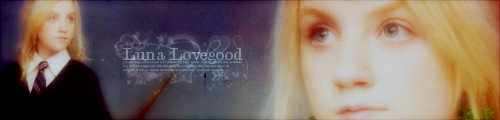
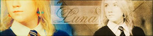
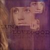
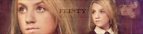
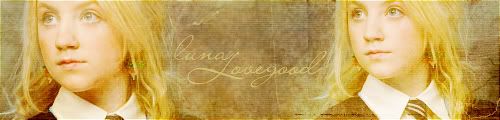
<center>
Theme: Luna Lovegood</center>
<center>
Graphic: Banner & Avatar (not of regular size, please check)</center>
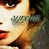
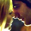
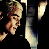
<i>Image:</i>
Removed for ending of contest.
 Notes:
---The rules above apply.
---You do not have to use all the pictures.
---The initial banner must be 500 x 120 pixels. The avatar must be 100 x 100 pixels.
---Anyone can enter (permission not needed). One entry per participant.
---Post the
LINK to your entry in your post. Try not to use the image tool.
---Entry is due by Friday, October 14th, 2006 at midnight, EST.
---Good luck and HAVE FUN!
I will use the first place winner's entry of this round as my signature/avatar for two weeks.
++++++++++++++++++
Members Entered:
[x] Gilraen Ringeril -
Avatar //
Banner
[x] IdrilFalastari -
Avatar //
Banner
[x] Limwen - Villya -
Avatar //
Banner
[x] Merry & Sam -
Avatar //
Banner
[x] Pandora -
Avatar //
Banner
[x] Bubble Black -
Avatar //
Banner
[x] Morwen Anduril -
Avatar //
Banner
[x] Riniel Anariel -
Avatar //
Banner
[x] Eldarwen -
Avatar //
Banner
Judges Signed Up:
[x] Mrs. Gamgee
[x] Johnny's Fan
[x] Luthien Star-Lover
[x] Beriadanwen
++++++++++++++++++
<center><i>The Screencapture Contest is proud to announce that it has reached its 1st anniversary. Last year on September 26, 2005, I started the Screencapture Contest in hopes to put more variety in the contest section, and I'm extremely glad/proud to see the SC Contest has lasted this long. I didn't really expect for it to, and I'm glad I could go through with the rounds of the contest. Through all the rounds there were participants, generous voters, and great amounts of support and appreciation throughout the process of the rounds and I believe that that is the key to a successful community. I thank you.</i></center>
<center><i>Notice the awards are cooler this round?

Happy anniversary!</i></center>
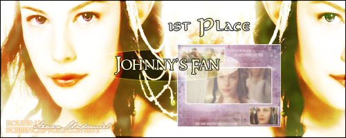
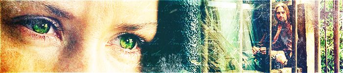
Awards/Results of Round 13 [Arwen Undomiel]
Our 1st Place goes to
Johnny's Fan!
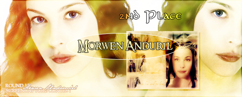
Our 2nd Place goes to
Morwen Anduril!
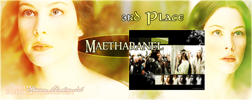
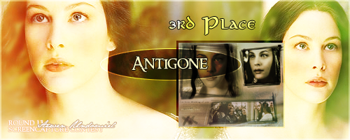
Our two TIED 3rd Places //
Maetharanel &
Antigone!
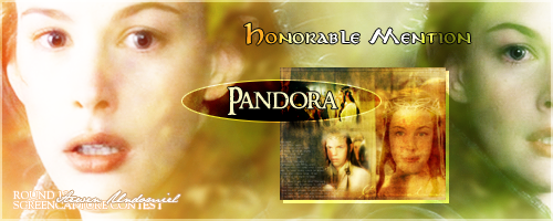
Our Honorable Mention is Pandora!
Last, but not least --- the Host's Choice goes to
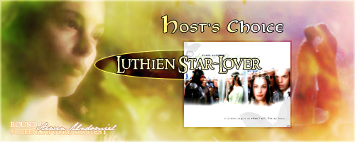
Luthien Star-Lover!
 P.S.
P.S. I made the awards again. Photobucket-hosted. If something's wrong, try again later.
P.P.S. I was thoroughly satisfied with this round!
Those who voted/judged:
1. Nurrantiel
2. Larael
3. ViviElessar
4. Scarlett Storm
5. Sam the Brave
6. ~RinielAranel~
7. Mrs.Gamgee
Comments:
Everyone:
"They were all spectacular and the sheer number of them was overwhelming. Congratulations to all for a job well done!" –Sam the Brave
"The blends this time are really good. There are quite a lot of "widescreen" designs but there is also a good mixture of really unique and creative blends. I'm glad the commentating is over!

" –Johnny's Fan
"I certainly can't say I'm disappointed this round, because there were a good number of entries [16, there were] for such a semi-popular graphic round, blends! The entries were absolutely beautiful and each had originality to it and their personal style." -Kitoky
Limwen - Villya
“The colors used are great and the text gives it a great look.” –ViviElessar
“The colours are stunning and the blending amazing though I think there is a little too much writing.” –Scarlett Storm
“The coloring is magnificent. Love the design. It is beautiful.” –Riniel Anariel
“I really like the peach/beige, it’s generally not a very easy color to actually get to work with graphics, I like the subtlety of the colors added and of the pictures them selves. It gives it a very memory/dream-like quality. Great job!!” –Mrs.Gamgee
“I really like the "parchment" colour for this. The blending is well done and the stars are a nice touch (although the ones on Arwen's face are a bit intrusive). The text is a bit hard to read but overall it is a very good blend.” –Johnny’s Fan
"This piece was just beautiful and so elegant, and it definitely made me feel like it was going to be a good round because to get the first entry and having it looking like that is just great! The actual text itself is beautiful and it fits, but a different font could've been used. With all the swirls and curls, it gets to look too clogged." - Kitoky
Caunion the Frost Lord
“Lovely colours but the text looks out of place.” –Scarlett Storm
“Love the color. Awesome design, great texture!! Awesome job!” –Riniel Anariel
“The texture looks really nice, and the pink colors make it look nice and blushy.
Good job.” –Mrs.Gamgee
“I love the background colours for this. I also like the background texture. The images are a nice choice as well. The "leafy" texture is nice but I a bit overpowering. The text is different to what others have used, but I think it stands out a little bit.” –Johnny’s Fan
"I definitely like the widescreen on this one, although pink is not my fondest color, it's blended nicely and it gives the blend a nice look. The texture is equally lovely!" -Kitoky
Thenidiel
“This one is very well made, simply stunning, the overall effect is extremely modern and well thought.” –Scarlett Storm
“Lovely entry. I really love the texture used. It is beautiful!! Great Job!” –Riniel Anariel
“The best thing about this is the colours! Great job with that and the texture as well, nice job blending too! You chose and placed the pictures nicely, as well. I like the text too, is that a song?” –Mrs.Gamgee
“The textures for this are really nice. I also like the way the pictures have been arranged. I would personally have liked to see less of the "whiteness" around the images but that's just me.  This is such a nice blend, I don't think any text was needed.” –Johnny’s Fan
"I love the texture and the style on this. The blending fits well with the texture and the graininess and the highlight of the text is beautifully done. The text itself --- it's a bit hard to read, but you can make it out with context. Beautiful!" -Kitoky
Luthien Star-Lover
“Very good, if not a little too sparse.” –Scarlett Storm
“I like the text the most. Beautiful piece. I like the different text sizes very cool.” –Riniel Anariel
“The set up was very nice, with the picture in the middle and the words on either side. It all looks very good when put together. Good work!” –Sam the Brave
“This one’s really nice. I like the white, it sets it apart, and gives it a simple air. I really like the glowy effect too, and the fading border, it gives it a very pretty look.” –Mrs.Gamgee
“This is nice and simple and very clear. Minimilist of the blend world. I like the images that have been used and the blending is excellent. I like the smaller text and the larger, faded text works well although it's very difficult to read, but I made a guess.
” –Johnny’s Fan
"I love, love, love, love, love, love this entry and I can't even reason out what I was doing when I skipped it in the voting queue. No, I didn't give LSL the award just because I felt guilty, I truly love this entry. It's simple, it's beautiful, and it portrays Arwen's character - simple, bright, and set on one choice -. The text, it may be overused or over-referenced but it just fits for the character. Bravo!" -Kitoky
Elenanna Lothendhel
“Very nice, this obviously has had a lot of work put into it.” –Scarlett Storm
“Beautiful color and great texture. I like the gradient you used also. Great Job!!” –Riniel Anariel
“I like how this one’s made up of mostly the pictures, and yet it’s not overdone. It’s a very simple blend, but great job with the actual blending and texture application.” –Mrs.Gamgee
“I like the colours used for this. the images are arranged differently, and the texture is nice. It's a shame there are so many spots (I presume for the texture?) as it spoils the overall look.” –Johnny’s Fan
"Very simple, nicely blended, nice style --- might've used a bit of color and maybe texture, the shadows are a bit too overdone, but otherwise, very nice." -Kitoky
Pandora
“I love the almost rustic feel that Pan gave to this blend. She blended it perfectly together to create a different look. The texture also gives it a good look, and feeling that makes you want to reach out and touch it.” –Larael
“The texture gives it an 'old look' which is great. The colors used are very pretty.” –ViviElessar
“Over all effect good but the lines are quite daunting.” –Scarlett Storm
“I love all of your work. I really loved this piece, except there is a little too much something over her face. I just love it though!!! Other than that it is beautiful!!” –Riniel Anariel
“First thing noticed was the texture, great job with that!! I actually really like the layout of this picture, and the little border given to it. It’s simple and yet has a lot to it, nice work!!” –Mrs.Gamgee
“I like the images that have been used and the way they have been arranged. The textures are very nic but there are way too many over the larger Arwen image. I think erasing some of the texture would have worked better. The text is good and works well.” –Johnny’s Fan
"I thoroughly agree with Larael's comment. I love the rustic feel and the grainy text to the side added to it. Very unconventional, but beautiful." -Kitoky
Enedlhach
“Very simple! Simple is good.” –Nurrantiel
“Very good and different.” –Scarlett Storm
“I really liked how you sort of differentiated yourself from the rest by doing a B&W. It looks great. It's got a nice feel to it. Very Nice Job!!” –Riniel Anariel
“The coolest thing about this picture is the picture on the right, I like how you did the lighting and that cool effect on the side and on the picture, looks awesome, with the words too. You did this VERY well for black and white, and it’s a really nice blend in general.” –Mrs.Gamgee
“This is unusual blend. I like the fact that it's black and white and the way the images have been erased makes it look very different. I think the squares could do with being erased a little, as they are abit overpowering. The text is nice and neat and suits the blend.” –Johnny’s Fan
"Simple, elegant, love the black and white tint to it. You did a lot of kinda neat tricks to it. I think the image on the right should be a bit clearer though under the whole patterns and grids." -Kitoky
Altariel Frodo
“I like the background and colours, especially the border.” –Scarlett Storm
“You did something different with yours too. I love it. It's bright and beautiful!! Great Job!” –Riniel Anariel
“Nice job with the stars and the purple, the blending of the pictures in the background is very well done, the subtlety of the Aragorn/Arwen picture there is very pretty.” –Mrs.Gamgee
“Purple! Woo hoo! I really love the colour as it is so different. The background images look great and contrast really well with the ful colour image. The stars are nice, although they are a bit big and stand out a little more then needed. The text is good but it could probably have been a bit smaller.” –Johnny’s Fan
"What I like about this one is the mix of colors. You have Arwen's eyes, and the purple background faded background with more blends. That is VERY neat. And I'll give you props to that alone." -Kitoky
Morwen Anduril
“Again there's a sort of clip by clip things going on here. I really like this idea, and I think she used it very well. Lovely colour theme, overall a great job!” –Larael
“I love the sharpness and the texture used It looks great.” – ViviElessar
“I like it but its quite sparse in the middle.” –Scarlett Storm
“Just beautifully done!! I love the feel, the texture, the color. Just everything about it!! Beautifully Done!!” –Riniel Anariel
“The arrangement is wonderful, paired with the texture and color. The text is well done and placed. I loved the way that you were slowly moving the focus towards arwen in the repeated picture on the side. Well done!” –Sam the Brave
“WOW! Definitely very nice! There’s a lot of elements in this picture that I really enjoy! First of all, that picture on the left, that fades color and get smaller as it goes down, looks REALLY cool, I don’t think I’ve ever seen it done that way before, so many kudos. On the main picture on the left, I really like it because of the colors you have on there, on the whole thing too, colour is always a big thing with me. Great great job with the texture, colours, and brushes, simply fantastic!” –Mrs.Gamgee
“This is great. I love the colours and the texture. The images are really well blended and I love the way the images on the left, "lose" more of themselves the futher down they are. That's is very unique and really artisitic.” –Johnny’s Fan
"I like the different positions of the pictures, great use of screencaptures! The texture fits perfectly and the text, perfectly place. What can I say? It's perfect!" -Kitoky
Antigone
“The dark color was very different, I liked the "scrapbook-y" look to it too.” –Nurrantiel
“I love the way her eyes look and the colors used. Also the brushes are great.” –ViviElessar
“One of my favourites, very well done!” –Scarlett Storm
“Beautiful and dark!! Awesome job!! I love the way you used the brushes. Great text, I love the design. Beautiful!!” –Riniel Anariel
“Very nice, especially the texture in the background, and the cool sketchy looking brushes, very cool! I really like that corner with the text, I don’t know why, but it’s an attention grabber with all those little words
lol. The brushes you used are definitely ace, and I like how you changed the lighting, especially on the top right picture. I also like the simple little texture you added on the top left picture, it’s really cool looking. Great work!” –Mrs.Gamgee
“This is really nice. I love everything about this blend, the textures, the brushes and the images. It's a really creative piece and the text is also a nice touch.” –Johnny’s Fan
"This entry is most likely the most DIFFERENT of all the entries --- very dark, grey, a different set of colors that you refer to when thinking of very negative things but it's a nice touch, the brushes beautiful, the borders for images, very stylish. I love that -- and I noticed that the most out of the blend." -Kitoky
Princess of Ithilien
“Nice colour scheme, though needs more originality.” –Scarlett Storm
“Lovely color, great design. Beautifully Done!!” –Riniel Anariel
“Nice job with the blending, and lighting, and the colours look very pretty too! So do the brushes on the side, I don’t think I’ve seen those before.” –Mrs.Gamgee
“The colours on this are nice (if a bit bright). the images have been blended well. The text is hard to read and the little swirly brushes on the left, are distracting, but it's a nice looking blend.” –Johnny’s Fan
"The Elvish! I expected someone to put elvish in the earlier entries, but I guess not. Well, a nod to you for being the first to ad elvish! I like the little decorations on the side and the blending of the image of Aragorn and Arwen in between the gap of Arwen and the flag." -Kitoky
LOTRfreak13
“The idea of having Elrond as a prominent person was interesting! It definitely gave a different feel to the wallpaper.” –Nurrantiel
“A very different approach, very nice!” –Scarlett Storm
“I really liked this one, A LOT!! This was my pick for first. I just love the coloring! It is so different from the rest. It's darker and more grungy looking. I love the texture and brushes you used. Great Job!!” –Riniel Anariel
“Certainly different, but in a great way! The pictures look SO awesome, especially that Elrond head, I don’t know how you did it but the texture looks fantastic!! (on all of them of course, but his head’s the best)
I just don’t know what else to say, in all it’s simplicity the colours look so complex and great! I guess you should take that as a compliment. Lol. Kudos!!” –Mrs.Gamgee
“I like the fact there are lots of images in this blend. And the colours are really nice and very different. The textures are good too but I think the grainy look is a bit too much in some areas.” –Johnny’s Fan
"I take it back, I think this is the most different. The first thing I thought when I saw this entry was "Woah! Emo!" But I doubt it's emo-based. I like all the contrast, bright colors of the rainbow. The way the images are blended are REALLY neat and very well set up. I love it!" -Kitoky
Riniel Anariel
“Very nice, love the text.” –Scarlett Storm
“The blending and texturizing was very well done and measured out. It came together well to make a lovely entry. The arrangement is well done also. Great job!” –Sam the Brave
“Wow wow wow, RA, this one’s great!! I really like this main colour that you chose. The lighting, texture, contrast, (especially the texture, ) all look so great. I just don’t know how else to tell you. And that bar thing that says “Arwen…” on it, looks really awesome. And sorry to reiterate, but the texture and colour, just looks so perfect! I especially like how the colours reflect off of her crown in the main picture. Great great job.” –Mrs.Gamgee
“This is really nice. I love the colours, the texture, the images that have been used and the way the images have been blended. The text is nicely presented as well.” –Johnny’s Fan
"This is another kind of rustic one. The font is lovely and the bits of elvish writing along the borders are such a nice touch and I think everyone overlooked that. It's brilliantly done like all of Riniel Anariel's works." -Kitoky
Tinnuhiriel
“Nice, but unfortunately, I think it’s lacking in something.” –Scarlett Storm
“Beautiful. Bright. Gorgeous. You did such an awesome job on this one. Great job!!” –Riniel Anariel
“The flowery background is very pretty, and so is the color. The purpley pastel shade goes really well with her complexion and the pastel colour of her dress. The squarey-ish texture also gives it a little touch. Kudos!” –Mrs.Gamgee
“This is a very pretty blend. It's nice and simple but it looks good. The colours are very nice and the textures work really well. The brushes are nice as well.” –Johnny’s Fan
"I love this one because it's simple and beautiful, I like how she glows and her eyes stand out in both images. Very simple, very elegant." -Kitoky
Johnny's Fan
“I love the blending. The softness of it is just so pretty. This also had the "scrapbook-y" look - I really like that.” –Nurrantiel
“Nice, very nice! Oh yeah...I forgot....NICE!” –Scarlett Storm
“As always JF you never cease to amaze. It is perfect!! I love everything about it. Texture, color, brushes, use of brushes, etc... Brilliantly Done!!!!!” –Riniel Anariel
“Your blend is breathtaking. I completely envy your amazing talents. I do believe I read that you had over 40 layers...and it looks outstanding. You put a lot of work into this, and it really shows Keep up the great work!” –Sam the Brave
“Wow JF! The first thing I noticed was the background. The textures and brushes on it are very pretty and Arwen-like, and the varying shades of purple looks really great! I really like how all the pictures seem faded and the fade into the background and seem very dream-like. Once again, great job with the colour, and brushes, and I very much like the layout and placement of this graphic, and the text is simple and cute. Very nice work, here!!” –Mrs.Gamgee
“This is really, REALLY nice...oh..yeah..it's me..*ahem*...” –Johnny’s Fan [Kitoky: LOL!]
"I love this one to pieces. It's so BEAUTIFUL. It's like a misty kinda look, like a memory --- and the lyrics are just wonderful that you just want to cry. Very romantic, very beautiful. The images themselves are beautiful but the real attention it calls for are the brushes and the embossed borders. Beautiful!" -Kitoky
Maetharanel
“I like this one because it's so modern looking, not too soft, but not too sharp either. I also like how the pics on the bottom fade into black and white, that's a nice touch which sets it apart.” –Larael
“Very very good, very very pleasing to the eye.” –Scarlett Storm
“I really, really adore this piece you made. It's simple yet elegant. I like the shapes you used. Beautiful!!!!!!!!” –Riniel Anariel
“Your eloquent simplicity always does the trick. As usual, this graphic is pure eye candy. I really like those three color squares, (besides the fact that those are just pretty colors) they seem to make a sort of a palette and base for the rest of the picture. The fading picture of Arwen is quite beauteous, and well done. And those two flower brushes simply seem to do the trick! That little brush on the side of the main picture looks cool on the elf’s tunic, all I can say is wonderful job, Mae. Great.” –Mrs.Gamgee
“This is very nice. I love the textures, the images, the brushes. The black background really makes the images stand out. It's a lovely simple blend but very striking.” –Johnny’s Fan
"There's so much clarity to this blend. The strip at the bottom is beautiful with the different levels of saturation and cropping. The brushes at the corners and edges are a nice add and I love how every image has perfect clarity even through all the photoshopping it probably went through. Beautiful!" -Kitoky
++++++++++++++++++
Thanks for participating!
-[kitoky]


")
 Thank you so much for the wonderful commments peeps, and the beautiful award Kit, I really appreciate it. 1st place, wow.


")

")

")