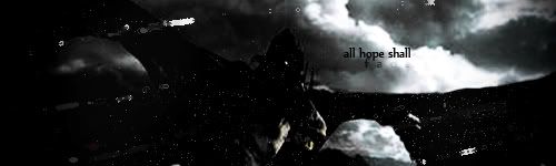
A: 4--I love how you moved away from blue to give us a different take on this scene
B: 5--one of my favorite scenes and I like the misty feel to it
C: 4--I really like the coloring and the "flatness"
D: 4--Oooh, nice. I like the coloring and the second picture
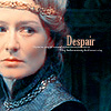
E: 3--I like seeing someone other than Eowyn for 'E' and this was a loverly graphic. I like the subtlety of the text
F: 5--Beautiful. Interesting cropping and I like the sideways text
G: 3--I like the blurry background with the inset of Gandalf's face.
H: 5--Aww, another favorite scene. And love the inset of Faramir and the overall dreamy feel.

I: 4--Very unusual and eyecatching. I like the unity of the text and the graphic
J: 4--Neat cropping, nice text and interesting coloring.
K: 2--This was very neat. I like the way the text looks and also the coloring.
L: 4--Very lovely and a nice treatment of the scene. Also unusual--not what you immediately think of for 'L.'
M: 4--Love the cropping and the text and the general feel of this one.
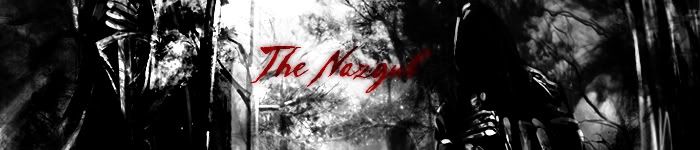
N: 4--Wow, that really makes him look frightening. I like how you stayed away from "Nazgul" but retained that theme. The coloring is also very neat.
O: 2--I like the text and the brush as well as the cropping
P: 2--Nice message, darling Pip, and I like how you framed his face with the text
Q: 4--This one was really difficult, but I liked the text on this one as well as the contrast and coloring.
R: 1--I like how you picked 'ring' but didn't go with The Ring. It's nice and simple and I think the Ring of Barahir is pretty cool.
S: 5--I like the simplicity of it and the details you can see on Sting. The border is nice too.
T: 3--Nice colors and the text really works into the picture
U: 1--I like the slight graininess and the way the text and the picture work together
V: 4--This is really lovely. I like the double image and the text works well with it
W: 3--Great cropping, nice coloring, and lovely text. Great job!
Y: 2--I normally don't really go for Tolkien artwork (other than Alan Lee) but this one caught my eye. Very Yavanna-y and you did a wonderful job putting it together. I like the font and the color you chose for it.
Z: 2--I like the runes--very cool. I also like the distant feel.
Lovely work everyone!


")


")


")

 <br><br><a href="http://immortalkiss.sarrand.net/"><img src="http://immortalkiss.sarrand.net/ik_lb6.jpg" border="0"></a>