<b>Please scroll down for results of round 06.</b>
___________________________________________________________
THE BASICS ::
[01] Each round will have a song as a theme.
[02] You must use that song and you must relate that song to the blend that you make.
[03] Each round is the same type of graphic --- blends, let's get better at making those!

[04] a. In your graphic, you must have the lyrics of the song, the name of the song, and the artist.
------ b. You do not have to use the entire lyrics, you must have a minimum of TWO verses, however.
[05] The images you use in your blend is at your discretion but no pictures can imply anything against the forum rules.
+++++++++++++++
<center>
Song Themed Contest - Round 07
Song :: "You And Me" by Lifehouse
Graphic :: Blend</center>
You & Me by Lifehouse wrote:
What day is it? And in what month?
This clock never seemed so alive
I can't keep up and I can't back down
I've been losing so much time
Cause it's you and me and all other people with nothing to do
Nothing to lose
And it's you and me and all other people
And I don't know why, I can't keep my eyes off of you
All of the things that I want to say just aren't coming out right
I'm tripping on words
You've got my head spinning
I don't know where to go from here
Cause it's you and me and all other people with nothing to do
Nothing to prove
And it's you and me and all other people
And I don't know why, I can't keep my eyes off of you
There's something about you now
I can't quite figure out
Everything she does is beautiful
Everything she does is right
Cause it's you and me and all other people with nothing to do
Nothing to lose
And it's you and me and all other people
And I don't know why, I can't keep my eyes off of you
and me and all other people with nothing to do
Nothing to prove
And it's you and me and all other people
And I don't know why, I can't keep my eyes off of you
What day is it?
And in what month?
This clock never seemed so alive
Rules:
------Have fun. Find your inner music muse.
------Please post the LINK of your entry and DO NOT use the img tools.
------Initial blend must be 600 x 400 pixels.
------Anyone is allowed to enter --- please do not ask for permission.
------Due date you want to aim for is
June 1st, 2007. I may accept entries a day after that, but sometimes I won't. No guarantees.
------Again, find your inner music-muse. JUST HAVE FUN.
+++++++++++++++
Members Entered:
[x] smeagollum -
Entry
[x] Caunion the Frostlord -
Entry
[x] ~RinielAranel~ -
Entry
[x] Valera Elenhathel -
Entry
[5] Rose of Rivendell -
Entry
[x] Morwen Anduril -
Entry
[x] Gilraen Ringeril -
Entry
[x] Luthien Star Lover -
Entry *
+++++++++++++++
Awards/Results of Round 06
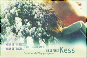
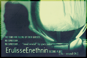
FIRST PLACE:: Kess ________________ SECOND PLACE:: ErulisseEnethnin
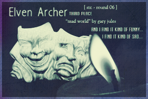
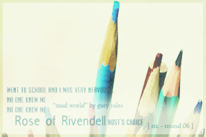
 THIRD PLACE:: Elven Archer _________ HOST'S CHOICE:: Rose of Rivendell
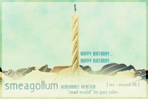
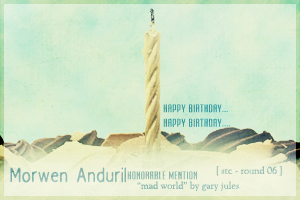
 HONORABLE MENTION :: Smeagollum & Morwen Anduril
Those who voted/judged ....
1. ethelfleda
2. Gilraen Ringeril
3. Bubble Black
4. MontanaBohemian
5. Nauriel Rochnur
6. ~RinielAranel~
:: Comments ::
++++++++++ EVERYONE :: “Aww, not as many people entered as usual

.....but everyone who did enter yo have my applause. *cheers loudly* Well done to everyone!

” –Elven Archer
++++++++++ ERULISSEENETHNIN :: “i really like the simplicity of the design, and i love how the snow creates the same impression of cold impersonality that the song does” –ethelfleda
“Beautiful colors and text!

I guess I would have used less 'gentle' pictures though...but that might just be because the first time I heard this song was on a violent video game commercial

” –Gilraen Ringeril
“Ooooo, is that one picture or two? Well it looks awesome anyway. I love, love, love the font and they way you did effects on it. And the color looks awesome. Very glowy. I loveses it!

” –Elven Archer
“I love the glowy effect you used and the picture is perfect as well.” –Bubble Black
“I was immediatly drawn to the starkness of your art. The child who (who sex is impossible to determine) is almost as pale as the snow, and the black foot prints offer amazing contrast that gives the viewer a sence of bleak lonliness. The verse you've chosen to accompany the art is also very good. I get the sence that he is a child that is often over looked and has no friends, the lonely kid you'd see playing by him or herself. Very nice job!” –Nauriel Rochnur
“A very touching blend! The small child with footprints really brings out the message of the song. The text goes very well with the other pictures and the snow. Overall excellence.

” -~RinielAranel~
++++++++++ KESS :: “really beautiful. the picture’s perfect as DT’s expression captures the emotion of the song, and i like how you highlighted those two key lines” –ethelfleda
“I really like the pictures you chose, they work very well

The only thing I'd do is maybe up the brightness/contrast =]” –Gilraen Ringeril
“All the different text looks really cool, and how you made two phrases stick out more. It gives it a nice touch. Your blending is also very well done, and the colors are very nice. A+ for you!

” –Elven Archer
“Doctor Who! YAY!!! I love the fading effect, and the picture is awesome, too.” –Bubble Black
“Perhaps that its because I'm an avid view of Doctor Who, but this art piece really says a lot to me. It seems as if the man is standing overlooking a busy city, but he's really locked away in himself and wants nothing to do with the "mad world" he's stuck in. I also like the way your art is arranged. Negative and positve pace is perfectly balance, so its quite pleasing to the eye! Good job! “ –Nauriel Rochnur
“I like the pictures you've used, and how there is a second faded picture of the man. The text is alright, but doesn't seem to work incredibly well.” -~RinielAranel~
+++++++++++ PANDORA :: “i like the dream-like quality of yours – it really suits the lines you chose” –ethelfleda
“These pictures are EXACTLY what I imagined when I heard the song! Wonderful choice

I also really think the red theme is perfect

The only thing I'd change is (again) maybe up the brightness/contrast =]” –Gilraen Ringeril
“Oh my....that's kind of....disturbing. But the blending and coloring look cool anyway. I like your texture the best though. Bravo!” –Elven Archer
“Ooh, I like. Very creepy, it makes me want to know the story behind the picture of the girl. I like the red coloring - it makes it intense.” -~RinielAranel~
+++++++++++ SMEAGOLLUM :: “wonderful blending on the globe and a very clever idea. it made me thing of the song on a less personal and more global scale.” –ethelfleda
“I love the colors and simplicity of it!

I'm not sure if the pictures exactly fit the words, but still nice job =]” –Gilraen Ringeril
“Ooh very creative idea! Not much blending, very simple, but very good. The text looks nice, but I like how you blended the pictures into the continents the best.” –Elven Archer
“Even if you hadn't put the lyrics in your art, I would have thought of the song. The white background gives a bleak sort of feel to the art. The blendings inside the continients are also a chilling reminder of how much of a "mad world" we live in. Good job!” –Nauriel Rochnur
“I love the simplicity and clarity of your blend! Very poignant, especially how the 'mad world' stands out with the globe. Definitely one of my favorites.” -~RinielAranel~
++++++++++++ ROSE OF RIVENDELL :: “the merry-go-round theme is perfect for the song and i like the blurred world in the background” –ethelfleda
“Ooo! Cool choice of pictures! At first glance they seem nice and cute, but when you read the lyrics they almost take on a creepy carnival kind of feel. But that's a good thing!

The blending could be a bit better, and you could have maybe added some more contrast, but I still really like it! =]” –Gilraen Ringeril
“I really like the desturated effect, with colored pictures. And the carousel is a little strange....but for some reason it works really well. Tis awesome!

” –Elven Archer
“Insteresting idea, using a carousel.

I like how it contrasts with the background.” -~RinielAranel~
++++++++++++ ELVEN ARCHER :: “beautiful blending, and the characters’ different expressions give more of a story to the song.” –ethelfleda
“
Amazing coloring and blending! I love it so much! The blend is very visually appealing

And I think the pictures fit pretty well with the lyrics too =] Great job!” –Gilraen Ringeril
“Eh pretty good...atleast your computer is working again. It looks a little too sharp or something, or to chatoic, but otherwise it's pretty good! (Love the SW theme!

)” – Elven Archer [Kit: YAY for computers!]
“I love the grunginess and it's Star Wars, so...Wicked.” –Bubble Black
“I love it! Your blend is beutiful, first off, the images and colors look wonderful. But I also love how you connected the song with Star Wars.

” -~RinielAranel~
++++++++++++ CAUNION THE FROSTLORD :: “the pictures are perfect. clive owen’s character really seems to be feeling the lyrics” –ethelfleda
“Absolutely
perfect pictures. I couldn't recognize them at first, but when I saw they were from
Children of Men then I knew that they were great! I might have used different colors, though, and blended the text more =]” –Gilraen Ringeril
“Oh it's green! My favourite color!

I like the texture alot, and your blending looks amazing. Your text looks a little funny, but it works. Nice job Frosty!

” –Elven Archer
“I'm usually detracted from this type of art when I see the subjects face but have no connection to them (meaning I don't know who the person is, whether it be freom real life or a tv show) However, you've proven that there are exceptions. This is a very beautiful piece of art that conveys the meaning of the song very well. Your subjst looks as if he's tired of the world but doesn't know who to escape. Beautifully executed! “ –Nauriel Rochnur
“I like the colors and the texture you've used. The text stands out a bit too much with its contrasting color. Otherwise, a very good blend.” -~RinielAranel~
+++++++++++++ LUTHIEN STAR LOVER :: “i like how you’ve captured the feeling of isolation in the song, and blue seems the perfect colour – it feels like a blue song to me” –ethelfleda
“Beautiful blue color scheme!

The only thing I'd change is maybe making the text less....obvious? Maybe just making it smaller would work

” –Gilraen Ringeril
“Oh I like this one, it's very simple, but pretty. The text looks awesome, and I love the blue color. I also like how it is just silhouettes.” –Elven Archer
“I love how you've used silouhuettes (sp?) of people against a light blue background. Very good idea.

The text blends very well, too.” -~RinielAranel~
+++++++++++++ MORWEN ANDURIL :: “stunning blending, and i like how you’ve literalised the lyrics (it looks to me like the woman’s catching tears)” –ethelfleda
“
Beautiful colors and images!! I think these images go amazinly well with the blend as well! I also love the way you did the text

Excellent job!” –Gilraen Ringeril
“Gah! I love it...that's all I have to say. I love the text, font, coloring, textures....everything...I just love it!

” –Elven Archer
“I Love the pictures and the textures you used. The light effects give it a wicked touch and the way you placed the text is perfect.” –Bubble Black
“I like the blending! Very pretty images. The large text at the top just doesn't seem to go, but other than that, it's stunning.

” -~RinielAranel~
+++++++++++++ JOHNNY'S FAN :: “gorgeous. i love how it has the hazy feeling i get when listening to the song” –ethelfleda
“Again, another great choice of images!

I'm just not sure if I like the...gritty(?)...border. I think it would have looked better more smooth and dark

” –Gilraen Ringeril
“Oooo me likes! I like the way you did the text the best, with the two different fonts. The one picture looks cool too. Although the kind of.....spray painted effect looks a little strange in my opinion, but mabye that's just me. Great job JF! (as usual!

)” –Elven Archer
“I like the picture and the way you've arranged the text. I'm not too fond of the spotty edges (Or whatever they should be called

) but I can see how they mix in with the overall blend.” -~RinielAranel~
++++++++++
-[kitoky]