Please scroll down for the results of Round 15 and awards.
_______________________________________________________
Basic info -- recopied for reference.
+++++++++++++++++++
[x] Good day to all. This is a contest that which is very much different from all the other general contests. Only this contest, you have to be more creative with a limited amount of choices that are offered to you.
[x] The name of the game: As it is, it is called the Screencapture Contest, and as you may have noticed there are rounds to this contest meaning I will continue with contests in the same routine [with variables...well..varying.

]
[x] Basically I will provide one or more screencaptures of various things. Whether it be Lord of the Rings, Harry Potter, a picture of a book, or a landscape capture. You will then use those screencaptures to make your graphic [avatar, banner, etc.].
Rules:
- You must
only use the screencaptures given to you.
- You must use them to make the required graphic (ie. Round: Avatar)
- Your entry must be a newly made entry. [Preferably with some kind of signature.]
- There will be no limit to the entries (meaning any number of people may enter), as long as it is entered by the date. Any entry given latter the date will be shown and recognized but will not be included in the judging (unless given a very good reason as to why you entered late).
[x] Judging: The voting/judging will now be publicly available however the voter must PM me with their votes/comments rather than posting it.
[x] Awards: Awards still are not guaranteed the best in the world. I've gotten better with Photoshop so I've gotten into the habit of making awards for every round.

++++++++++++++++++++++++++
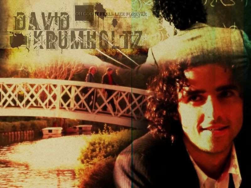
<center>
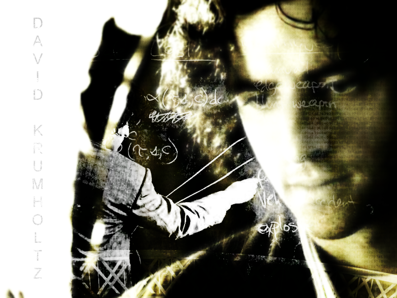
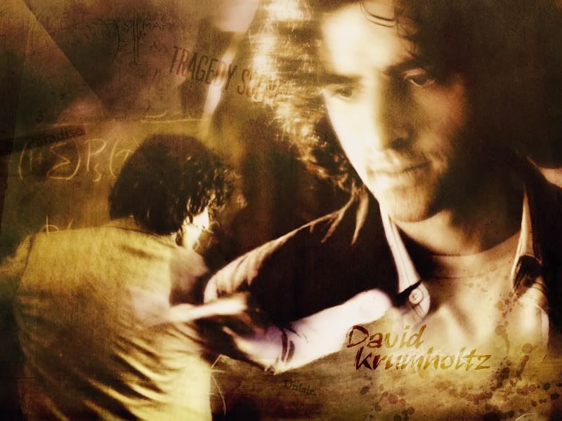
Screencapture Contest - Round 16</center>
<center>
Theme: David Krumholtz</center>
<center>
Graphic: Wallpaper</center>
<i>Images:</i>
>>
Courtesy of David Krumholtz UberGallery [Numb3rs 2.05]
>>
Courtesy of David Krumholtz UberGallery [Numb3rs 2.05-1]
>>
Courtesy of David Krumholtz UberGallery [Numb3rs 2.05-2]
>>
Courtesy of David Krumholtz UberGallery [Numb3rs 2.05-3]
>>
Courtesy of David Krumholtz UberGallery [Numb3rs 2.05-4]
If any of these pictures do not work, please inform me!
Notes:
---The rules above apply.
---You do not have to use all the pictures.
---The initial bookmark must be 800 x 600 OR 1024 x 768 (whichever floats your boat) pixels.
---Anyone can enter (permission not needed) --- no limit of participants. One entry per participant.
---Post the
LINK to your entry in your post. Try not to use the image tool.
---Entry is due by Friday, November 24th, 2006 at 11:30 pm EST.
---Good luck and HAVE FUN!
++++++++++++++++++
Members Entered:
[x] timtimtimtim -
Entry
[x] Pandora -
Entry
[x] Nurrantiel -
Entry
[x] Riniel Anariel -
Entry
[x] Morwen Anduril -
Entry
[x] Gilraen Ringeril -
Entry
++++++++++++++++++
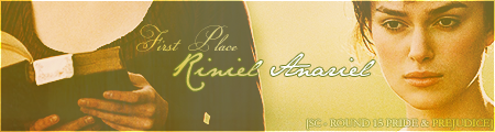
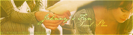
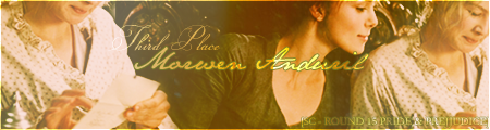
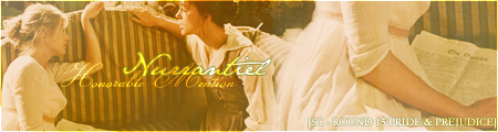
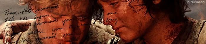
Awards/Results of Round 15 [Pride & Prejudice]
FIRST PLACE: Riniel Anariel!
 SECOND PLACE:
 One of our tied second placers, Gilraen Ringeril!
 SECOND PLACE:
 Our other tied second placer, Johnny's Fan!
 THIRD PLACE:
 Morwen Anduril!
 Honorable Mention:
 Nurrantiel
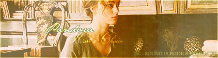
 Host's Choice:
 Pandora
 P.S.
P.S. I made the awards again. Photobucket-hosted. If something's wrong, try again later.
P.P.S. Possibly the most passive contest voting! You guys are awesome! The pink duckies worked, JF!

Those who voted/judged:
1. Limwen - Villya
2. Bubble Black
3. Elven Archer
4. Fencing Maiden
5. ViviElessar
6. Eldarwen
7. TrueNarnian
8. Ms.Gamgee
Comments:
Everyone:
“Amazing!
Everyone did such wonderful jobs that it was SO hard to vote! A lot of you used the same pictures, but everyone’s came out very different.

Again, wonderful work everyone! *claps*

” –Limwen – Villya
“I think this was a rather nice bunch, not the best but it was quite a lovely vote, there was a nice range of color displayed and a few diferent techniques. :] Nice jobs.” –Ms.Gamgee
“Maybe because the graphic was a bit different this time, or maybe because it was P&P, there were a lot of different entries, even though most were of the same image. I think people were extremely creative this time. It was really nice to see so many lovely entries.
” –Johnny’s Fan
Gilraen Ringeril:
<i>“I love how this bookmark came out! It has an interesting coloring, and the splatter brushes fit nicely. In addition, I think the faded black and white pictures give it a final touch! Good job!
” –Limwen – Villya
“I love it! The ink splatters give it a kind of grungy look, and the way you duplicated the picture and then blended it looks wicked! The text is in the perfect place as well.” –Bubble Black
“I love the style of this one Gil! It's absolutely amazing! The brushes and the coloring are amazing, and it is very well blended. Once again, you've blown me away!” –Elven Archer
“The effect with the picture is amazing. It really works. Also, the brushes go great with the whole bookmark.” –ViviElessar
“It's very bold-looking, and I like how you used only one image to get across the idea. Also, I think there's so brilliant layering going on.” –Altariel Frodo
“OMG!!! This is my all time fav. of this contest!!! I absolutely adore the style!!
The brushes are a very nice addition, but my favorite thing about yours is the text.
Awww!!! Sisters how sweet!!! I really love the conversion of black and white and color.” –Riniel Anariel
“The use of the doubled image was really unique! I liked it, it gave it the feel of a "mirror." And the color contrast was really interesting.” –Nurrantiel
“I reeally like what you did with that second one comng out,there. It look really cool, and how you put sisters in there, very very nice. I think you could have a been a little...not neater, but a little more organized with brushes, but all in all, its a really great blend!!
” –Ms.Gamgee
“This is a very creative design. I love how you have taken a simple image but have made it more interesting to look at. The "double image" thing is a very good effect. The text is nice and simplistic but I just wish there were lightly less "splatter" marks.” –Johnny’s Fan
"Your bookmark was an excellent first entry, Gil! And it even placed! Amazing job! I thought the theme was touching and the double-images were very interesting! Though the splat brushes seem to be kinda off, and in tune with their facial expression; creepy! But overall, a beautiful entry!" -Kitoky</i>
ForeverFrodo:
“Very unique cropping!

Everyone else who used that picture cropped it the same way, except you. A lot of brushes and textures, but nicely put together. The text is nice and simple, and I think that goes very well with the rest of everything else.” –Limwen – Villya
“Even though there is quite a lot going on in your bookmark (which isn't a bad thing!) it has vibrant colours and a nice texture. The tiny text at the bottom are a nice effect too.” –Bubble Black
“Wow, there is just something about the contrast of this one that really catches my eye! The colors are brilliant and add to it a great deal, not to mention the fantastic little text down at the bottom, which really adds a great deal of class to it.” –Fencing Maiden
“I really like the colours, and the use of textures.
Also, the text is very well done, and adds a nice touch.” –Altariel Frodo
“I love the colorful-ness of this one!
And the text "Bewitched" is
perfect for that picture!” –Gilraen Ringeril
“It is really bright and shiny, yet dark. I really like the use of text throughout the piece!!!
Amazing job!!!! I love that pic of them so much!!” –Riniel Anariel
“Sideways! The colors were bright and eye-catching. I liked the flower at the top, and the text. It really fit with the rest of the picture.” –Nurrantiel
“I like the highly saturated color in this one, it looks very nice and the little flower brush is quite cute. The black text also looks good there, good job. :]” –Ms.Gamgee
“I like the fact that your design is a different angle to everyone else. The colours are a little too "loud" for my taste but I like the text at the bottom and the various brushes you have used.” –Johnny’s Fan
"Very unconventional bookmark!
I like that it's horizontal, because that's what a lot of bookmark artists tend to do with a picture they're given. The flowers seem off though --- or maybe it's the saturated spots of color all around, I'm not sure." -Kitoky
Pandora:
<i>“I like how this one is centered on Jane and Elizabeth, and how you used multiple pictures… The text is what I liked the most, its just one word, but it rather describes the look on their faces! Nice job!

” –Limwen – Villya
“Wow, this is SO creative, it really is! The arrangement of the pictures is perfect, and the color is quite appropriate! She really did a cool job with it, admirable talent there.” –Fencing Maiden
“It looks really soft and pretty, which fits the pictures well. It’s nice how you included the picture of all of the Bennets, but kept the focus on Jane and Elizabeth.
” –Altariel Frodo
“I like the way you made yours pink
It seems to fit the 'girly-ness' of the family
” –Gilraen Ringeril
“B-E-A-U-T-I-F-U-L!!!!! I love how you focused on jane and elizazbeth.
Love the pinkish color, and I love the cute little swirly brushes you used!! Beautifully done!!” –Riniel Anariel
“So beautiful! The texture is wonderful, and I loved how you fit all those pictures into the one! Isolating Jane and Elizabeth to match with the other picutre was a really neat idea too.” –Nurrantiel
“I like how this one is done, very much. How you did the rectangular panels rather than a normal blend, and the blushy color goes well with the whole girlyness of all..the..girls in the picture...lol. I especially liked the two separate [ictures of Jane then Lizzy, lovely job. :]” –Ms.Gamgee
“I really like the way the images have been displayed and the fact that it's pink, suits the overall theme. The text is nice and also suits the theme and the brishes are a nice touch. It's very pretty and nice to look at.” –Johnny’s Fan
"My favorite thing about this bookmark is the girliness of it all, and we forget, through the rough stubborness of Elizabeth Bennet and the putrid conspiracies of the rich and the poor, that the Miss Bennets are just that. Miss's -- girly girls! And I think this bookmark potrayed it well, especially with the blending of the two screencaptures! An excellent use of pictures!
"</i>
pirateoftherings:
“I love how you add the faded picture at the top! The warm yellow colors are also very nice, good job!
” –Limwen – Villya
“Love the whole orangey glow. It's warm and the texture is placed nicely. Lovely picture choice, too.” –Bubble Black
“I love this piece potr, it's very soft and the texture is very nice. I love how you blended the picture at the top too.” –Elven Archer
“The colours are neat, it makes it look like it's glowing. Also, Darcy looks a little darker than Elizabeth, which somehow seems right.” –Altariel Frodo
“Great bookmark! I like how it's nice and simple
The only thing I suggest is maybe making it a little less yellow on the bottom so the bottom and top halves match better
” –Gilraen Ringeril
“I love the texture you used!! Love the brushing that was used!!
I love that picture -a lot of people used that pic. I really love the silouette pic in the background!!
Amazing job!!!” –Riniel Anariel
“This texture is also beautiful! I like the softness of it, and the faint picture of Elizabeth and Darcy at the top as well.” –Nurrantiel
“Done very nice, I like how very faded you haev that picture of them two on top there and how the two pictures sort of contrast eachother in the different emoitons of the two scenes. The shiny brushes go very well with it. Great work.” –Ms.Gamgee
“I like the images you have used and the way you have arranged them. The colours are a bit different to everyone else's so it stands out. The textures are brushes are nice but I can't actually read the text. It's a nice piece but I think it needs a bit more to it.” –Johnny’s Fan
"I love the flow of this one! Particularly different from the others! However, the texture seems overpowering, and it doesn't give the viewer the opportunity to see the image underneath. Very nice, though!" -Kitoky
Morwen Anduril:
<i>“I adore the coloring in this!
And the papery brushes used on the bottom are beautiful… as well as the fancy little flowers at the top! This bookmark has a very fitting look to Elizabeth and Darcy’s battle, and so the text fits very well! Excellent!” –Limwen – Villya
“Wow Morwen! I'm speechless, your bookmark is very simple, but yet very elegant. I love the brushes, and the kind of...victorian look (I think the word is victorian...

) I love it so much!” –Elven Archer
“It looks very simple and clean, which looks brilliant. The brushes used add a great effect to it.” –ViviElessar
“It almost looks like something I would actually use as a bookmark in a real book.
I like how it fades into sort of parchment, and I like the butterfly. Also, the font you used is very nice.” –Altariel Frodo
“Another stunning bookmark! I love the coloring and that paper-ish texture on the bottom!!
The only thing I'd change is maybe the font; when you do vertical text like that, sometimes it's easier to read if the font isn't so scripty
” –Gilraen Ringeril
“Love the vintage flower brushes in the background!! Amazing texture, great use of brushes!!
My favorite thing about this piece is the torn paper at the bottom the butterfly on top of that is a nice addition.” –Riniel Anariel
“I loved the brushes on this! The bottom was really neat, it looks like parchment - and the butterfly looks so cool.
” –Nurrantiel
“I like this one very much, its quite simple and yet, the colour looks a bit different and i like the (for lack of better word, since im slow tonight) thing on the bottom there with the butterfly, it looks really cool. And the text "confrontation" seems to sum up that whole scene, Very nice job, he looks so hot in your specific blend (and scene). :]” –Ms.Gamgee
“This is a very simplistic looking piece. I like what you have done to the image and although the texture at the bottom sgouldn't work, it actually works very well and adds something to the entire thing. The text and brushes are also nice and work well.” –Johnny’s Fan
"What I like the most is the paper designed at the bottom corner with the butterfly on it. Very beautiful, and I like how it refers to the book Pride & Prejudice instead of focusing on the movie.
And the image used just sums up the book!
Elizabeth Bennet: 21, Darcy: 21. Score, even." -Kitoky</i>
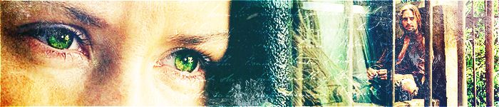
Nurrantiel:
“I love the glowing look to this bookmark! Even though I think, the faded picture of Elizabeth is a little confusing with the text, but very wonderful job anyway!

” –Limwen – Villya
“Very simple, but very lovely. Lizzie’s face in the background is not only unique, it is beautiful. Also
really like the softness, which gives it such a feminine feel.” –Fencing Maiden
“It looks so soft and clean! I like the faded image in the background - I didn't notice it at first, so it sort of creates another little detail and layer to the whole thing.” –Altariel Frodo
“I love the softness of it! It just seems to glow!
” –Gilraen Ringeril
“Very soft, great style!! I love the siloutte of elizabeth in the background!! That theme is just so sweet!!
Amazing Job!!!” –Riniel Anariel
“:duh: It can be better.” –Nurrantiel [Kitoky: Now there’s the constructive criticism I’m looking for!
]
“I like this one, I like the glowy effect on Jane andLizzy, and how youfaded Lizzy's face out in the background like that. It looks really cool. :] Nice job.” –Ms.Gamgee
“Apologies but I can't actually view your piece.” –Johnny’s Fan [Kitoky: Hmmm, odd.]
"Love the overall blend. The picture of Elizabeth Bennet behind the two of them is just beautifully blended. Though the overall piece is a bit blurry, I like the glow and dream-like quality of it." -Kitoky
Altariel Frodo:
<i>“The blending on this is wonderful! Though the text is a little blurry, you did a great job!
” –Limwen – Villya
“I love how you used the picture of Lizzie on the cliff as the main image, but had other pics of her in the 'background'
” –Gilraen Ringeril
“Very nice blending!! I love the placement you used. It is a little plain, but very beautiful!!!!
Beautifully done!!!” –Riniel Anariel
“The isolation of just Lizzie was rather neat! I like the stars at the bottom of the picture.” –Nurrantiel
“I really like how this one's blended with the different pictures of her, that looks very nice and ooohh....sparkly things. :]” –Ms.Gamgee
“I like the images you have used and the way you disaplyed them. No-one else really used those images so it's different from the rest. The text and brushes are a bit blurry, so it does detract from everything else. But I like the simplicty of the design.” –Johnny’s Fan
"Hats off to you for being the only one to tackle the cliff picture. I like this one for it's characterization but the contest was an overall theme, so it doesn't weigh much.
Excellent entry!
I agree with the others that the font is too blurry for the eye's comfort. You wouldn't come out reading a book to ruin your eyes with blurry text on your bookmark do ye? Again, great work!
" -Kitoky</i>
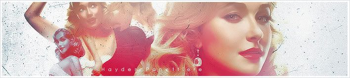
Riniel Anariel:
“I love the orangey-red and green colors! As well as the softness these pictures have! The blending on this is also very great! The ‘fairytale’ text is in a very good place, and overall this turned out great!
” –Limwen – Villya
“First of all, I would like to say I love how you put "Fairytale" on your bookmark. I absolutely love that! And I am in love with the coloring of it, it's very peaceful.
Amazing!” –Elven Archer
“I'm in love with this one!! The blending, the pictures used and the title are simply perfect. Good work!!!” –ViviElessar
“The contrast of the red and the white is lovely.
The whole thing really seems to fit the word "Fairytale." “ –Altariel Frodo
“I just LOVE this one!
It is blended awesomely, and the colors rock, and the text rocks, and it is just BEAUTIFUL!
” –Gilraen Ringeril
“Gorgeous! The texture is beautiful, and I love the colors in it! The word "Fairytale" also fits so well. And I don't what it is about the butterflies, but I love them!” –Nurrantiel
“O_O I really really like this one, I think its the one that stood out the most to me, the brightness and colors looks really very nice and the little circle brushes on the sides and the lines, and overall how its blended as well, and the text too, it is all sorta like a fairytale, lovely job!!” –Ms.Gamgee
“Again, this is another unusual piece. I really like the colours you have used and the images. The main "Lizzie" picture, her face looks a bit weird - but it's not your fault, we'll blame it on KK's chin! I also like the "dot" brushes, and the straight lines going down, it reminded me of a film reel. The text is nice and the little butterfly brush is a nice touch.” –Johnny’s Fan
"I L-O-V-E this entry! It's beautiful! The blending perfect, and the entire gradient gives it an ethereal glow. I love the fairytale theme of it.
Another excellent work! You deserved 1st place!" -Kitoky
Johnny's Fan:
<i>“Unique colors from everyone else! *holds up thumbs* The butterflies and sparkles give it a bit a romantic look. However, the text is a little small but very pretty and fitting perfectly with the scene.
” –Limwen – Villya
“Also definitely one of my faves! I love the faded, dreamy blue look. It's very subtle and the butterflies and sparkles make it even nicer.” –Bubble Black
“Overall, it is a stunning graphic, with characteristic JF sparkly-ness.
I love the simplicity of just using one picture, which are really set off by the butterfly’s. Very creative text too... it goes perfectly with the theme.” –Fencing Maiden
“I love this one because it looks very glowy and blue, like from a dream. The little butterflies go great with the bookmark.” -ViviElessar
“The colours and the butterflies make it look really pretty, almost twilight-ish. I really like how at the bottom you kind of explained the name, which I don't think many people think much about. Also, the words fit the picture really well.
” –Altariel Frodo
“The softness of it is very nice
And I ♥ purple!” –Gilraen Ringeril
“As always aww inspiring!!! I love that scene to pieces!! Amazing use of brushes and color!!
Of course the classic text!! Beautiful!!!!!!!!!!!!!!!!!!” –Riniel Anariel
“Gorgeous, as always.
The text is so perfect! I love the texture, and once again, the butterflies!” –Nurrantiel
“Very nice, I think you haev the best use of sparklies here. In fact the way you used the brushes, both sparklies and butterflies is really well done, because you used just enough without overdoing it, and I like the text too, very true. And obviously you always do a great job with colour, so kudos on that too! Awsome. :]” –Ms.Gamgee
“'nuff said.” –Johnny’s Fan [Kitoky: Booyah]
"These are the kinds of entries that I look for in a screencapture contest. To show an artist's skills for making a graphic beautiful from their works of techniques using textures, layers, and brushes not of the picture itself. And JF doesn't disappoint! The brushes are gorgeous and the overall glow is wonderful. I also find it ironic that my 1st and last entries tied for 2nd place.
" -Kitoky</i>
+++++++++++++++
Thanks for participating!
-[kitoky]
Past Rounds >>
::
Screencapture Contest [ Round 01 ]
::
Screencapture Contest [Round 2] (With Results of Round 1)
::
SC - Round 3 [Mr. Tumnus] (W/ Results of R. 2)
::
SC - Round 4 [Billy Boyd] (W/ Results of R. 3)
::
SC - Round 5 [Writing] (W/ Results of R. 4)
::
SC - Round 6 [Martin Luther King, Jr.] (W/ Results of R. 5)
::
SC - Round 7 [ Nature ] (W/ Results of R. 6)
::
SC - Round 8 [Viggo Mortensen] (W/ Results of R. 7)
::
SC - Round 9 [Anakin/Darth Vader] (W/ Results of R. 8 )
::
SC - Round 10 [Superman Returns] (W/ Results of R. 9)
::
SC - Round 11 [James Norrington] (W/ Results of R. 10)
::
SC - Round 12 [Dominic Monaghan] (W/ Results of R. 11)
::
SC - Round 13 [Arwen Undomiel] (W/ Results of R. 12)
::
SC - Round 14 [ Luna Lovegood ] (W/ Results of R. 13) * Celebrating 1-year anniversary of SC Contest
::
SC - Round 15 [Pride & Prejudice] (W/ Results of R. 14)
::
SC - Round 16 [ David Krumholtz ] (W/ Results of R. 15)


")


 <br><br><a href="http://immortalkiss.sarrand.net/"><img src="http://immortalkiss.sarrand.net/ik_lb6.jpg" border="0"></a>


")


")

 Blargh... I couldn't think of anything else to put besides his name. Uh... I'll fix it.
![Courtesy of David Krumholtz UberGallery [Numb3rs 2.05]](http://www.sdkg.net/gallery/albums/assassin2/a060.jpg)
![Courtesy of David Krumholtz UberGallery [Numb3rs 2.05-1]](http://www.sdkg.net/gallery/albums/assassin2/a061.jpg)
![Courtesy of David Krumholtz UberGallery [Numb3rs 2.05-2]](http://www.sdkg.net/gallery/albums/assassin2/a349.jpg)
![Courtesy of David Krumholtz UberGallery [Numb3rs 2.05-3]](http://www.sdkg.net/gallery/albums/assassin2/a453.jpg)
![Courtesy of David Krumholtz UberGallery [Numb3rs 2.05-4]](http://www.sdkg.net/gallery/albums/assassin2/a572.jpg)