Please scroll down for the results of Round 21 and awards.
_______________________________________________________
Basic info -- recopied for reference.
+++++++++++++++++++
[x] Good day to all. This is a contest that which is very much different from all the other general contests. Only this contest, you have to be more creative with a limited amount of choices that are offered to you.
[x] The name of the game: As it is, it is called the Screencapture Contest, and as you may have noticed there are rounds to this contest meaning I will continue with contests in the same routine [with variables...well..varying.

]
[x] Basically I will provide one or more screencaptures of various things. Whether it be Lord of the Rings, Harry Potter, a picture of a book, or a landscape capture. You will then use those screencaptures to make your graphic [avatar, banner, etc.].
Rules:
- You must
only use the screencaptures given to you.
- You must use them to make the required graphic (ie. Round: Avatar)
- Your entry must be a newly made entry. [Preferably with some kind of signature.]
- There will be no limit to the entries (meaning any number of people may enter), as long as it is entered by the date. Any entry given latter the date will be shown and recognized but will not be included in the judging (unless given a very good reason as to why you entered late).
[x] Judging: The voting/judging will now be publicly available however the voter must PM me with their votes/comments rather than posting it.
[x] Awards: Awards still are not guaranteed the best in the world. I've gotten better with Photoshop so I've gotten into the habit of making awards for every round.

++++++++++++++++++++++++++
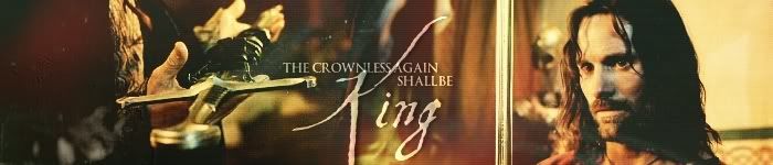
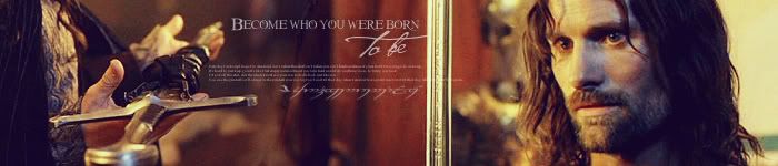
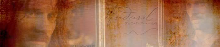
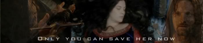
<center>
Screencapture Contest - Round 22</center>
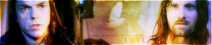
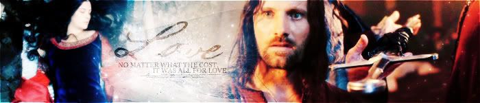
<center>
Theme: ROTK - Anduril</center>
<center>
Graphic: Banner</center>
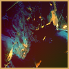
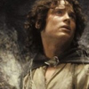
<i>Images</i>:
Notes:
---The rules above apply.
---You do not have to use all the pictures. Take your pick.
---The initial banner must be 700 x 150 OR 550 x 150 pixels.
---Permission not needed to enter :: one entry per person.
---Post the
LINK to your entry in your post. Try not to use the image tool.
---Entry is due by Tuesday, April 17th, 2007 at 11:30 pm EST.
---Good luck and HAVE FUN!
+++++++++++++++
Members Entered:
[x] Elegost Eruaphadion -
Entry
[x] Pandora -
Entry
[x] Hobbit Riley -
Entry
[x] Caunion the Frostlord -
Entry
[5] DarkPalantir -
Entry
[x] Firiel -
Entry
[x] Morwen Anduril -
Entry
[x] Elven Archer -
Entry
[x] Enedlhach -
Entry
[10] Tintinnabulator -
Entry
[x] Rose of Rivendell -
Entry
[x] Shadowcat -
Entry
[x] ~RinielAranel~ -
Entry
[x] Limwen Galathil -
Entry
[15] Johnny's Fan -
Entry
[x] Gilraen Ringeril -
Entry
+++++++++++++++
Awards/Results of Round 21 [ At World's End ]
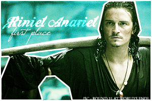
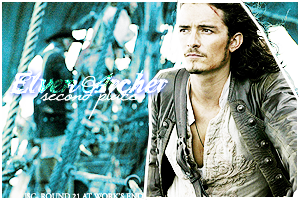
First Place >> Riniel Anariel _____ Second Place >> Elven Archer
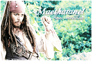
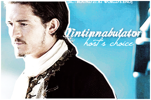
 Hon. Mention >> Maetharanel ______ Host's Choice >> Tintinnabulator
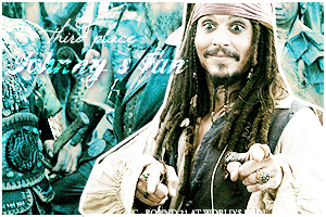
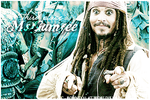
 All the Third Placers ----- Johnny's Fan, Pandora, & Ms.Gamgee!

<center>
</center>
Those who voted/judged!
1. Fencing Maiden
2. Smeagollum
3. Zandain
4. Luthien Star Lover
5. Kelenloth
6. Beriadanwen (most valuable commenter)
7. Rose of Rivendell
COMMENTS++++
>>>>>> <b>Everyone</b> :: “All I have to say is Wow......wow, wow, wow. These are all AMAZING! I'm glad I didn't have to vote, otherwise it might have taken my a century to decide. Excellent job to everyone! *applauds*” –Elven Archer
“
Wow! All the entries are fantastic! One of the best group of graphics for a contest that I've seen. I like something about every single one. Awesome job, guys!

” –Beriadanwen
“There were a lot of entries that used the same pictures, or the same picture arrangement as other people’s, but they are all very different from one another, so this for me, was a great round to comment on as there was something new to look at each time. Excellent work peeps! “ –Johnny’s Fan
“You've all done a very, very good job and it was really hard to decide.
I really enjoyed having a look at all those wonderful graphics!
” –Rose of Rivendell
++++++++++ <b>HOBBIT RILEY</b> :: “Love how ye do the boxes, so distinctly your style, and perfect.” –Fencing Maiden
“Oh this is so cool how you took the different parts of Lizzy, her eyes, and face, and put them all in little boxes, along with the normal picture. Very creative! I the texture is cool too!

” –Elven Archer
“I love how you did the different shots of the picture. Really cool brush(es)(texture?).” –Beriadanwen
“I love how you have captured the look of Elizabeth with each little box. It really makes the bookmark stand out, and catch your eye. I like the fact you have taken one picture and yet made it seem much more. I like the patterns you have used for the background and the text has been used well.” –Johnny’s Fan
++++++++++ <b>ELVEN ARCHER</b> :: “The use of colors and pictures here is like magic. I especially like the middle, where Will is faded black n white.” –Fencing Maiden
“Well it's a little too sharpened, but I guess overall look good. My favourite part is the text though (I'm gonna get pummeled!

)” –Elven Archer [Kit: Well, you never know!]
“Lovely
Great picture placement, text, and colour.” –Beriadanwen
“I really like the way you have arranged the pictures and the colours and effects you have used. The text is nice and simple but is striking. I like the add text you’ve put as well.” –Johnny’s Fan
“I love the way you've arranged the pics, the soft colours, the texture you've used and the way you've included the text. Well done!” –Rose of Rivendell
++++++++++ <b>PANDORA</b> :: “The ribbon of text is my favorite aspect, but really the whole bookmark is lovely. Well balanced too.” –Fencing Maiden
“Will! *huggles* I don't care what everyone else says, I still like Will the best *cough* back to graphics *cough* Anway I really love this one Pan, The texture looks awesome, and I like the little picture at the bottom under the title. I give it an A+!” –Elven Archer
“I like it - it's one of the entries that best goes with the feel of the movie.” –Beriadanwen
“The use of colour on this is very striking and very different from the other Will bookmarks. I like the grungy textures you’ve used and the little picture at the bottom just gives it that something else. I like how you have used the characters name and the films title.” –Johnny’s Fan
++++++++++ <b>PIRATEOFTHERINGS</b> :: “The positioning of your pictures is perfect, as is the darker theme. Lovely.” –Fencing Maiden
“pirateoftherings: Wow! There's alot to look at! I really like this on potr. All the different pictures on the side look neat, with the text next to them. And it's Norrie, how could it be bad?
Excellent work my friend!” –Elven Archer
“Very cool - you made it interesting without using a bunch of crazy texture. I just love how you did the sideways text & side bar with pics.” –Beriadanwen
“Good picture choice, and I like how you have used part of the image down the side. I also like the blue stripe on the right as it really adds something to the overall bookmark. The text is nicely positioned and I like the text you have used.” –Johnny’s Fan
++++++++++ <b>FOREVERFRODO</b> :: “Your colors are beautiful and so diverse. The fonts are also well-used and make it very pretty.” –Fencing Maiden
“Okay I really like this one....alot. I like how simple, yet nice it is. The colors are very pretty and I like the ink in the middle with the text. 'Tis awesome!
” –Elven Archer
“Yay! A bright entry! I love the colour, text & brushes. Awweeessoommme, one of my favourites
” –Beriadanwen
“I really love the colours on this and the textures you have used. The way you have arranged the pictures is really good and I also love the splotchy brushes and you have used the text really well. Really stands out.” –Johnny’s Fan
++++++++++ <b> CAUNION THE FROSTLORD</b> :: "I positively LOVE your gradient, it compliments the picture as if it was made for it.” –Fencing Maiden
“Wow, your blending is excellent.....like really good! I like the simplicity of this one too, and the texture looks really nice with it. I would want this as my bookmark!
” –Elven Archer
“I like how you put the pictures and the beautiful orangey colour. Gorgeous. I think it would have been better without the boxy red texture, though. “ –Beriadanwen
“I think the way you have arranged the pictures both vertically and horizontally is really unique, and stand out because of this. I love the colours and the brushes you’ve used. The only thing, is I think the text should have stood out a bit more, and maybe have been positioned elsewhere, but it’s a lovely piece nonetheless.” –Johnny’s Fan
++++++++++++ <b> ~RINIELARANEL~</b> :: “I must first commend you for being the only one to make a Sao graphic. The text fits the picture too, wonderful work.” –Fencing Maiden
“Yay! You're the only one who did Fang! Anyway, it's very nice Riniel. I like the color and the texture, and your text looks really neat.” –Elven Archer
“Wooo, new character featured. Love the colour & the text fits really well. Definately stood out from the rest, good work.” –Beriadanwen
“Kudos for being completely and utterly different. One of the things I love most about this is the “claw” marks you have added. I just think that’s a great touch for this character. I really like the colours and the textures you have used and the text you have used, and the way you have positioned it, is great.” –Johnny’s Fan
++++++++++++ <b>ELENANNA LOTHENDHEL</b> :: “Ah, the green and the frame are both very original. Nice to see something centered too.” –Fencing Maiden
“Yay for [s]Sabe[/s] Elizabeth!
I like the "Pirate Queen" the best! It's very simple, but pretty, and I like how you put here face twice. Good work!” –Elven Archer [Kit: LOL. She’s so Sabe]
“Very cool, I like that you really highlighted her beautiful face.” –Beriadanwen
“I like the fact we have a close-up of Elizabeth. I think that’s quite eye catching. The box at the bottom gives it a little something extra. I really like the texturey, patterney….thingy…you used, as I think it works really well.” –Johnny’s Fan
++++++++++++ <b>TINTINNABULATOR</b> :: “Yer text is amazingly good, and fitting, hah. The gradient works well too, good work.” –Fencing Maiden
“I like how you used almost everyone, and the quote at the bottom is funny! (It reminds me of finding Nemo...

) Anway, its awesome and the colors look really cool!” –Elven Archer
“I love the colour, and the 3 overlapping pics on top are great. The text fits a bit awkwardly (a great phrase though), but other than that, it's really good.” –Beriadanwen
“First off, the text is so unique, I love it. Not only is a great just as text, but it also ties the pictures all together, which in itself is a unique idea. The effects you have used are really good and I love the colours.” –Johnny’s Fan
++++++++++++ <b> MS.GAMGEE</b> :: “Props to you for creative text! I also love the gradient... so nice.” –Fencing Maiden
“Oh I looove this one! The colors are so cool and I like how you did the little desturated circles! The text looks awesome and the texture is amazing! You go girl! (Norrie!

)” –Elven Archer
“The intense colour is very cool - and your bubbles too. As usual, the text, concept, texture, I love it all.” –Beriadanwen
“I love, love, love, love, love, love (ya get what I’m saying) the colours. Purple + Norrie = dies of happiness. The little bubbly things…of greydom…are a really neat addition, and really add something to the already Norrie-fied bookmark. The text is also really good.” –Johnny’s Fan
++++++++++++ <b>GILRAEN RINGERIL</b> :: “I love the coloring, and the frame. It makes it look a bit neater than others.” –Fencing Maiden
“Oh the colors are soo pretty! As I've said a million times I wish I could color stuff like you!
It's very simple and very nice. I loveses it Gil!” –Elven Archer
“Jack! I love it. The simplicity of it really lets the goofy grin on his face speak for itself

” –Beriadanwen
“I love the picture you have used and the colours. The simplicity of it is what makes it so striking. I love the text and the way you didn’t put “Captain”. The font really suits the image so well (needs to know the name precious).” –Johnny’s Fan
“I really like the banner's colour, the texure you've used and the font. Great job!” –Rose of Rivendell
+++++++++++++ <b>MAETHARANEL</b> :: “The sharp look works very well here, giving it a bit more detail than the original picture. Very nice.” –Fencing Maiden
“I really like the simplicity of this one. No text, just a picture some brushes, and it looks awesome! The colors are very nice and bright but I like the brushes and the slight border the most.” –Elven Archer
“I'm loving the lack of text, the cool half-border, the paint splatters...and the list could go on. Awesome - it's one of my favourites.” –Beriadanwen
“The affects and colours you’ve used for this image are really, really good. The brightness makes it stand out, and I love the splotchy border. Just goes to show you don’t need text to make something striking.” –Johnny’s Fan
+++++++++++++ <b>ENEDLHACH</b> :: “Your brushes work very well here, and the coloring is perfect.” –Fencing Maiden
“Prettyfulness! I like the colors on yours, they are very pretty! And the brushes look really cool too. I like the "At World's End" in the middle the most though! Exellent job!” –Elven Archer
“Love the text brushes, and the colour. It's hard to describe it - all put together it just works really well. Great work!” –Beriadanwen
“The colours you have used on this are very different from the other entries. The images you have used and the way you have blended them is great. The text is nice and I like the little text brush. I also really like the other brushes you have used, as they really work well, but it’s a shame that Barbossa’s face is covered with one.” –Johnny’s Fan
+++++++++++++ <b>SAPPHIRE</b> :: “Old and a bit grungy looking: simplicity is perfection in the case of this graphic. Honestly can't think of any way to make it better.” –Fencing Maiden
“Oh really like the selective coloring *sigh* I wish I had selective coloring......Anyway I really like it. The brushes make it look kind of old and dirty and it looks great!” –Elven Archer
“Oh man, how did you get it to look like that! I
love the newspaper-ish look. It's so cool I can't stop looking at it, lol. One of the four best, in my opinion. When graphics work with no text, it makes me happy
” –Beriadanwen
“Really good use of colours and texture. You have really made this different from every other entry with the same picture. I especially like the grungy line running down and the bordery thing on the left.” –Johnny’s Fan
++++++++++++ <b> LIMWEN - VILLYA</b> :: “The contrast between colors is so eye-catching, and the soft glow is nothing short of brilliant.” –Fencing Maiden
“*gapes* The coloring is just so cool on the one Limwen. It's very simple and very pretty. I like the desturated circle at the top and the font looks really cool! Kudos to you!
” –Elven Archer
“I can't put my finger on why, but I just love it. How you made the picture look is awesome - and the text is just perfect. I didn't think that the black & white bubble really seemed to fit, though.” –Beriadanwen
“The close-up of Elizabeth is really striking, as are the colours and the “scratchy” brushes. I like the grey image at the top, but the main image is so striking, it would have looked just as wonderful on it’s own. I like the text, simple and straight to the point.” –Johnny’s Fan
“I especially like the way you've combined the coloured picture with the black-and-white image and the text that you've included. Well done!” –Rose of Rivendell
+++++++++++++ <b> JOHNNY'S FAN</b> :: “The sidewaysness is so original and cool! You made each of the characters stand out distinctly, not stressing any more than another.” –Fencing Maiden
“I like how yours is horizontal and different from the rest. It looks really cool and I like the text the most! As usual for you JF, it's awesome!
” –Elven Archer
“The usual fabulous-ness that is your work. Text & pic & colour are all just great. I don't like that I have to turn my head to look at it though,
” – Beriadanwen
“It is clear that this contestant had only one thing in mind when this was made – to cause the judges severe neck-ache. I believe she should be disqualified for causing the judges to suffer from Neck-Is-Soreus-I’m-Not-Aright-itus.” –Johnny’s Fan [Kit: Sorry, but unfortunately we can’t disqualify a contestant on these terms.
]
“I especially like the banner's colour, the texture you've used and the font with the sparkiling dot. Great job!” –Rose of Rivendell
++++++++++++ <b> RINIEL ANARIEL</b> :: “This one has a magical look, and your use of texture and brushes is terrific!” –Fencing Maiden
“The colors are sooooo pretty on this! It's very saturated, and very pretty. I like how the text is horizontal, but the picture isn't. It's just amazing!” –Elven Archer
“It's all...mystical. I love it. The colours are
gorgeous and the brushes & text just fit perfectly. Amazing!” -Beriadanwen
“Love the effects on this one. You can see a lot of effort has gone into this. I like the colours you’ve used and all the different textures. All the brushes you have used, really suit this piece well. It looks like it is simple. But the more you look the more you see.” –Johnny’s Fan
+++++++++++++
-[kitoky]
Past Rounds >>
::
Screencapture Contest [ Round 01 ]
::
Screencapture Contest [Round 2] (With Results of Round 1)
::
SC - Round 3 [Mr. Tumnus] (W/ Results of R. 2)
::
SC - Round 4 [Billy Boyd] (W/ Results of R. 3)
::
SC - Round 5 [Writing] (W/ Results of R. 4)
::
SC - Round 6 [Martin Luther King, Jr.] (W/ Results of R. 5)
::
SC - Round 7 [ Nature ] (W/ Results of R. 6)
::
SC - Round 8 [Viggo Mortensen] (W/ Results of R. 7)
::
SC - Round 9 [Anakin/Darth Vader] (W/ Results of R. 8 )
::
SC - Round 10 [Superman Returns] (W/ Results of R. 9)
::
SC - Round 11 [James Norrington] (W/ Results of R. 10)
::
SC - Round 12 [Dominic Monaghan] (W/ Results of R. 11)
::
SC - Round 13 [Arwen Undomiel] (W/ Results of R. 12)
::
SC - Round 14 [ Luna Lovegood ] (W/ Results of R. 13) * Celebrating 1-year anniversary of SC Contest
::
SC - Round 15 [Pride & Prejudice] (W/ Results of R. 14)
::
SC - Round 16 [ David Krumholtz ] (W/ Results of R. 15)
::
SC - Round 17 [X-mas Sig Set Awards] (W/ Results of R. 16)
::
SC - Round 18 [The Pevensies] (W/ Results of R. 17)
::
SC - Round 19 [ Cats ] (W/ Results of R. 18)
::
SC - Round 20 [Reese Witherspoon] (W/ Results of R. 19)
::
SC - Round 21 [At World's End] (W/ Results of R. 20)


")
 Wow, I was not expecting that! Thank you guys so much for voting for me. And Kit, the awards are fantastic as usual. Thanks guys!
  (Loved your comments as well


")

")


 Have a


 </center>